In this article, you will learn:
- The different parts of the Tulip App Editor
- Basic visual elements that you can add to an app (also called Widgets)
- How to add basic logic using Buttons
- How to complete an app to log data
This topic is featured in the Introduction to app building course in Tulip University.
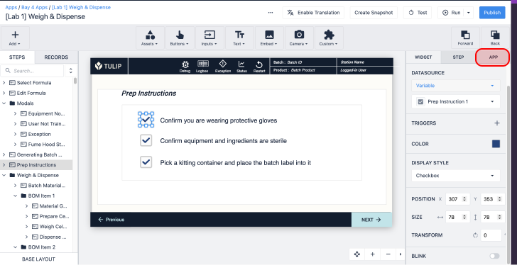
If you are still getting familiar with the Tulip App Editor, this article is for you. We’ll use an example of a work instructions app to walk through all the major tools in the App Editor.
The App Editor allows you to build apps for operators without writing any code.
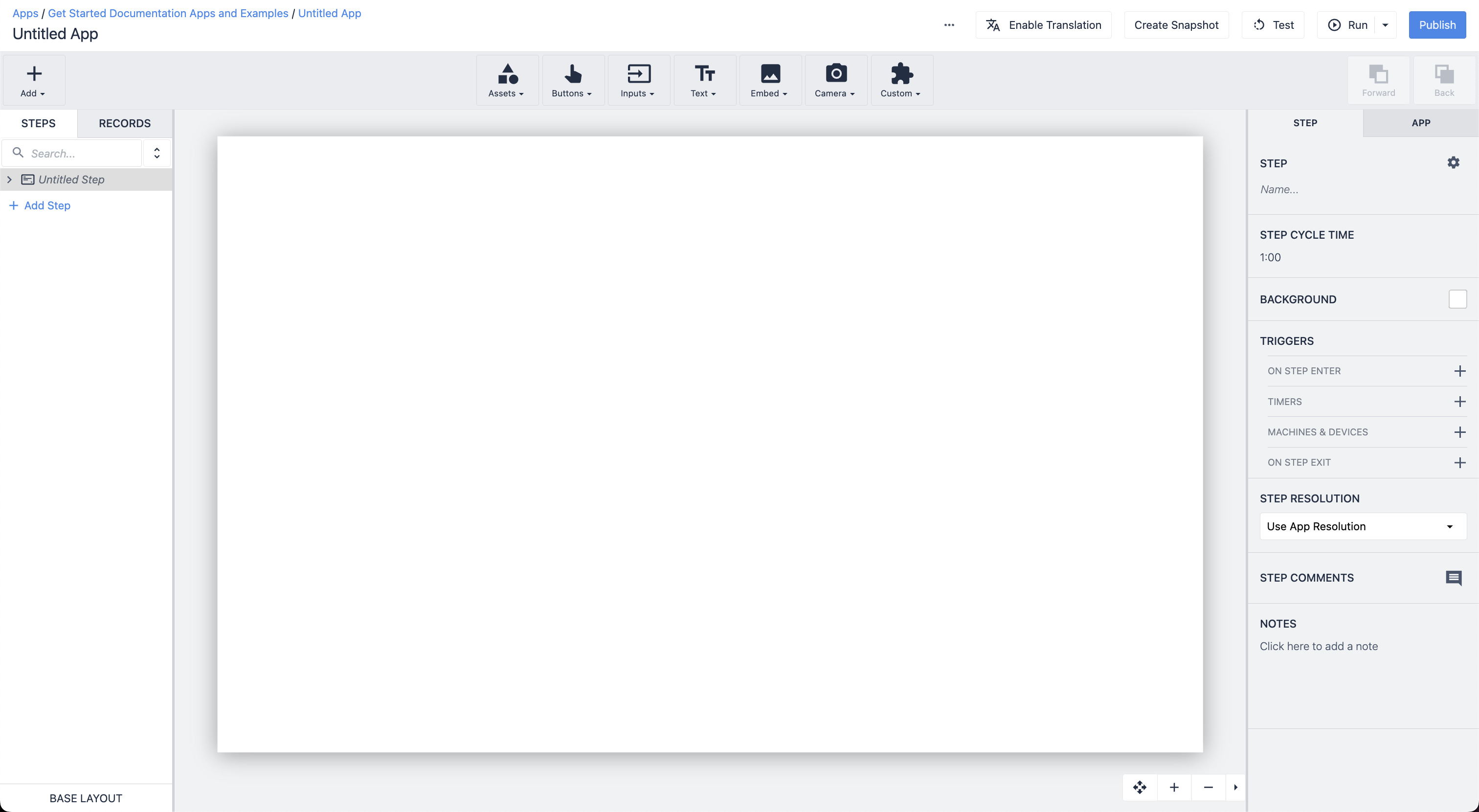
Here's what it looks like:
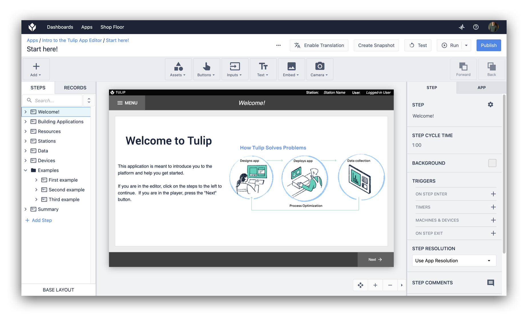
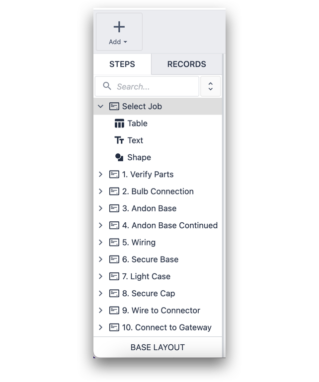
In the app editor, you can create a series of Steps that digital visual elements of a process.
Introduction video
We're constantly improving the applications that come in new instances. If you joined Tulip recently, the apps in your instance might look different than what you see in images in this article. No worries, the ideas are the still same even if the content is a little different.
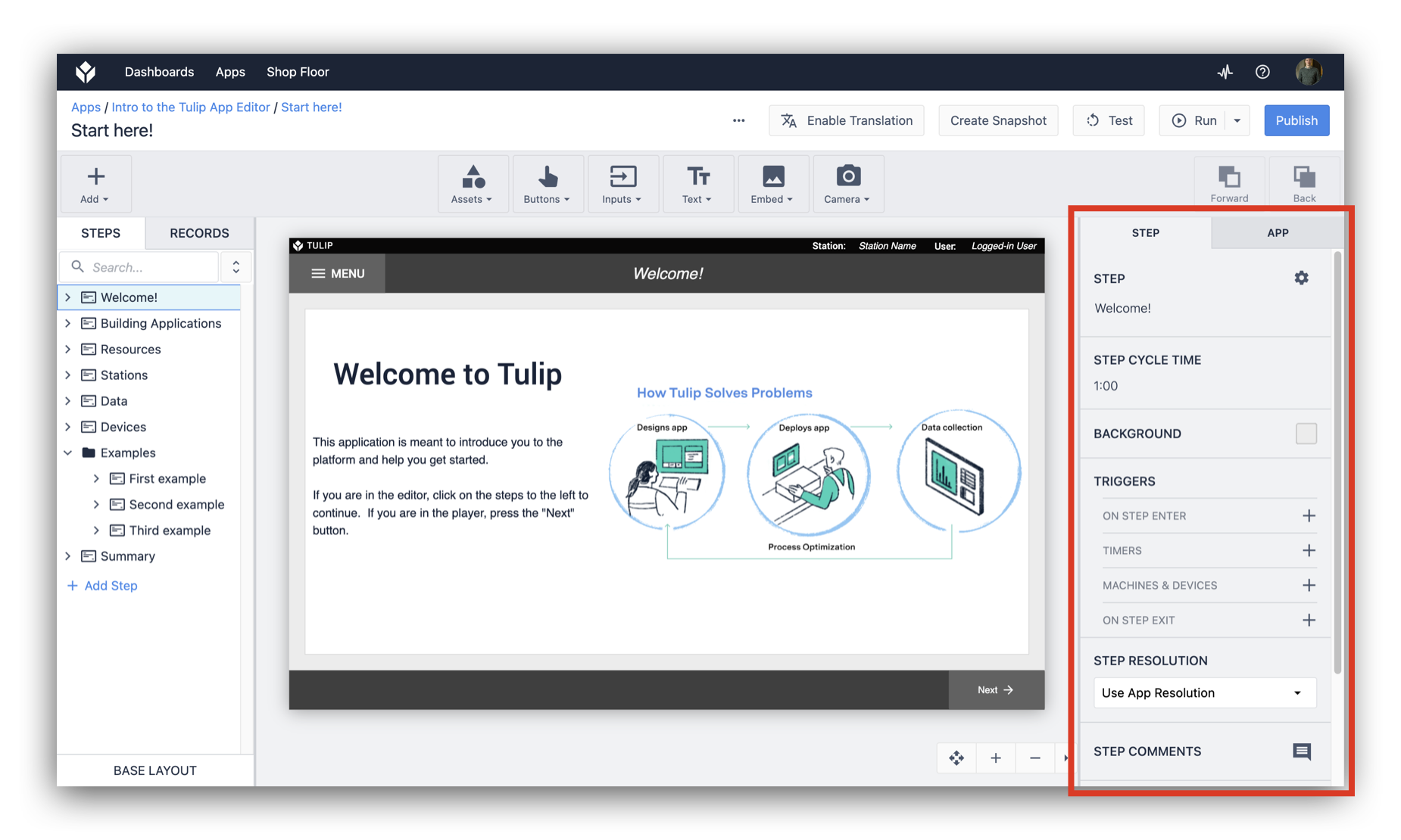
Breakdown of the app editor
The App Editor is where you build and edit your app. The following diagram shows the different parts that make up the app editor:
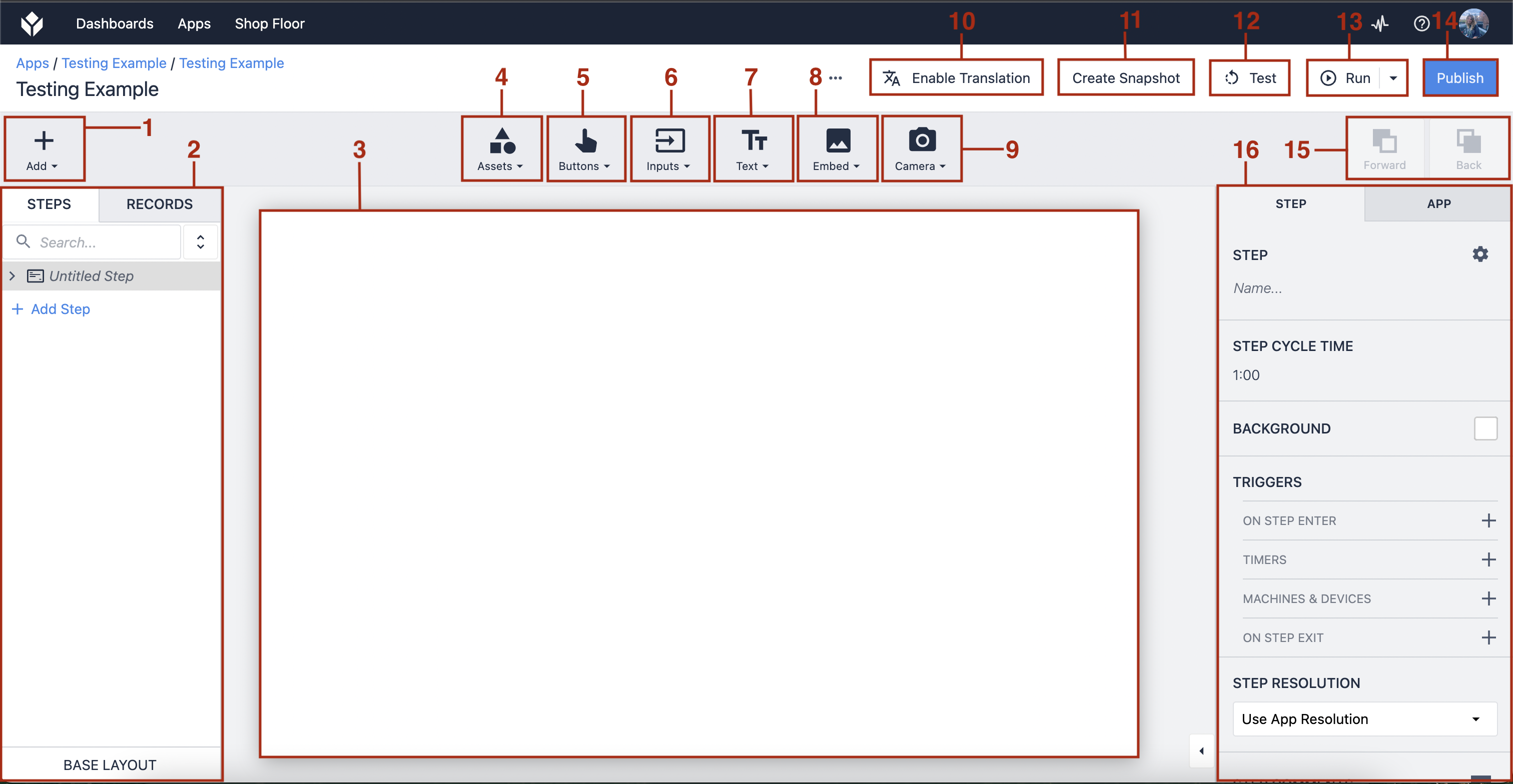
- Add Step/Step Group - Add a new Step or Step Group
- Step/Records Panel - View your steps via the step tab or switch to the records tab to view the Tables used
- Workspace - The space to create your app interface
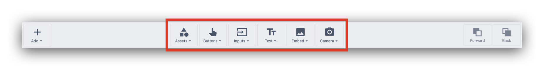
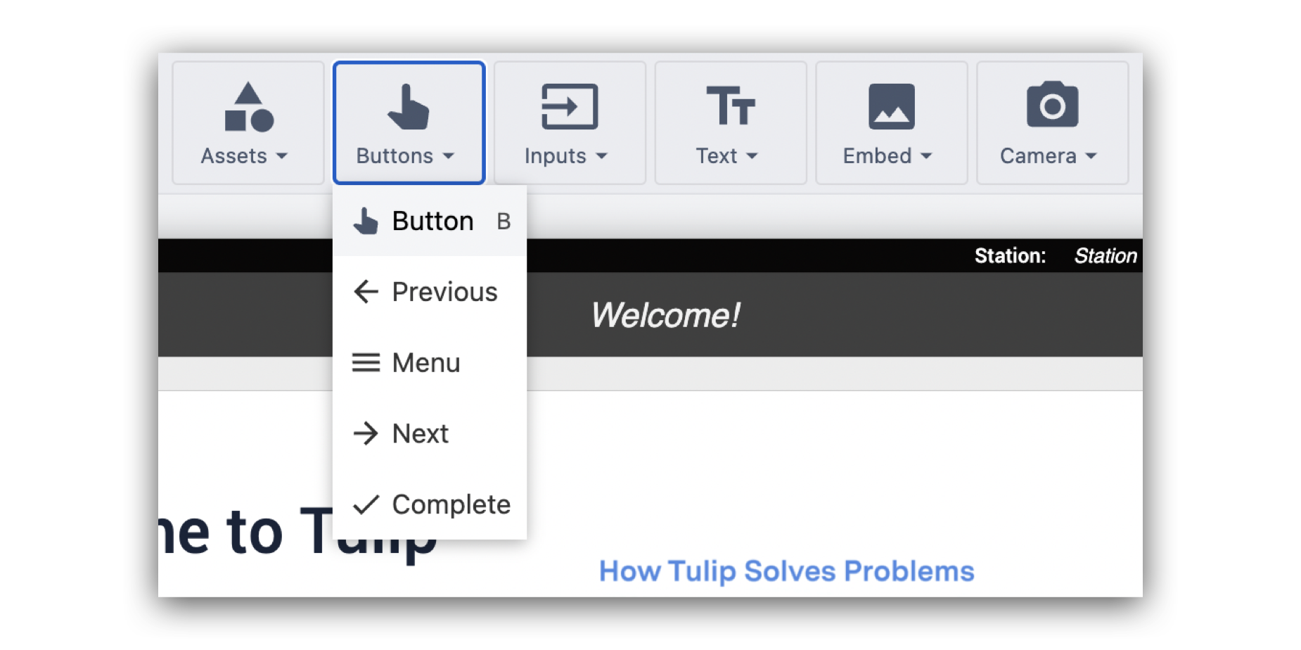
- Add an Asset Widget - Add a shape, icon, or logo to your app
- Add a Button Widget - Add a button to your app
- Add an Input Widget - Add an input field to your app
- Add a Text Widget - Add a text box to your app
- Embed a Widget- Embed a variety of widgets, such as images, analyses, machine attributes, and more
- Add Camera Widget - Add a regular camera or barcode camera snapshot
- Translate - The Tulip Player will automatically translate the app into your selected language via your Tulip profile
- Create Snapshot - Save a current version of your app, creating a duplicate
- Test - Test your app via Developer Mode
- Run - Run your app in the Tulip Player
- Publish - Publish your app
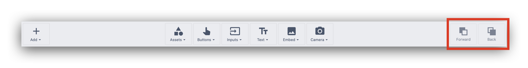
- Forward/Back - Move an element within the workspace forward or behind other elements
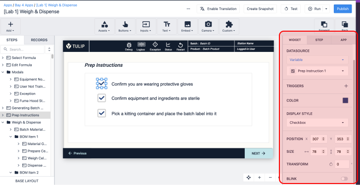
- Side Pane - Set Triggers and stylistic components in the Widget Tab, Step Tab, and App Tab.
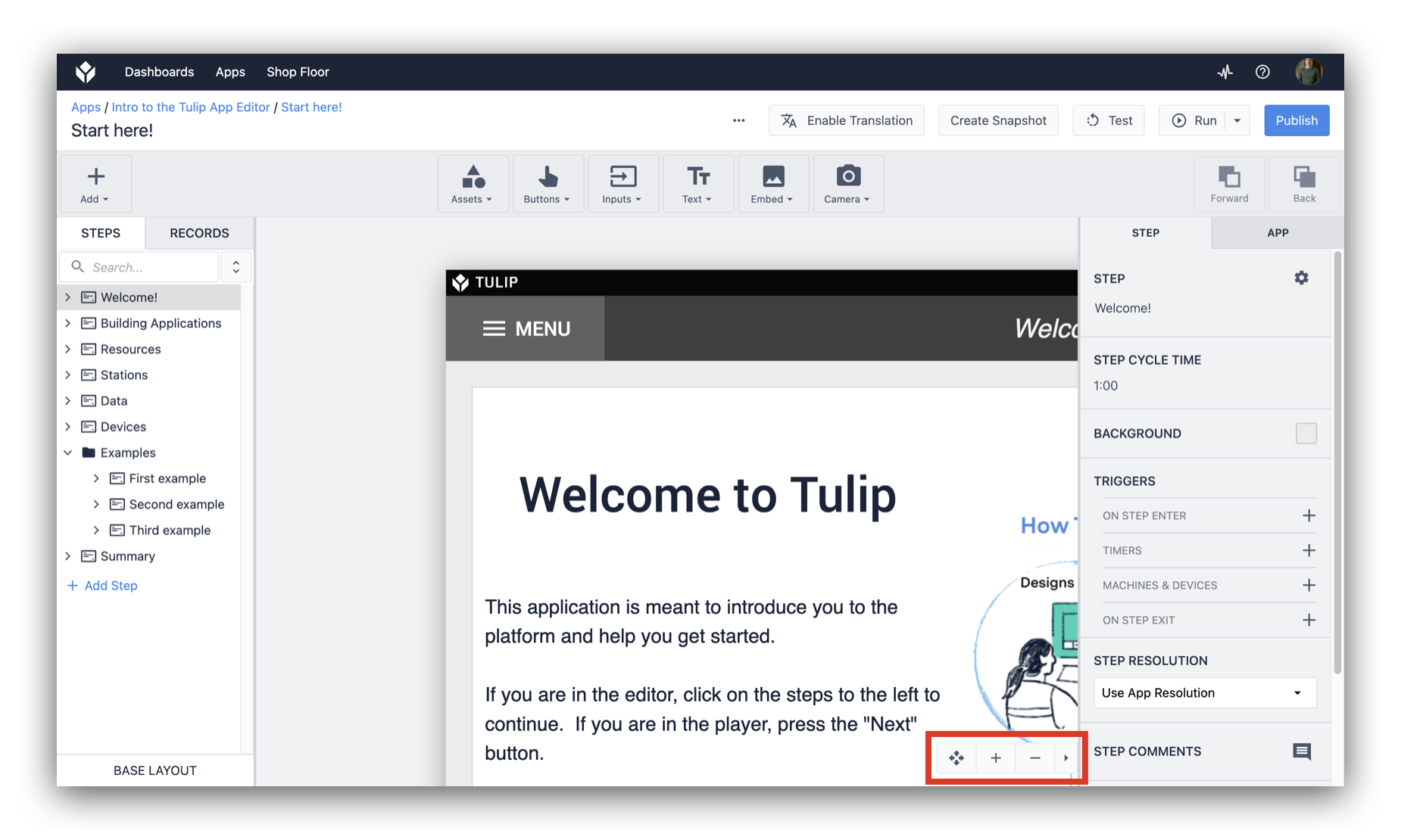
Using the pan and zoom tool you can:
- Move the editing surface of your application
- Zoom in or Zoom out
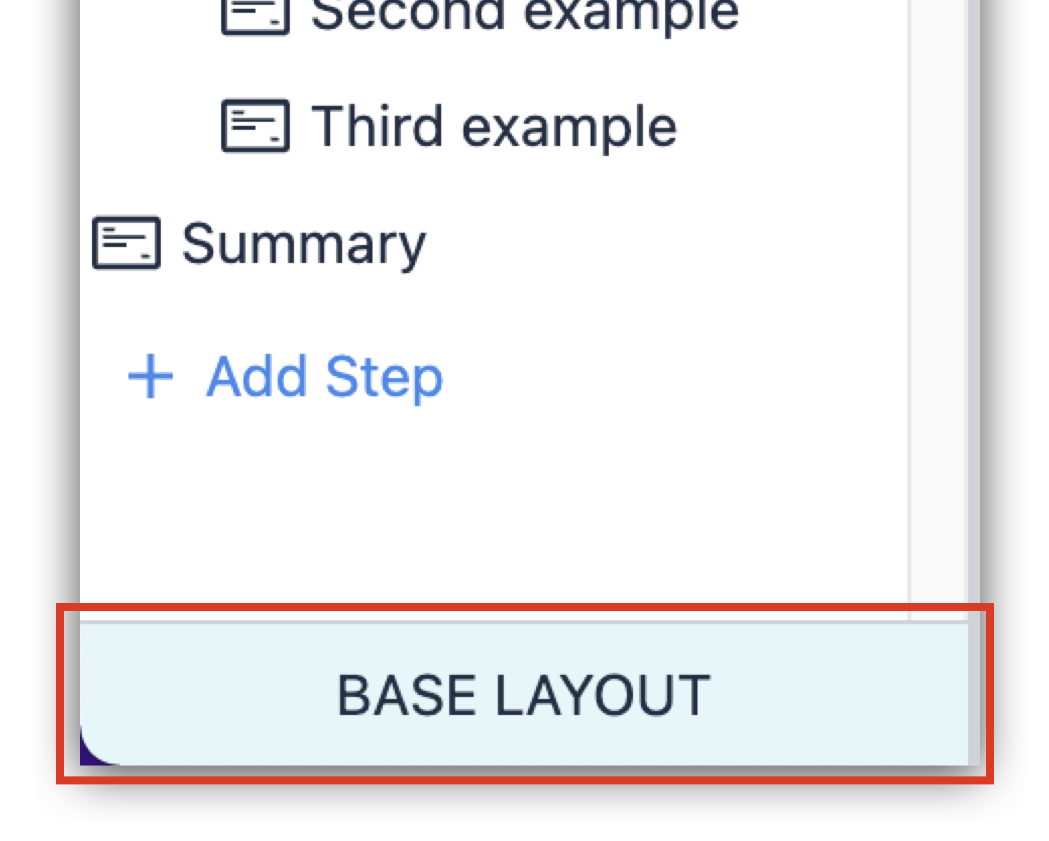
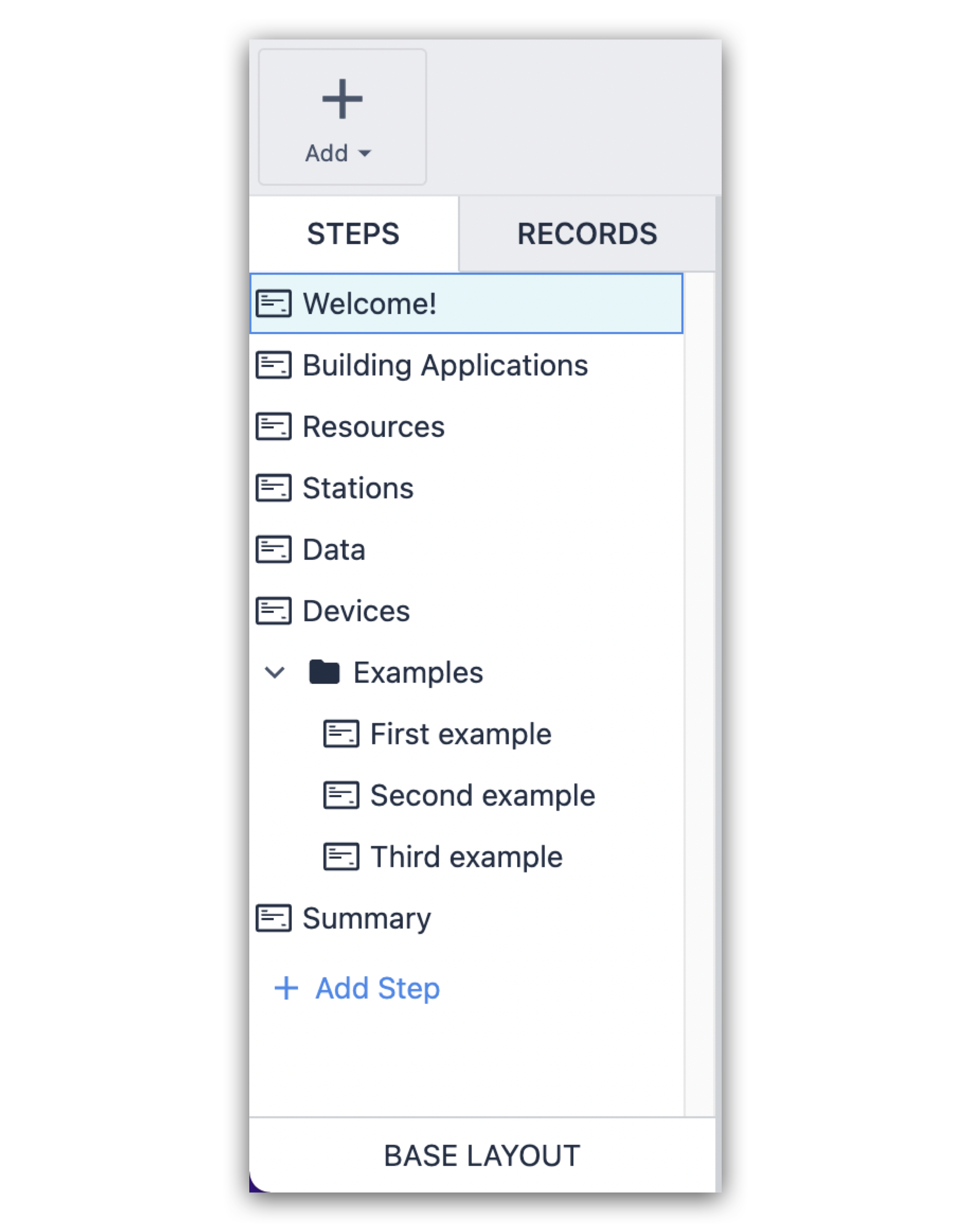
The Steps List on the left shows the list of steps including the Base Layout.
Base layout
Any formatting or layout edits you make to the Base Layout will automatically apply to each individual step in the app.
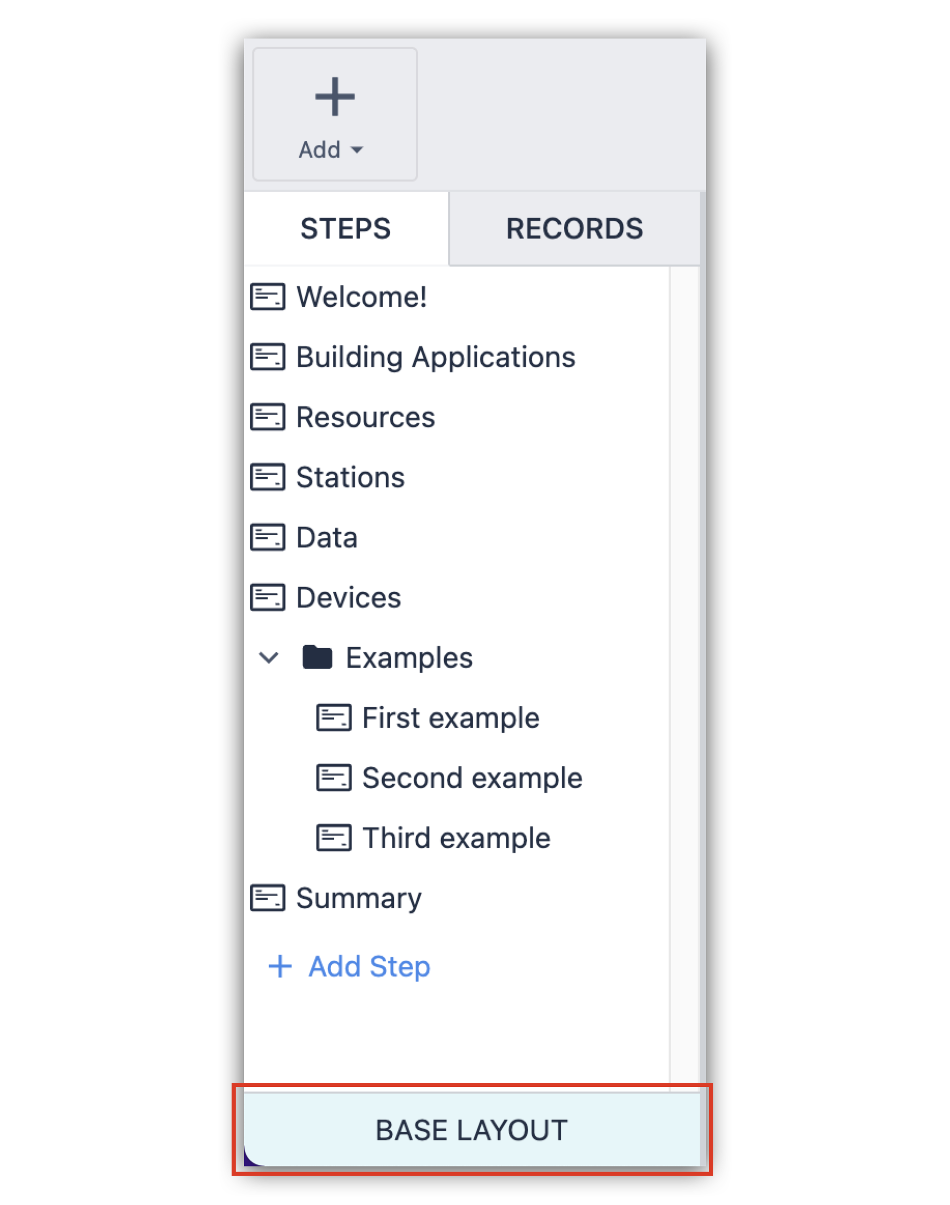
You can alter the base layout on a single step by "unlocking" individual elements in the Side Pane on the right.

Learn more about base layouts here.
Steps
You can click on a step to view the elements that it contains.
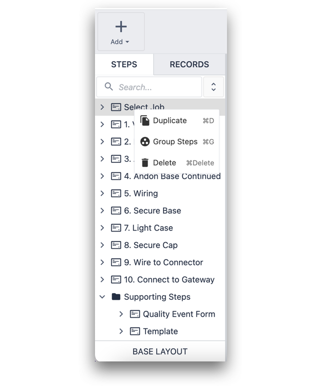
Right-click on a step to duplicate it, group steps together , or delete it.
Learn more about steps here.
Toolbar
The Toolbar at the top of the screen includes visual elements that can be added to the app. These are elements like shapes, photos, text, videos and buttons. To add a new visual element to the app, simply click and drag it to the desired location.
On the right side of the Toolbar there are additional tools you can use to layer the objects in the Tulip App Editor.
Context pane
The Side Pane on the right side of the screen is where you handle all of the formatting and logic in the app. Read more about Widget configuration here.
There are three tabs:
- Step Tab
- App Tab
- Widget Tab
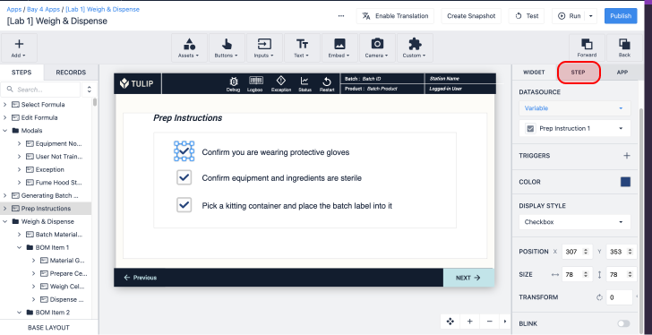
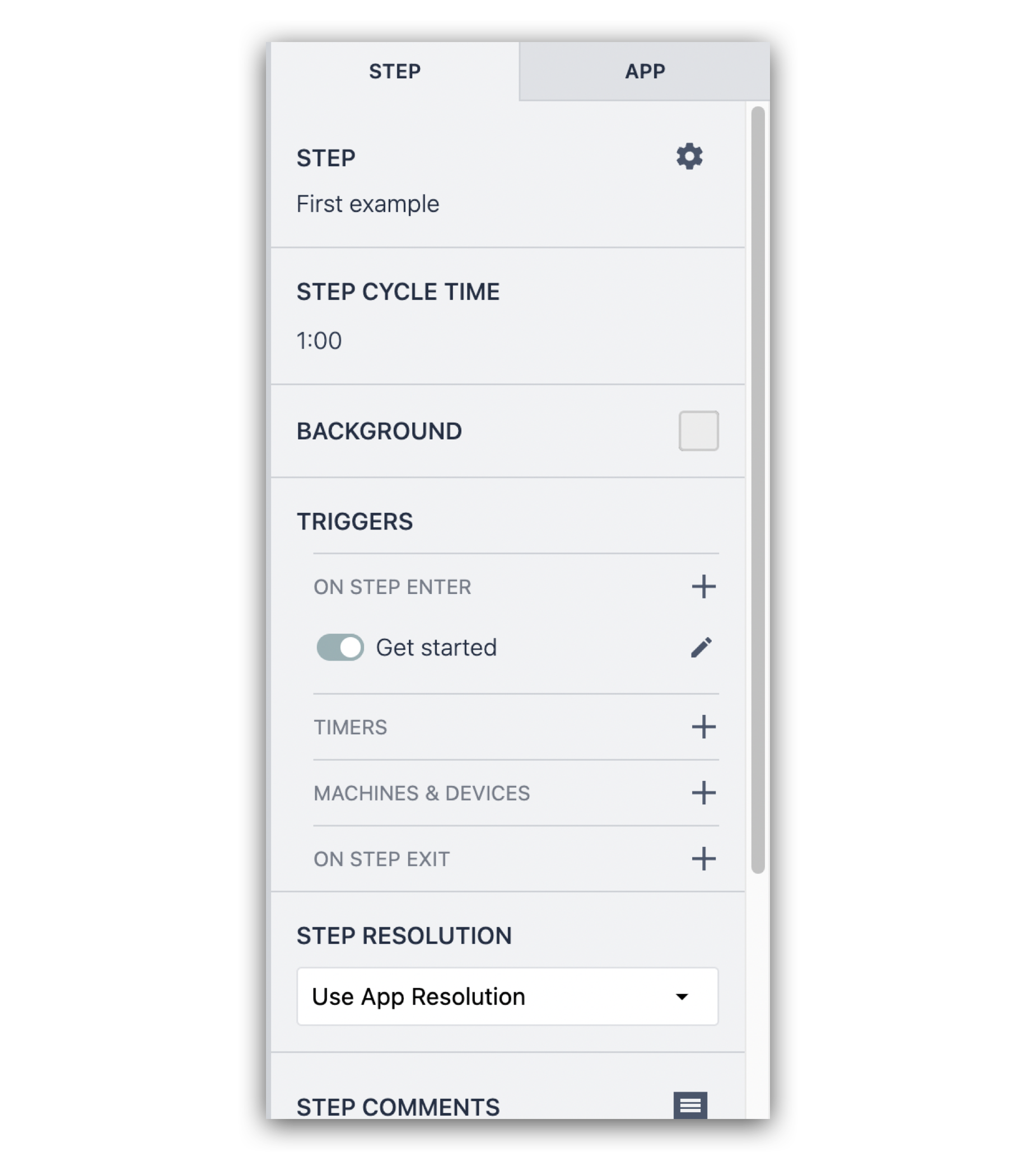
Step tab
The Step Tab shows you:
- Formatting options for the whole Step
- Allows you specify the target cycle time for this step
- Allows you to reset to the layout specified on the Base Layout
- Allows you to delete the current step
- Gives you the ability to build logic that will be executed whenever this step is opened or closed - we’ll talk more about Triggers a bit later.
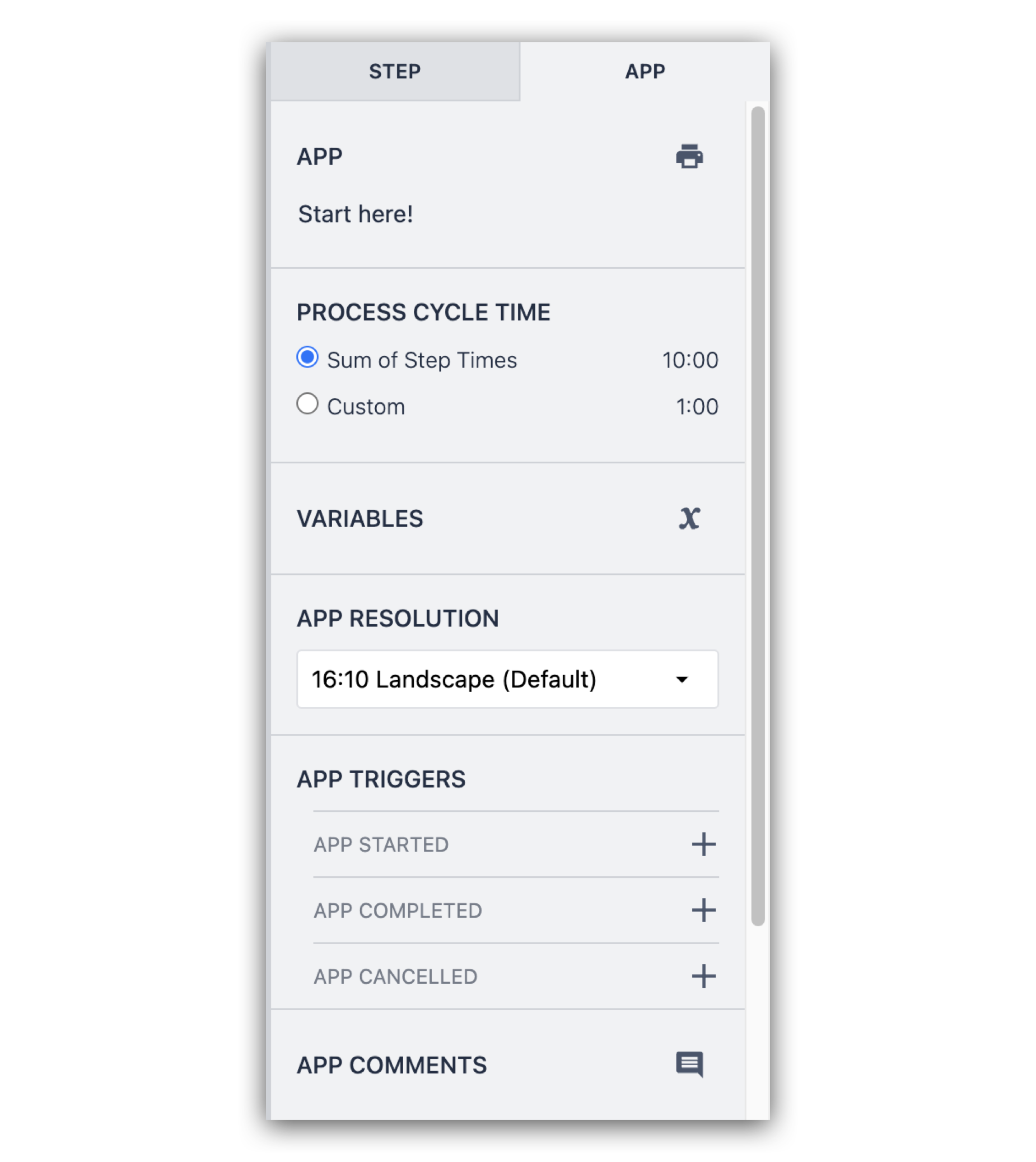
App tab
The App Tab:
- Allows you to print out the steps in the app
- Allows you to adjust the cycle timer for the entire app
- Shows you a list of all Variables associated with this app
- Allows you to specify the app resolution to fit your intended interface.
- Allows you to add comments if multiple administrators are reviewing changes
- Gives you the ability to build logic that will be executed whenever this app is started, completed or cancelled
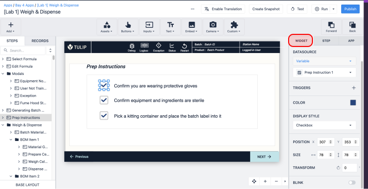
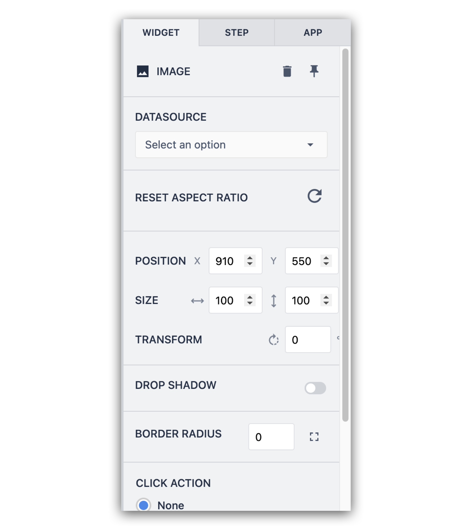
Widget tab
Clicking an element in the app will expose another tab in the side pane called Widget Tab. This is where you go to adjust the format of the various visual elements of the app, along with its behavior when interacted with.
Add logic to an app
Logic determines what happens in the app when the operator interacts with it.
To start, let’s use a simple button with a Trigger to navigate from step to step.
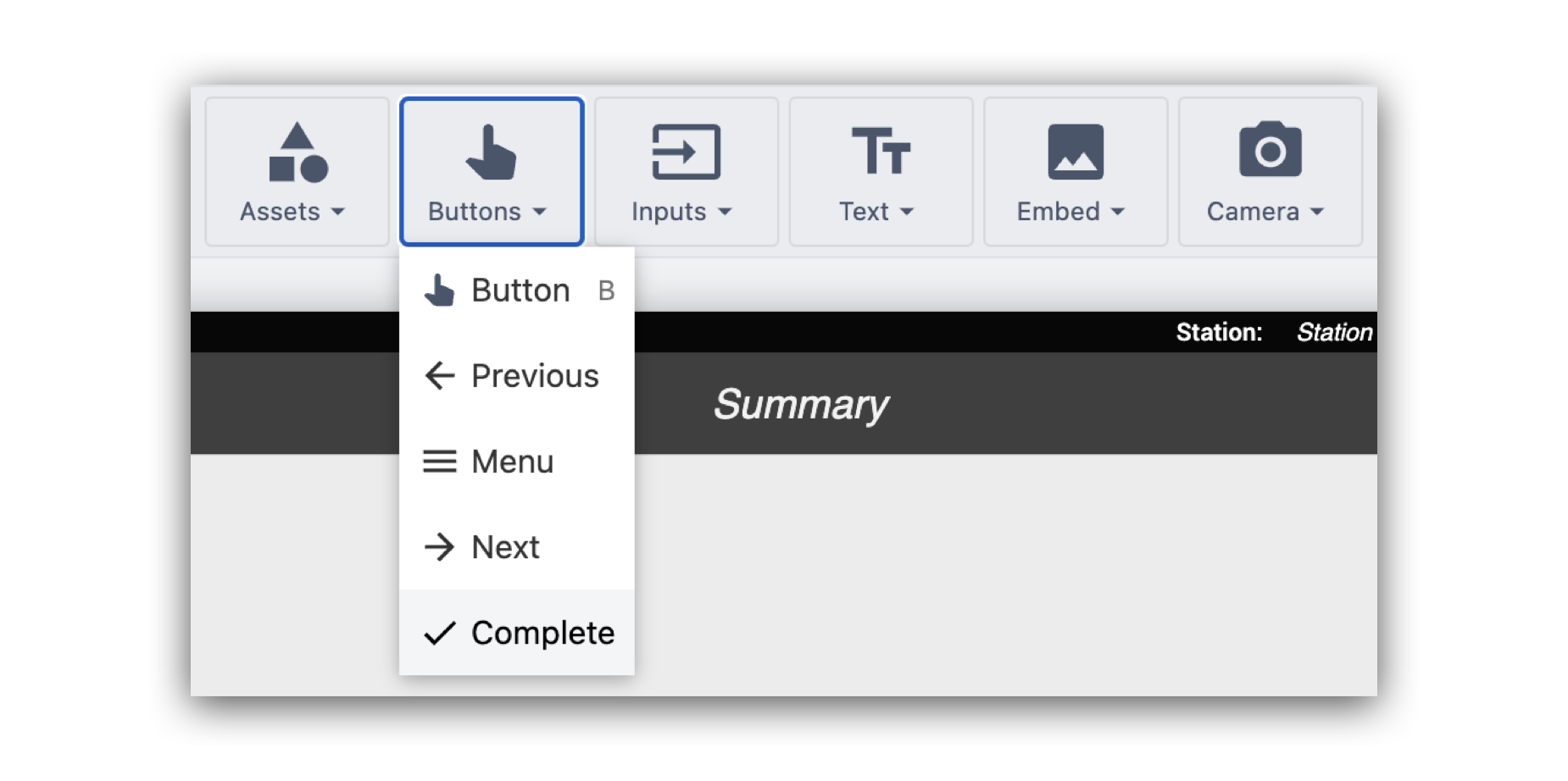
- Click Buttons from the Toolbar and select Button.
- Drag the button to your desired location.
- Add a label to the button and adjust the format/coloring options using the Side Pane along the right.
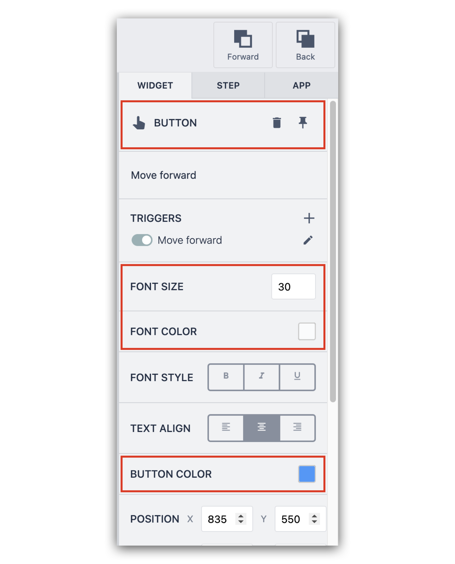
- To add logic to the button, click + next to Triggers in the side pane.
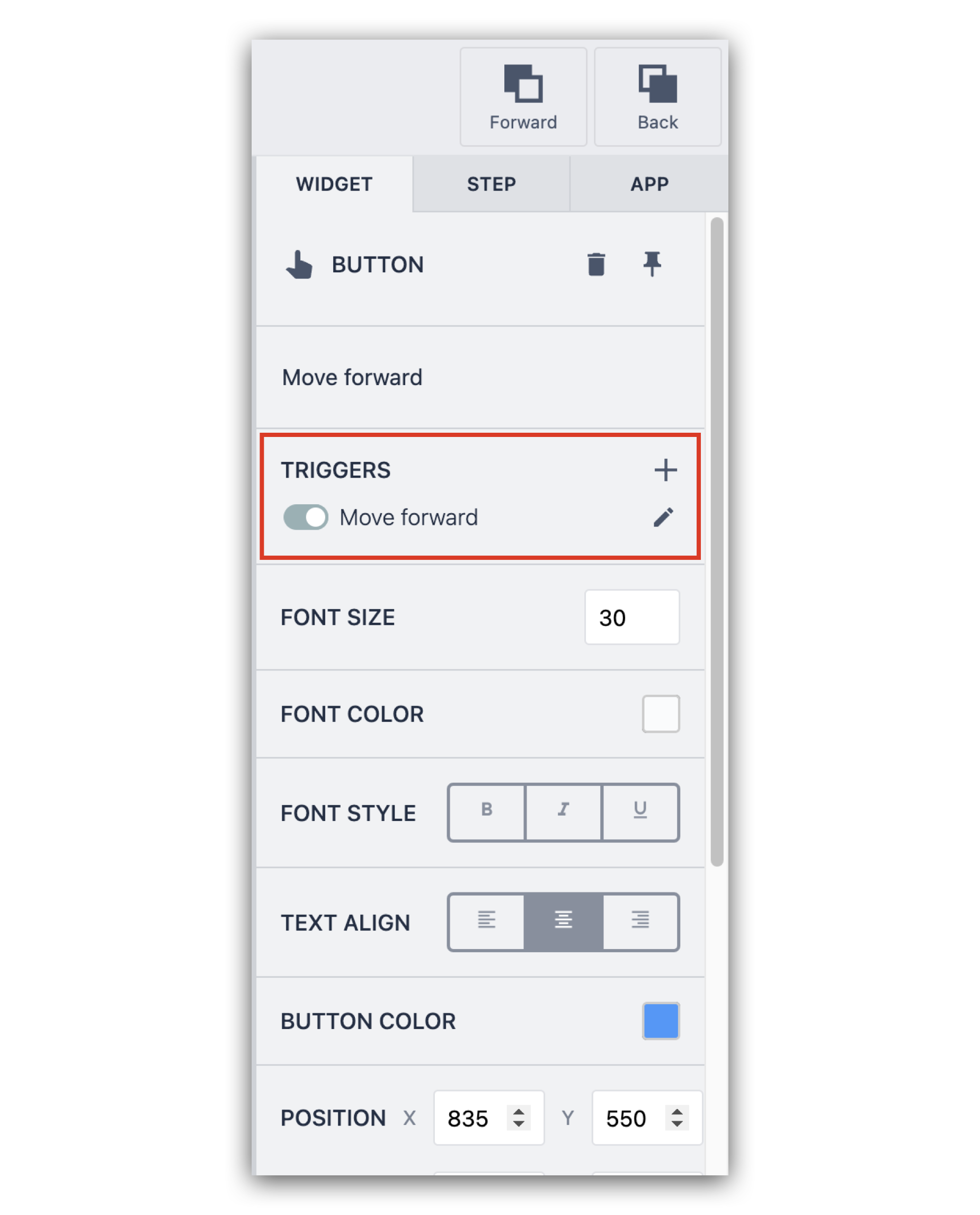
Triggers let you add logic to your applications without having to use any code. Trigger use a when, if, then, else sequence.
The trigger we'll build here has the following logic:
When: Button is pressed
Then: The current time is saved to a Variable
Transition: Go to Step → Next.
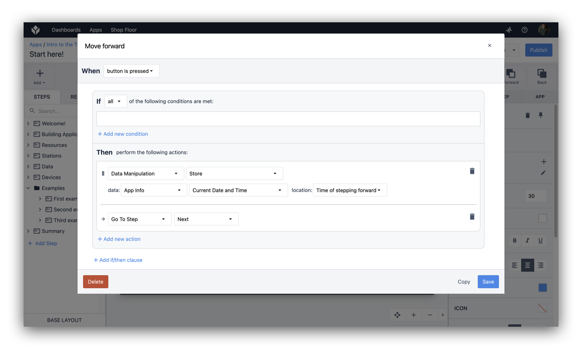
- Click Save.
This button moves the user to the next Step. You would typically want to add a button allowing users to navigate to the previous step as well.
Once you’ve built out the basic logic of the application, you can click Test in the top right. This will launch your application in Developer Mode, so you can test the app.
Complete an app and log data
A Complete button so that Tulip will log all the app data associated with each operator.
In this example, we are going to add another button on the last step of the app.
- Select the last step of your app.
- Click Buttons, and select Complete.
- Drag the new button to your desired position.
Further Reading
Use these step-by-step guides to build a full app using these concepts:
Did you find what you were looking for?
You can also head to community.tulip.co to post your question or see if others have faced a similar question!