To download the app, visit: Library
Purpose
This article presents what the design template contains and what it can be used for.
What purpose does the design template serve?
This design template assists application builders in creating user-friendly, consistent, and streamlined applications.
It provides less experienced application developers with a usable template to start working with. The app provides an example of what a Tulip application looks like and what are some common step layouts they can use in their applications. It also shows which element a base layout a header and a footer should contain so it is easy to get started on a Tulip application.
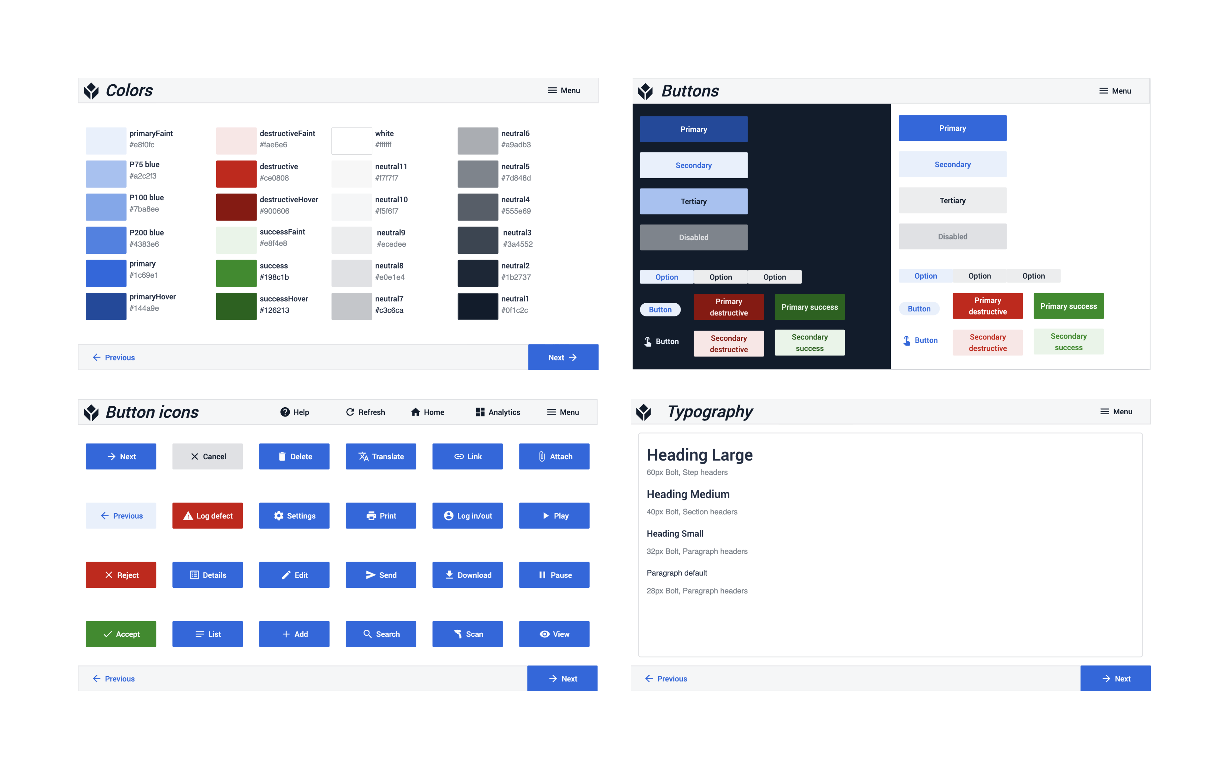
It is also aiding more experienced developers in faster development and maintaining a consistent interface. The template makes it a lot easier to build apps, by enabling the app builder to copy-and-paste step layouts to their application. This way, the app not only saves time for the developer but also provides a unified look for all the apps built with this guide. In the first step of the application, the user can see the colors, buttons, button icons, and typography that are used by the applications. By defining these elements it becomes easy to maintain a consistent interface for any company or instance.
Considerations and use cases
The main principles behind creating this template:
Simplicity: A simple design template helps application developers to understand and remember the design guidelines for their company. It also provides a clean design that helps application users to navigate the application.
Easy to customize: The template is designed so that any user can create their UI template in just a few steps. The base colors of the design template are different shades of grey, a green “success” color, and a red “destructive” color. In addition to these, we use blue for primary buttons. Only changing this blue to your own company’s brand color you can create a customized design template that you can use.
Appropriate contrasts for application in industrial areas: It is important that your application not only looks well but functions well. When designing the design template it was important to keep the app suitable for use on the shop floor. That means the color contrast and the buttons are big enough, the font sizes are clear and readable and the step layouts are simple and easy to implement.
Clear and consistent labels: Many times, an app user work with multiple apps, so it is important that the same labels mean the same things in all the applications. That is why we considered defining buttons and button icons so that required actions are as clear as possible.
Function-oriented design: The step templates on the design template application are based on common use cases and best practices seen in Tulip apps.
Features Overview
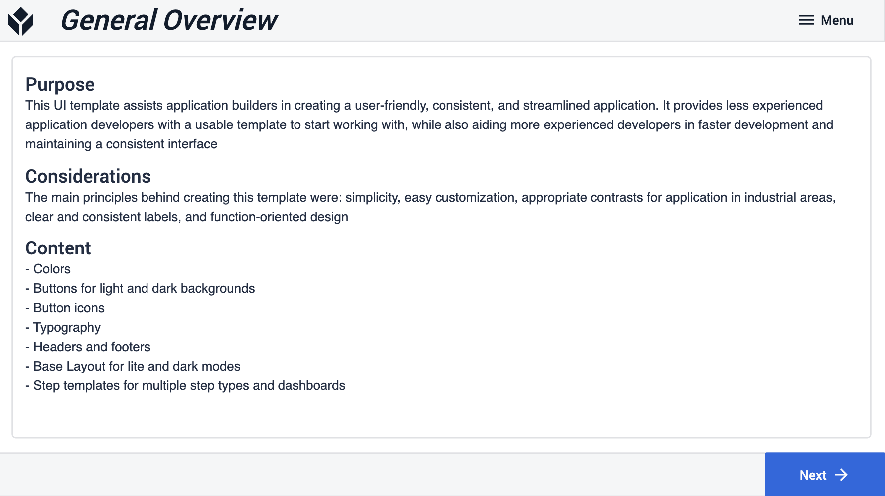
General Overview
In the first step of the application, the user can read a general overview of the purpose of the application and a content summary.
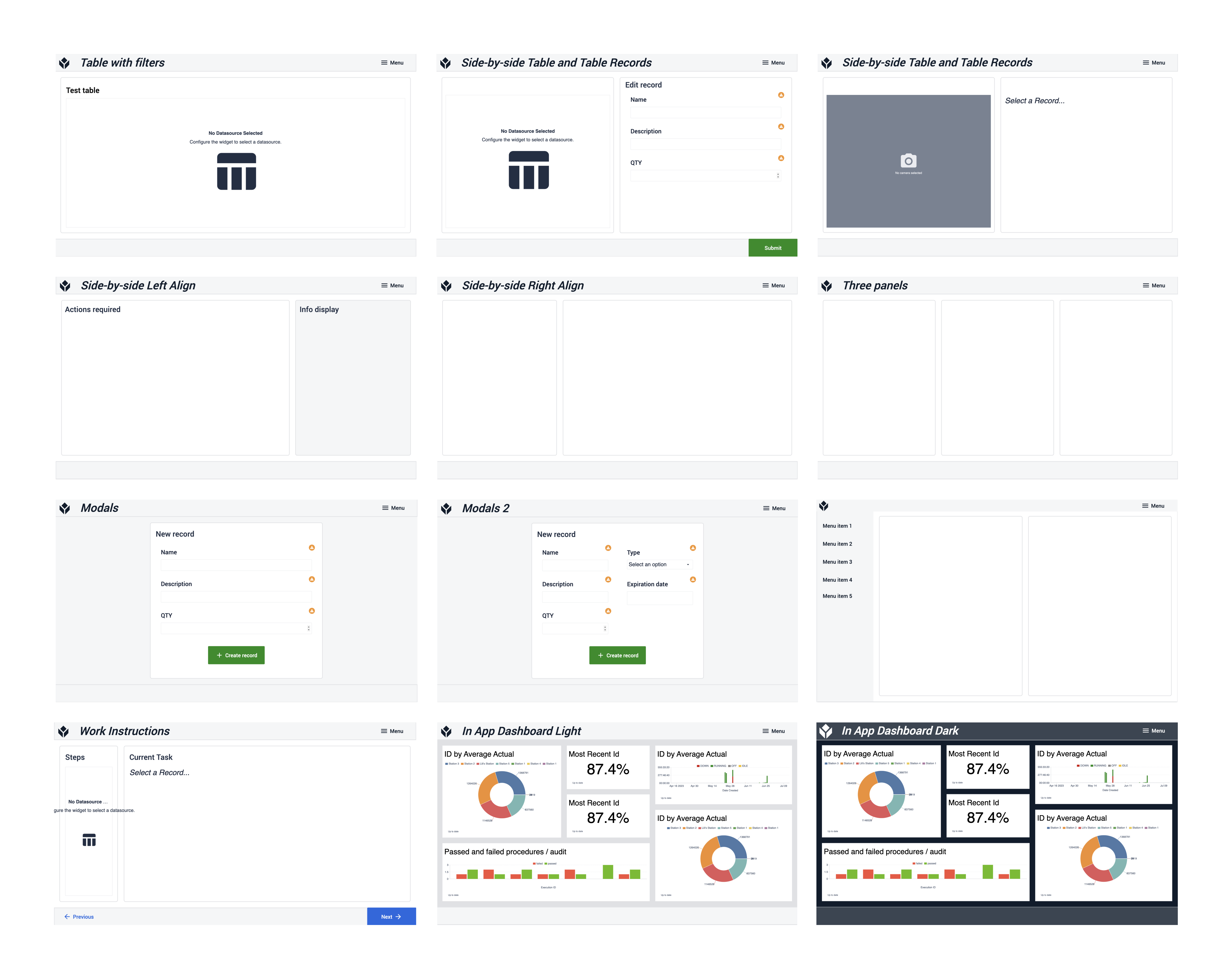
Design guides and app elements (Colors, Buttons, Button Icons, Typography)
After the general overview, the following four steps serve as a design guide for application building. In the Colors step, the user can see all the colors used in application-building with their Hex Codes. The Buttons and Button Icons steps define all the often-used buttons for both light and dark-mode apps with the icons associated with them. The last step of this section is the Typography step, which defines the font sizes and styles for titles and paragraph texts.
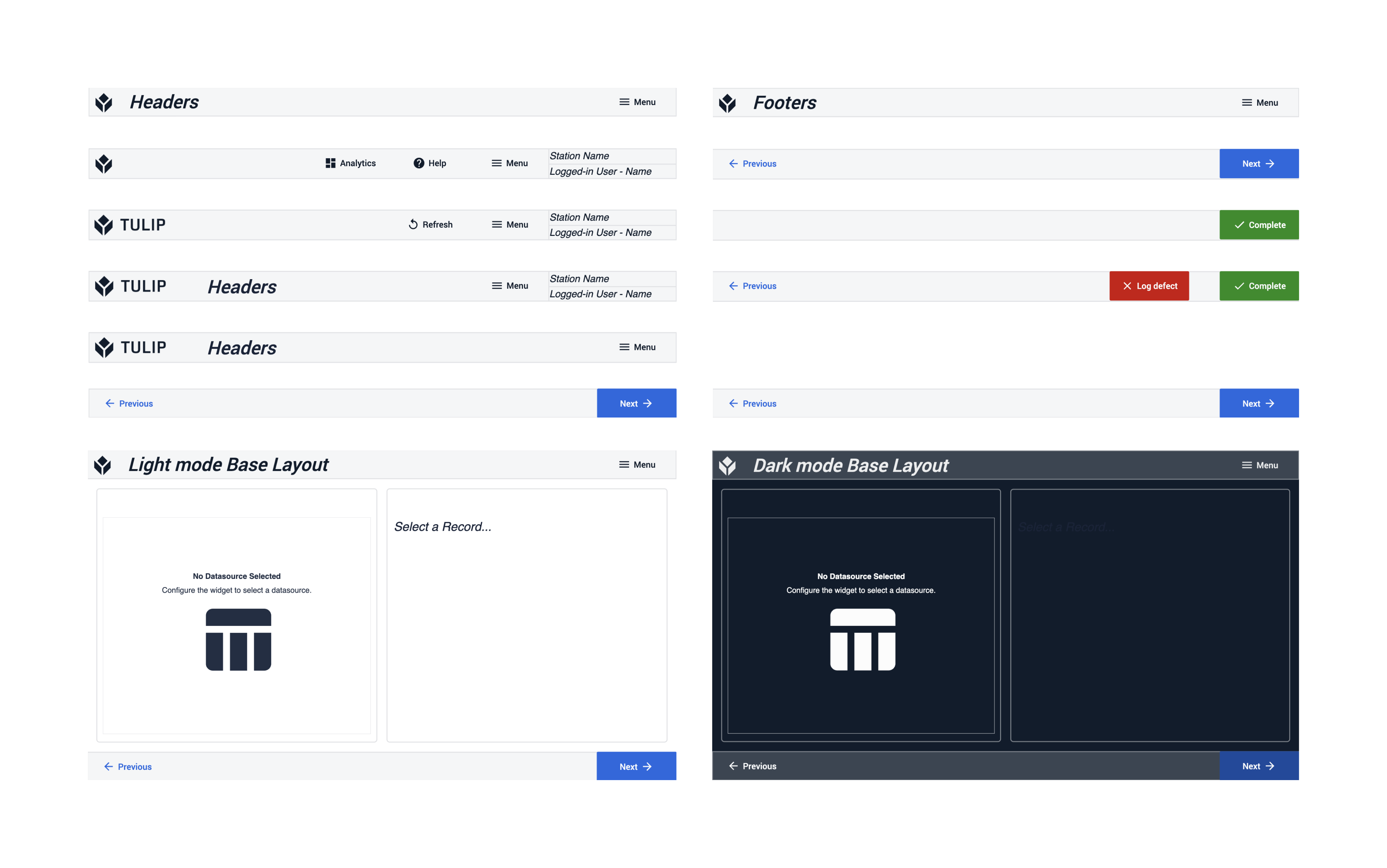
Base Layout guides (Headers, Footers, Base Layout for light and dark background)
The second section helps app builders design the base layout that fits best for the app their app. The steps list different Headers and Footers that they can copy-and-past onto your base Layout. The app builder can also choose between using the light or the dark theme.
Step UI templates