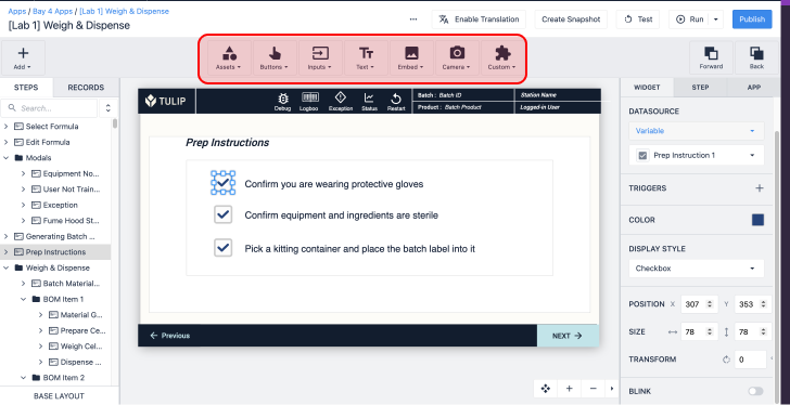
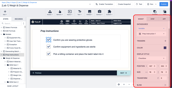
Here's how to add a checkbox or toggle to a normal step within an app.
Sometimes, it may be easier for an operator to fill out a checklist or complete an inspection in a normal step, rather than a Form Step.
If you use a normal Step, you can add images to the checklist and customize the layout of the entire step.
In order to track data around the completion of the checklist, you can use the Checkbox Widget. The widget can be formatted as a checkbox or as a "toggle" slider.

This short guide will show you how to use the checkbox widget. Before reading, you will just need to understand how to use variables in Tulip
Add a Checkbox Widget to a Step
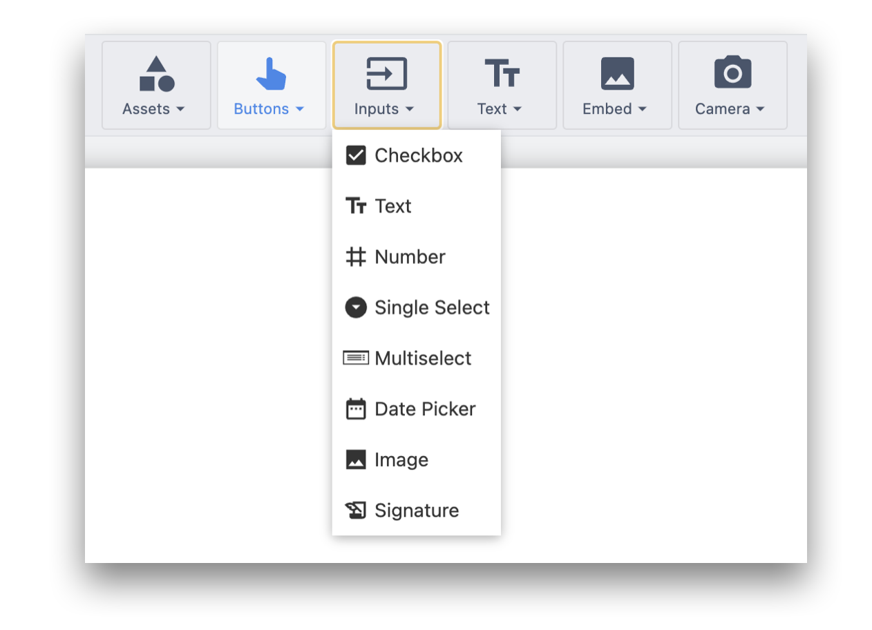
To add this widget to a step, select the "Embed" option in the Toolbar and choose "Checkbox".
Then, you will be able to configure the following options in the Widget tab of the Side Pane:
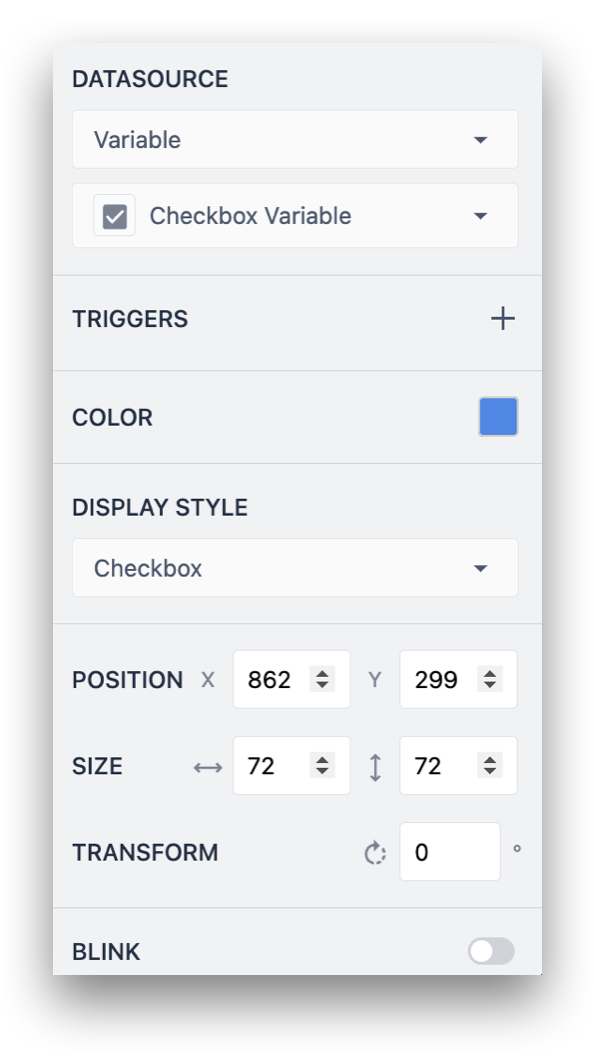
Datasource:
- Variables: Any variable in your app that you've created
- Tulip Table Record: Reference data stored in tables
These must be of a boolean type (must be true/false).
Trigger: Add triggers that execute when this widget is used.
Color: Choose the color for the background of the toggle.
Toggle: Choose whether it should appear as a checkbox or toggle.
Store the Checkbox Value in a Variable
You will likely want to know which boxes were checked when the app is completed or cancelled.
In order to do this, you must store the value of each checkbox in a separate variable.
To do this, first create a series of boolean variables in the app editor or from the Variables pane.
If you are doing a visual inspection checklist, you may want to name each one after the item in the checklist, like "tray_cleaned" for example.
Then, add and select a checkbox, to assign a variable to this widget in the side pane to store the value of the checkbox.
Further Reading
Did you find what you were looking for?
You can also head to community.tulip.co to post your question or see if others have faced a similar question!


