Number Input Unit Test
This application explains how to setup and use the Number Input custom widget plugin
Purpose
The purpose of the Number Input Unit Test is to allow users to learn and understand how to setup and use the Number Input custom widget plugin in their Tulip applications. Custom widget plugins are coded widgets that sit on top of the Tulip platform to give additional functionality that is not currently part of the main platform. The Number Input custom widget plugin is an enhancement on the standard Number input and allows for a label, helper text, Min value, Max value and Unit of Measure following the Tulip UI Standard. The primary benefit of this custom widget is that it allows labels and helper text to be integrated within the same widget, rather than separate widgets, for easier organization of fields in your step.
Setup
Custom Widget Plugins interact with your application through the use of properties and events. Properties are the shared data that exists between your application and widget, while events are signals that your widget can send to your application. In your app editor you can build triggers based off these events. Events can be made to send data to your application as well.
The Number Input Custom Widget Plugin makes use of ten properties and zero events. The properties being used in this widget are:
- 'DATASOURCE' having type Number - Should be connected to the Variable or Table Record field that you want to Store
- 'LABEL' having type Text - Enter the text that you want to display as the label. Can be connected to a dynamic data source like a variable or table record
- 'HELPERTEXT' having type Text - Enter the text that will be shown under the Label to give more guidance to the user
- 'LABELCOLOR' having type Color - Allows you to set the label color
- 'TEXTCOLOR' having type Color - Allows you to set the color for the number being inputted
- 'LABELFONTSIZE' having type Integer - Allows you to set the Label font size
- 'INPUTFONTSIZE' having type Integer - Allows you to set the Number Input font size
- 'MIN' having type Number - The minimum value to accept for this input. This value must be less than or equal to the value of the max attribute
- 'MAX' having type Number - The maximum value to accept for this input. This value must be greater than or equal to the value of the min attribute
- 'UNIT' having type Text - Allows you to enter the text that should be considered as Unit of Measure
How it Works

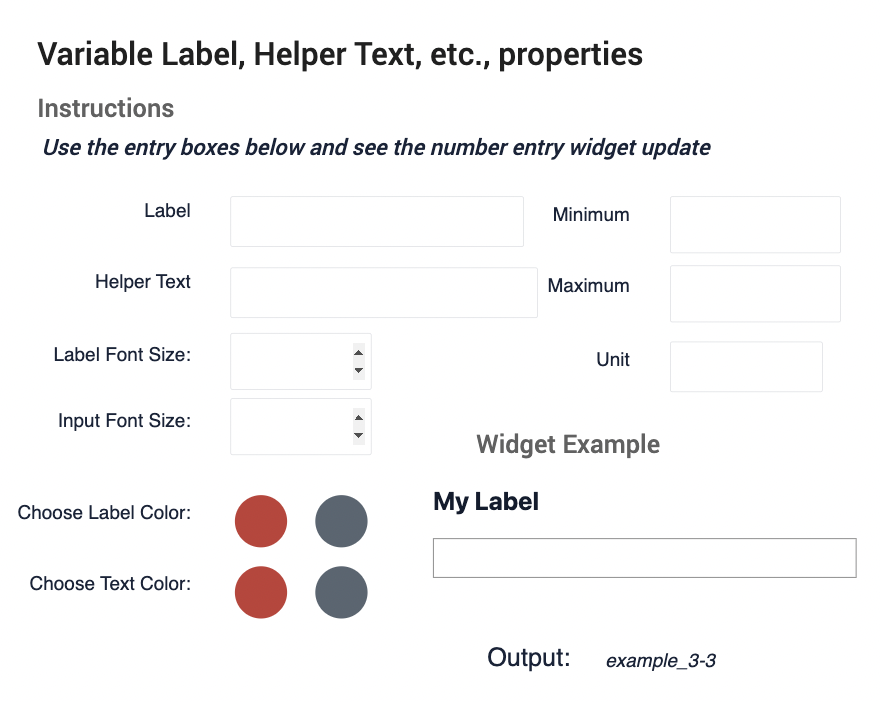
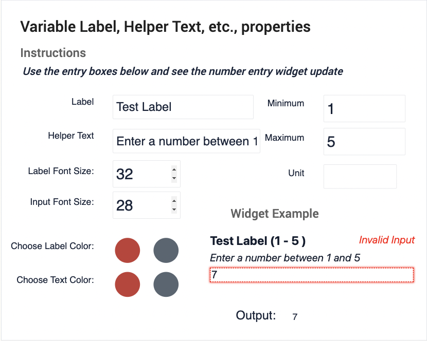
This application asks you to define all the properties listed above on the example step in order to see how the Number Input Custom Widget Plugin can be setup and configured. Once you define all the properties, you will see the widget example in the bottom left update.

There is also data validation built in, which prevents you from entering a number outside of you min-max range, and this will trigger an error and display text saying that the input is invalid, and will highlight the input box in red as well.
Video Overview of Application
