
Analysis Template Types, Explained
Here's how to figure out which type of analysis is appropriate for your scenario.
Tulip's Analytics Builder provides 7 different analysis templates to use as starting points for new Analyses. These provide the structure of the analysis.
You define what data to include in the analysis using the left-hand Context Pane, and then define various display options using the “Display” dropdown.
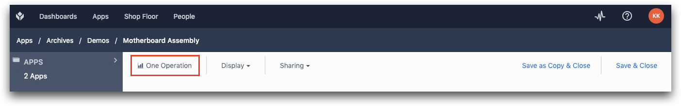
You will be prompted to select an initial analysis template when you first create an analysis and you can change the analysis template by clicking the name of the current template in the Analytics Builder:
When selecting the template, you will be shown a preview of the type of analysis you can make with each template. Some templates may offer multiple pre-built analyses, which you can select via a dropdown below the sketch:
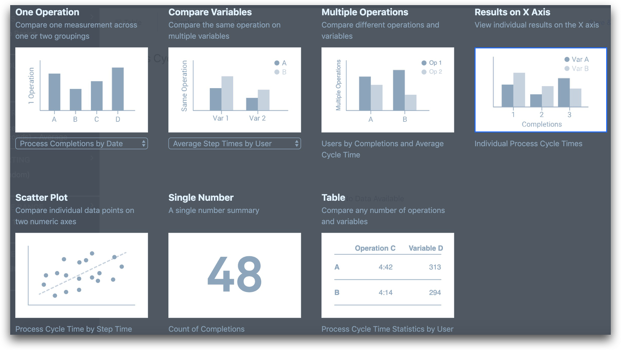
The chart templates are as follows:
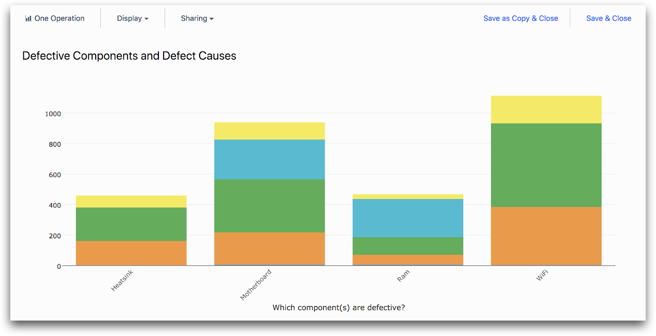
One Operation
Select the “One Operation” template if you want to analyze a single measurement (like count of completions or average process cycle time).
You can then split your data into groups based on one or two attributes like:
- “User”
- “Hour of day”,
to create analyses like:
- “Each Operator’s Average Cycle Time”
- “Completions by Hour of Day and Date”.
You must choose one attribute to put on the x axis using the “X AXIS” field in the Context Pane, and you may choose to add the second attribute to add different colors by using “COMPARE BY” in the Context Pane
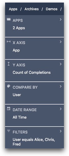
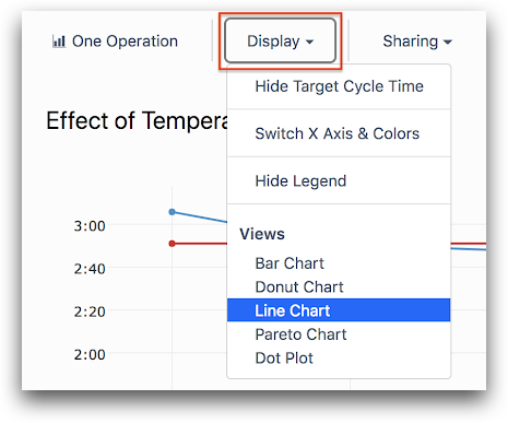
You can switch operations between “X AXIS” and “COMPARE BY” by selecting the “Display” dropdown and clicking “Switch X Axis & Colors”.
You can change the measurement you are viewing using the “Y AXIS” field in the Context Pane. You can change the type of chart (for instance, from a bar chart to a line chart) using the “Display” dropdown.
Some examples of charts you can make using the “One Operation” template include:
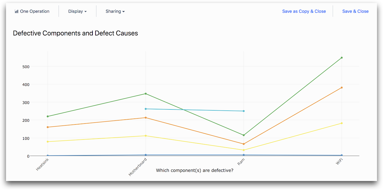
Compare Variables
Select the “Compare Variables” template if you want to analyze multiple measurements of the same sort (like multiple step times in a single App) using the same aggregation (like average or maximum).
You may then split your data into groups by choosing a single attribute (like “User” or “Hour of Day”). You can:
- Select the measurements being analyzed using the “X AXIS” field in the Context Pane
- Change the aggregation using the “Y AXIS” field in the Context Pane
- Optionally add an attribute to add different colors by using the “COMPARE BY” tab in the Context Pane.
You can change the type of graph (for instance, from a bar chart to a line chart) using the “Display” dropdown.
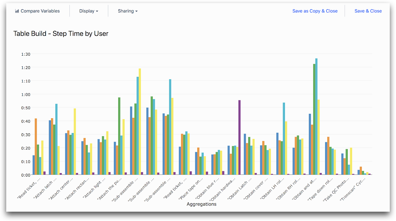
The following is an example of a chart you might make using the “Compare Variables” template:
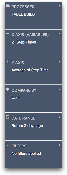
And here is the associated Context Pane:
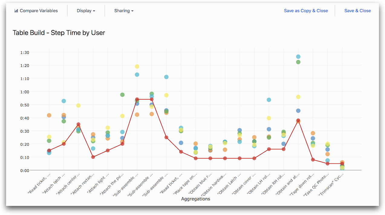
Multiple Axes
Select the “Multiple Axes” template if you want to analyze multiple measurements of different sorts (like the minimum, median, and maximum process time).
You may then split your data into groups by choosing multiple attributes (like user and hour of day). By default, the different groups of the attribute (like individual users) will be placed along the x axis and the different measurements (like minimum, median, and maximum process time) will be given different colored bars or dots.
By selecting the “Display” dropdown and clicking “Switch X Axis & Colors” you may place the different measurements along the x axis and give the different groups of the attribute colors.
You can select the different measurements and groupings using the “X AXIS” and “COMPARE BY” fields in the Context Pane. You can change the type of graph (for instance, from a bar chart to a line chart) using the “Display” dropdown.
Some examples of charts you can make using the “Multiple Axes” template include:
"Step Time by User"
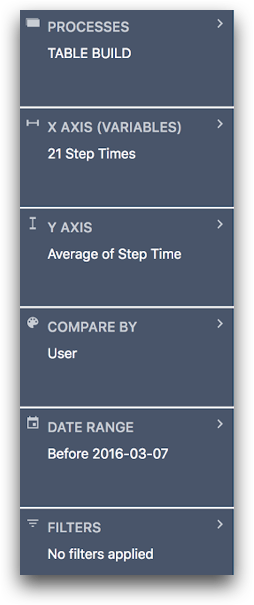
And here is the associated Context Pane:
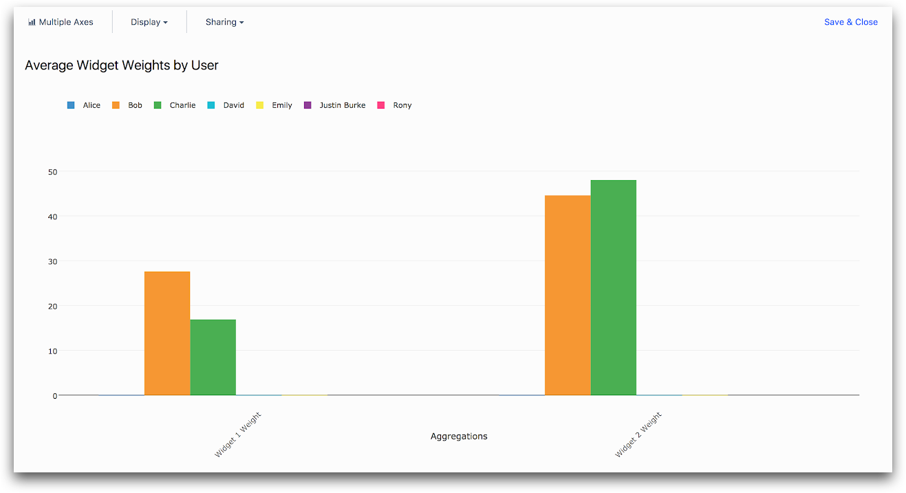
"Widget Weights by User"
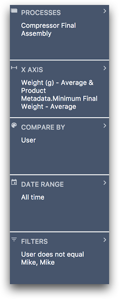
And here is the associated Context Pane:
Scatter Plot
Select the “Scatter Plot” template if you want to analyze individual data points from two numerical variables (like process cycle time, or a device temperature reading).
Note that you can still make dot plots of aggregated or grouped data using the “One Operation”, “Compare Variables”, and “Multiple Axes” templates. The “Scatter Plot” template is used to view raw individual data points.
You can select a numeric variable for each axis using the “X AXIS” and “Y AXIS” fields in the Context Pane.
You may use the “COMPARE BY” field to choose an attribute (like user or hour of day) to determine the color of each dot. You can switch the variables on the x and y axes by selecting the “Display” dropdown and clicking “Switch X Axis and Colors”.
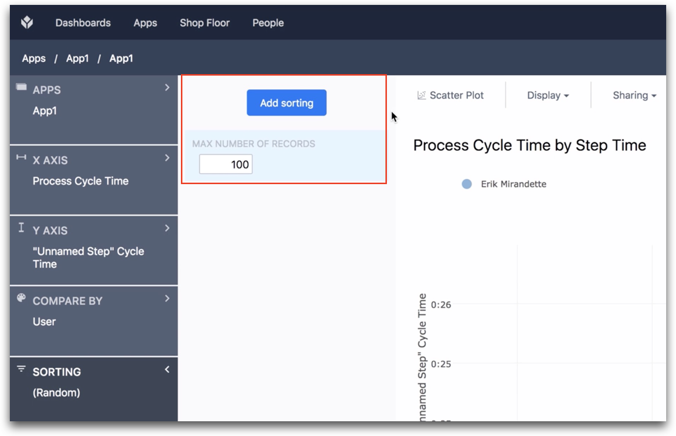
You can use the "Sorting" tab to rank the the data points within a given date range, and then choose the top X results. For example, the 100 fastest app completions.
Some examples of charts you can make using the “Scatter Plot” template include:
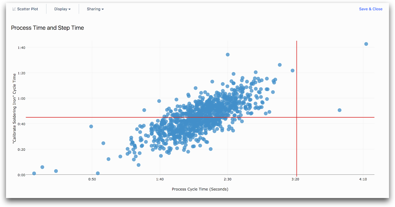
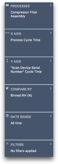
"Process Time and Individual Step Time"
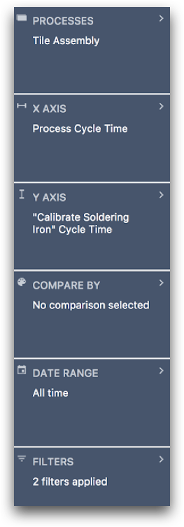
And here is the associated Context Pane:
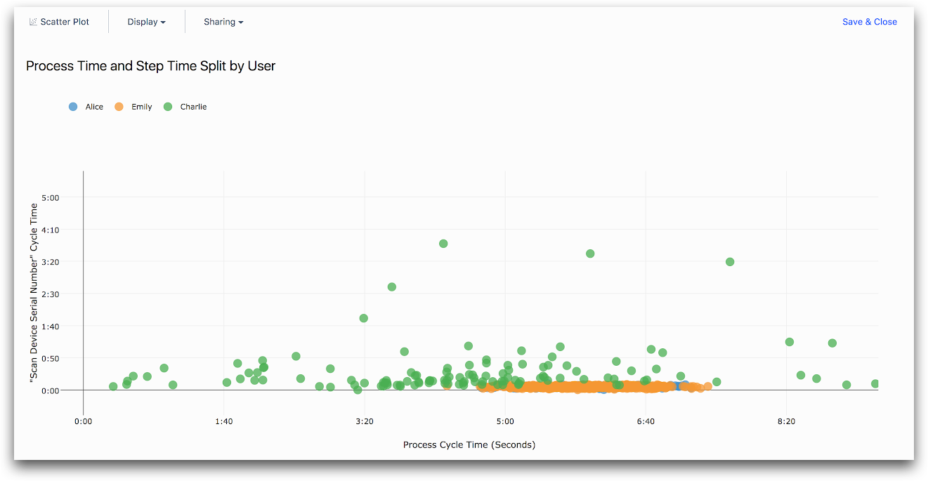
"Process Time and Step Time Split by User"
And here is the associated Context Pane:
Single Number
Select the “Single Number” template if you want to analyze a single measurement (like count of completions or average process cycle time) for one or more Apps without splitting it into groups. You can select the measurement using the “NUMBER CALCULATION” context pane.
The following is an example of an analysis you might make using the “Single Number” template:
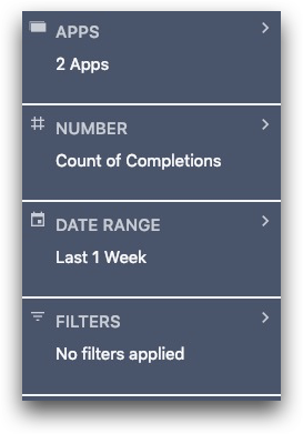
"Count of Completions"

Here is the associated Context Pane:
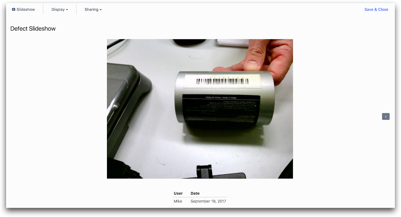
Slideshow
Select the “Slideshow” template if you want to view a slideshow of photos (such as those collected by a photo form input).
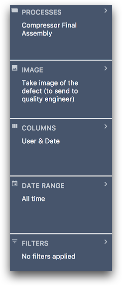
You can select the form inputs and variables to include in the slideshow using the “IMAGE” field in the Context Pane. You can select additional data points (like user or date) to show under each image using the “COLUMNS” field.
The following is an example of an analysis you might make using the “Slideshow” template:
And here is the associated Context Pane:
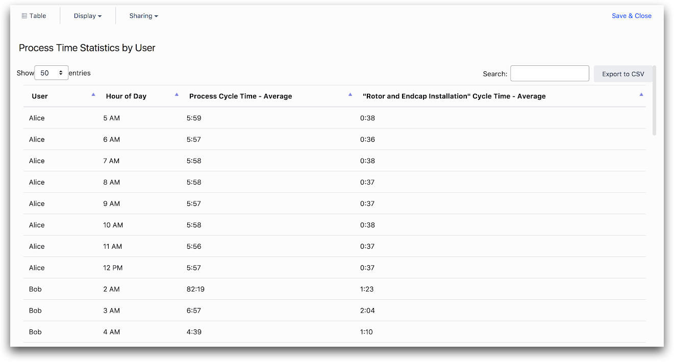
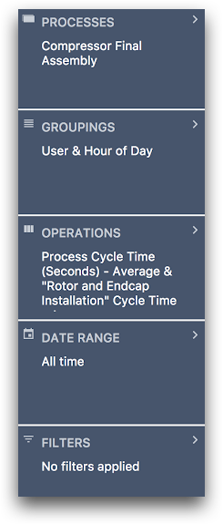
Table
Select the “Table” template if you want to view a table of your data.
You may select various attributes like user or hour of day to group the data by, and then various measurements to view for each group. Each row in the table will correspond to a different group.
For instance, if you have selected the “user” and “date” groupings, and Bob and Emily each had completions on:
- September 1, 2017
- September 2, 2017
There will be four total rows in the table:
- Bob on September 1, 2017
- Bob on September 2, 2017
- Emily on September 1, 2017
- Emily on September 2, 2017
There will be a column for each grouping and each measurement. You can add groupings via the “GROUPINGS” field, and various measurements via the “OPERATIONS” field in the Context Pane.
"Process Time Statistics by User"
And here is the associated Context Pane:
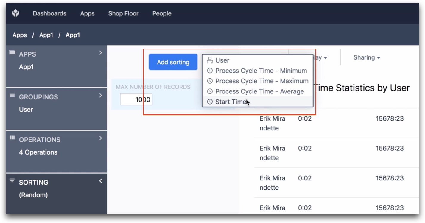
You can also sort and limit your results via the Sorting tab. To choose the variable that will determine the sorting, click the "Add sorting" button and choose from the list. That variable must be already included in the Table. You can add variables to your table via the Operations tab.
Once you have chosen your chart template and customized its data, you may wish to control other options about the data it displays, or change various display options.
Did you find what you were looking for?
You can also head to community.tulip.co to post your question or see if others have faced a similar question!