Building an app in Tulip may seem intimidating at first, but once you break down and understand the core elements to it, it’s not so complicated. Applications combine the following principles:
- Design - The layout, organization, physical appearance, and color scheme of steps and the components on a step.
- Functionality - How the app logic performs, such as: trigger behavior, step navigation, or widget configuration
- Architecture - The defined scope of the app, the data model (the data that’s read from or written to), and the integrations and/or devices connected.
Remember–Tulip is a no-code platform, so we’ll focus on the features you need to design production-ready apps, regardless of your coding experience.
Before you build an app, you need to understand what you’re building and why.
App Development Process
Following a development process for apps ensures that you’re building apps that address business and operational needs. When building multiple apps, ensure that they work together as a solution by sharing data and routing between process.
The app development process includes the following steps:
Set business objectives
- Pick 1-3 goals to focus on
- Be realistic when setting goals. Your goals must be specific and measurable.
- Identify areas for improvement that will have the biggest impact on your business.
- Align goals with overall business strategy.
- Ensure goals fit your business' maturity level and growth focus
- Assess your current stage of development and growth focus.
- Align goals with available resources.
- Anticipate future needs and challenges.
- Use these goals to prioritize use case development with Tulip
Identify and prioritize use cases that support your goals based on potential impact.
- Develop a roadmap for implementation.
- Use the business objectives template below to help pinpoint operational pain points, prioritize goals, and set measurable KPIs.
Pick a first use case
A use case is a broad improvement area or process that you build applications around, such as digital work instructions or inventory management.
Work backwards from your business objectives to app design.
Example
Your business objectives are:
- Increased first pass yield
- Fewer rework loops
- Less scrap by volume
The data you need to evaluate these objectives are:
- Scrap by station (in weight)
- Throughput by line
- Number of defects by type
Use cases to build apps:
- Weigh and categorize scrap with scale connection
- Track throughput with production data
- Detailed error and defect reports
Take the Tulip University course to learn more: How to Pick Your First Use Case.
Map the shop floor
When designing a solution in Tulip, it is critical to think about where the solution will physically live (equipment, tools, constraints), as well as what activities (process sequence, time of day) the operators perform in the location.
An operational flow diagram (OFD) helps you map apps to your factory floor and breakdown the processes that will be the models for those apps.
Example Activity OFD
Learn more about building an OFD in the Tulip University course: Tulip Solution Design
Document operator activities to app features and functionality
Before you start building an app in Tulip, it is helpful to create a wireframe. This is a high-level map or sketch of your application layout and workflow, minus the detailed elements and design. You can build these wireframes from the OFD.
- Identify main functionality
The first step is to determine the primary function of your application. What key task will it accomplish? Who will be using it?
- Sketch the app steps
Sketch out the steps of the app, which are essentially the different screens that the operator will interact with. What actions will operators perform, and in what order? Your apps should model every step of a process on the floor.
- Establish user flow
Illustrate the potential paths a user may take through the app by drawing arrows between steps to map the user flow.
- Indicate interactive elements
Add interactive elements for each step to indicate anything operators will physically interact with. These elements can include buttons, forms, tables, and devices.
- Features outside of workflows
Include additional functionalities that operators may need access to outside of their flow, such as defect report forms, call for help screens, analytics screens, etc.
Example Wireframes
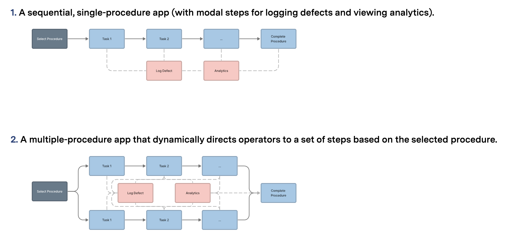
Once you’ve sketched out a basic wireframe, app builders can easily start building out each step in the App Editor.
App Editor
The App Editor is where you build and edit your apps without needing any coding experience.
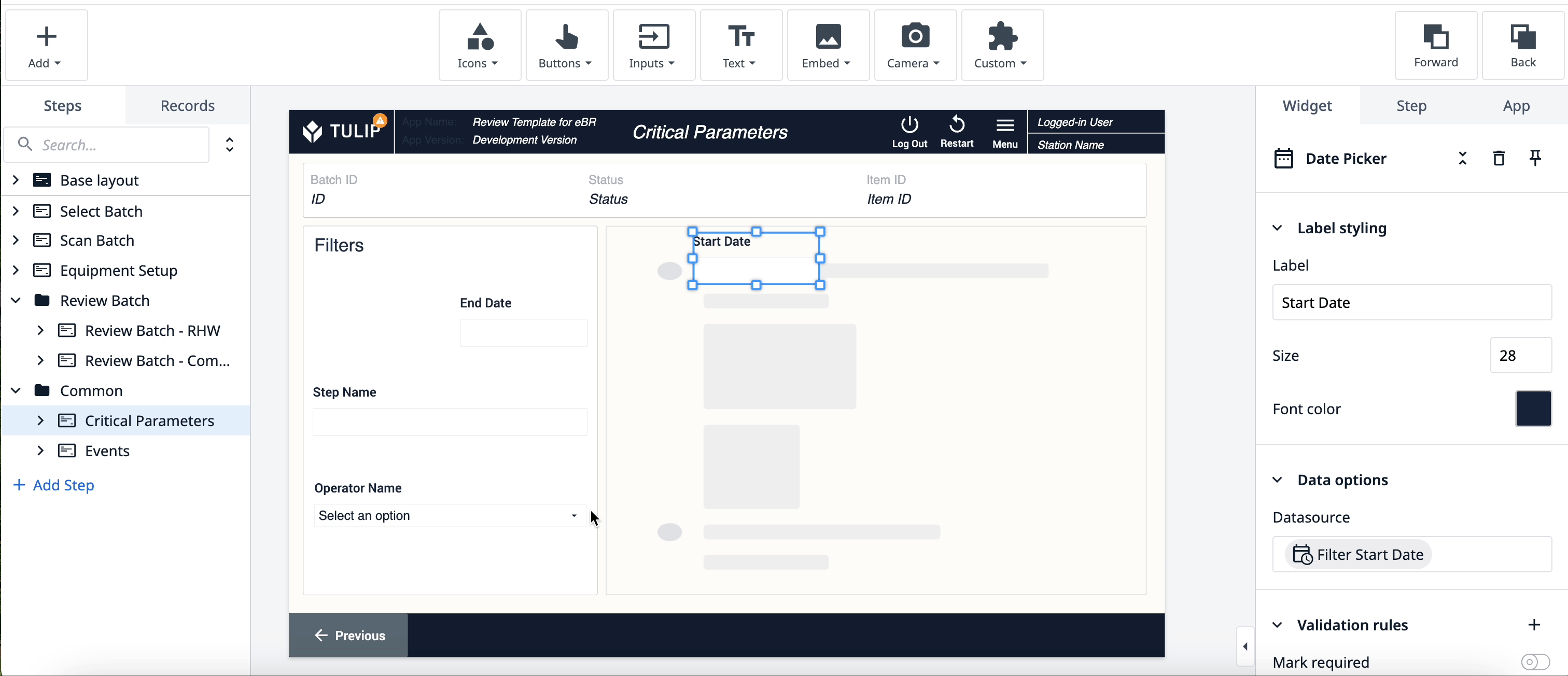
For an in-depth overview of the app editor, visit Intro to the Tulip App Editor.
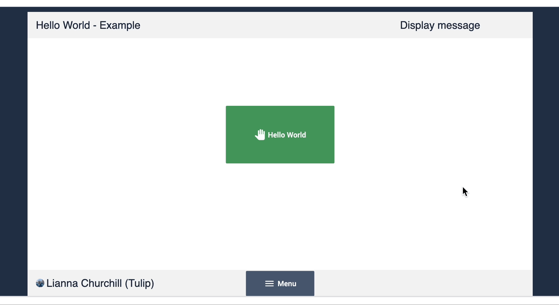
Steps
Steps are the “pages” of your app, the various screens that display content
Steps can be linear or non-linear, in that they don't have to consecutively follow each other in the order you arrange them. The logic you add to your app will determine the transition of steps.
Learn more about Steps here.
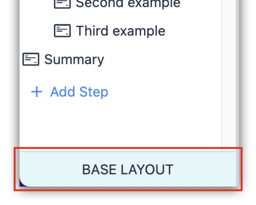
Base Layout
The Base Layout is the template that applies to each step you create. Creating a base layout makes it easier to build your app, with the foundational elements automatically added to each step, and ensures a cohesive style throughout your app.
Learn more about base layout here.
Widgets
Widgets are the building blocks of apps. They can display information, collect data, execute Trigger logic, and more.
Here are the different types ofm widgets:
-
Icon widgets - Place shapes, icons, or logos within the workspace and configure logic to design the look and branding of your app.
-
Button widgets - Choose from a variety of buttons, one with pre-programmed logic or blank custom ones, to use in your app.
-
Input widgets - Collect data from app users with Input Widgets, with each type of input representing a different variable of data.
-
Text widgets - Display static or dynamic text including the values of Variables, plain static text, and entire Record Placeholders.
-
Embedded widgets - Embed videos, images, CAD, documents, barcode scanners, and more into your app.
-
Camera widgets - Show your Tulip Vision camera feed or scan a barcode all with the camera on your device.
-
Electronic signature widgets - Sign data within Tulip in accordance with 21 CFR Part 11
-
Custom widgets - If none of the above widgets are suiting your needs, you can create your own widget using HTML, CSS, and Javascript to extend the platform’s capabilities.
Learn more about widgets here.
Triggers
Triggers enable you to add logic to your app.
Triggers make your app do something. An app is a flat screen without them. Triggers can be added to widgets, as well as to steps (Step Level Triggers) and apps (App Level Triggers), and upon certain events like a device firing.
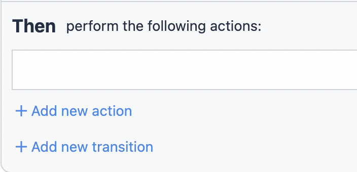
All triggers follow the same basic format: when an action happens, then perform the following Action and/or Transition.
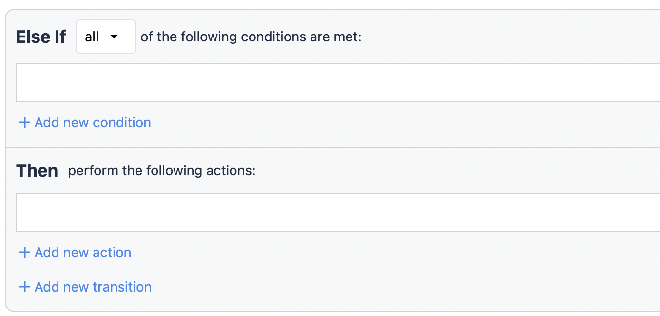
Triggers can be as simple or complicated as you need, having the ability to add multiple actions. You can also add if statements, that add a condition to the action being performed, if the criteria is met.
With an If statement, you set the conditions that allow actions to follow.
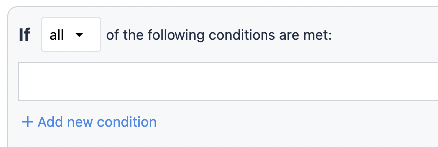
Then statements are either an action or a transition. An action is a change in the app that is not related to changing the steps. A transition is either changing the steps or completing the app.
Finally, to coincide with if statements, there are else if statements which determine the alternate action to take when the if statement is proven false.
Learn more about triggers here.
Variables
Variables are the primary means for storing and referencing data within Tulip apps. They capture data from various sources, including user input and device output, and enable calculations based on app activity. You can use variables to control app behavior through triggers, display dynamic content, and build detailed reports in Analytics.
Variables can have the following datatypes:
- Boolean - Yes/no
- Color - Dynamic color to set widget status
- Datetime - Date and time timestamp
- File - Link to a file stored in Tulip
- Image - Link to an image stored in Tulip
- Integer - A whole number
- Interval - Amount of time displayed in seconds
- Machine - Machine object in Tulip
- Number - A real number
- Object - Configurable object structure with child attributes which have their own data type
- Station - Station object in Tulip from the Shop floor
- Text - Sequence of characters
- User - User object in Tulip from Account/Workspace settings
Learn more about variables here.
App building best practices
The following practices for each element of apps:
Design
The layout, organization, physical appearance, and color scheme of steps and the components on a step.
-
Single Role, Single Process: Each app should be tailored to support a specific user role and the tasks associated with that role. This ensures that the app is focused and easy to use.
-
Base layout: A base layout applies a step design to every step in an app. This standardizes the UI and ensures an intuitive user experience for operators. Learn how to design an effective base layout here.
-
Clear component names: App components such as steps, triggers, and variables should all have clear and unique names. This allows app developers to intuitively understand what each component is or does. Learn more about best practices for naming components here.
-
Standardized statuses: A predefined set of (order, station) statuses that you can reuses across additional apps to maintain consistency and enable seamless integration.
Functionality
How the app logic performs, such as: trigger behavior, step navigation, or widget configuration.
-
Unified Record Placeholders: Consistent use of record placeholders across different apps ensures data integrity and simplifies data management.
-
Step naming: Use proper step naming and step group naming to determine what the task or activity is
-
Variable management: Use generic variables where possible and clear variables before reusing them
Architecture
The defined scope of the app, the data that’s read from or written to, and the integrations and/or devices connected.
- Standalone function: Apps should be designed to operate independently without relying on other apps. This promotes modularity and maintainability.
- Integrate on an as-needed basis: Any external data should only be used in Tulip as necessary to provide context in an app. This ensures you are maintaining a source-of-truth. Learn more about system integrations here.
App Design Best Practices
When designing your app, navigability and accessability are two important notions to keep in mind. Users must navigate through the app without getting lost or stuck in their process.
Learn more about designing apps here.
Next Steps
Start building apps with Tulip experts’ guidance:
Become a Tulip certified app builder:
Basic app builder certification
Did you find what you were looking for?
You can also head to community.tulip.co to post your question or see if others have faced a similar question!