To download the app, visit: Library
Purpose
The purpose of this article is to provide an overview of the four applications within the Digital Tierboard App Suite.
Purpose of the Digital Tierbpard App Suite
The app suite comprises three applications that record essential information about manufacturing progress, including downtime periods, safety incidents, quality issues, and the number of products produced. The fourth application is the Digital Tierboard, where users can access analytics based on data collected by the other apps. The tier board is designed to support shift starter meetings and notify users of any significant events occurring on the shop floor.
Applications in the Digital Tierboard App Suite
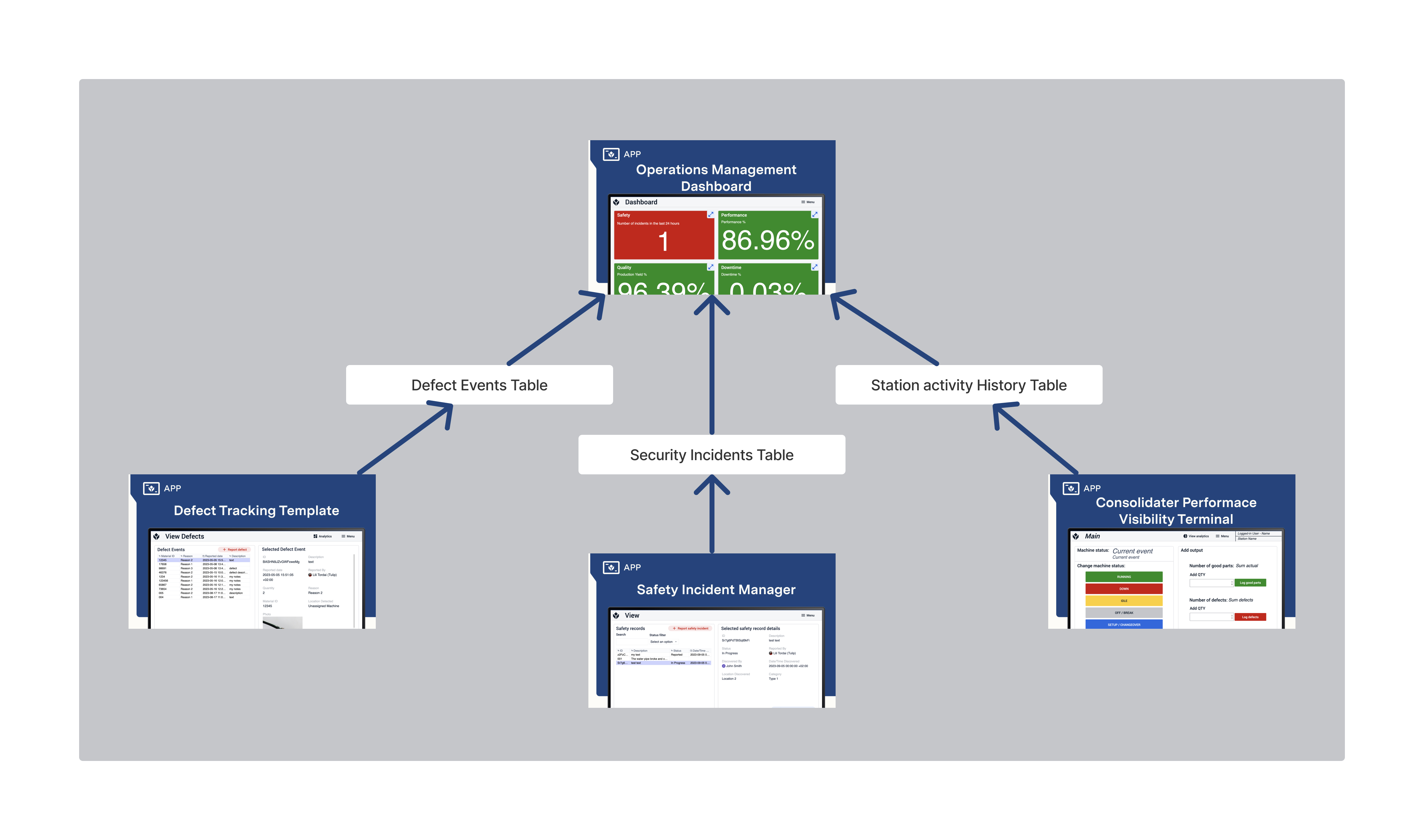
Tier 2 Board
The Tier 2 Board application primarily features a simple dashboard displaying key metrics for Safety, Quality, Performance, and Downtime. Compliance with company standards is indicated by red and green colors.
Users interested in detailed information about any of the four aspects can access dedicated sections containing multiple charts visualizing the data.
Consolidated Performance Visibility Terminal
This application offers a straightforward solution for manual logging of machine activity. Users can easily switch between machine statuses and record good and bad parts during production.
Safety Incident Manager
The Safety Incident Manager application allows users to log safety incidents, view their details and statuses, and define subsequent steps associated with a specific incident when necessary.
Defect Tracking Template
The defect tracking template can be used independently or as a complement to other apps. Its functions include viewing defect events that occurred during production, reporting defects, and editing defect event logs. Users can assign defect reasons to defect events and store all information in a Tulip Table. The data collected using the app can be easily analyzed and visualized, for example, on a Pareto chart.