How To Use Buttons in Apps
Button Widgets are one of the primary ways to create Triggers in your apps.
To add a button in a particular step, open the step in the Tulip App Editor and click on “Buttons” from the Toolbar.
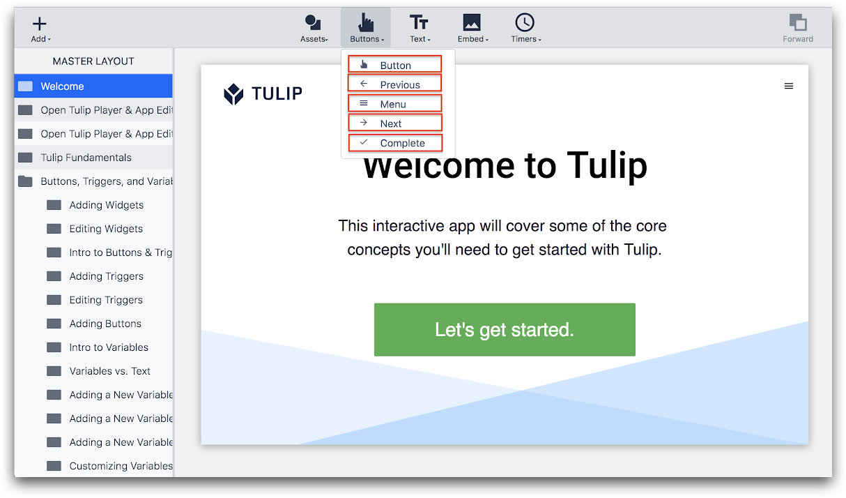
There are five options for adding buttons. Four of them have pre-defined logic associated with them.
- Button: This is the only option without predefined logic. To make a custom button, select “Button” and follow this guide to add custom logic.
- Previous: The “Previous” button takes the operator to the last step they were on.
- Menu: The “Menu” button opens the menu where the operator can add comments, pause, restart or switch the app they are using. The operator can log out of the Tulip Player or even change the language running on the Tulip Player from here.
- Next: The Next button takes the operator to the next step in the app flow.
- **[Complete:](https://support.tulip.co/docs/how-to-complete-an-app The “Complete” button completes the app that the operator is running.
How To Add A Custom Trigger to a Button
With Button Triggers, you can run specific Actions and Transition when a button is pressed within an app.
Note: Button widgets cannot be inserted in a Form Step.
Here's how to add a Trigger to a button.
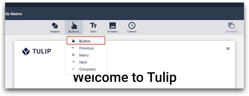
1- Insert a new button widget to your app by clicking the “Buttons” dropdown from the Toolbar and choosing the type of button that you would like to use.
In this example we will create a Custom Button using the first option, “Button”.
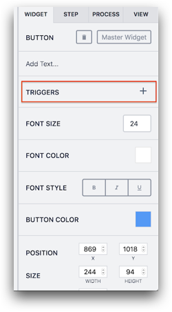
2- Select the new button and press the plus icon next to "Triggers" in the Side Pane.
3- Now you should see the Trigger Editor.
Name the trigger by clicking the title in the Trigger Editor.
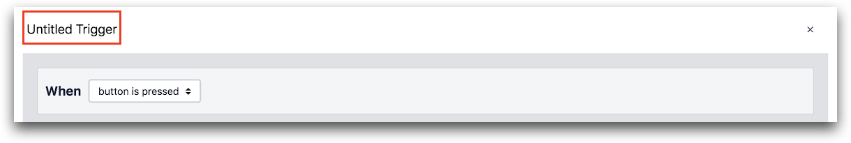
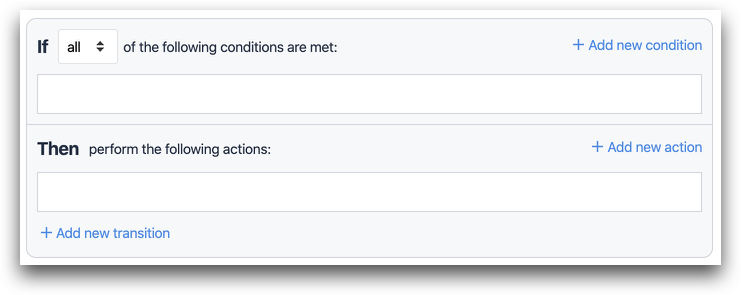
4- Next, you can set an IF condition - you can leave this row blank or add a condition based on your need.
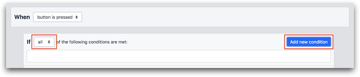
You can add a condition or multiple conditions by "Add new condition" button.
You can select “all” or “any” condition from the drop down menu to allow for multiple logical conditions.
5- Set an action (THEN) - select one of the actions from the dropdown menu. In this example we will send an SMS alert to a Tulip administrator.
Add an Action by pressing on the "Add new action" button in the “Then” section.
Select “Send SMS” from the drop down menu.
Select whom you would like to send the SMS to from the drop down “to” menu.
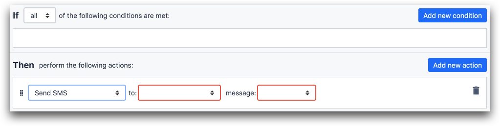
Please note, only administrators who’ve verified their phone number will be available in this menu.
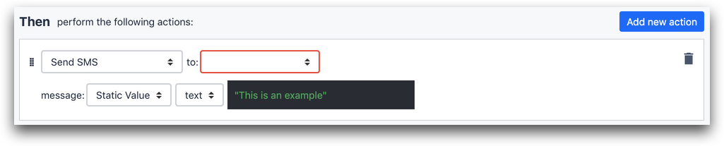
Select the message type from the message dropdown menu. The three options are:
- Expression,
- Static Value,
- App Info.
In case you want to send a text, select Static Value and enter the text you wish to send on the text box.
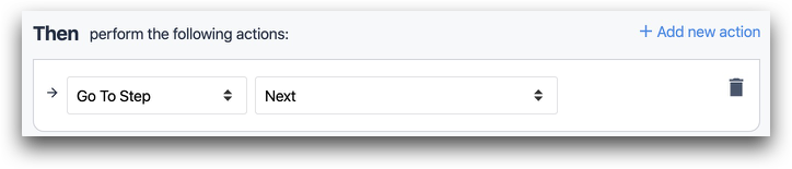
6 (optional)- Add a Transition so that you can complete the app or go to the next step.
Styling Buttons
You can edit the following properties of buttons after they are uploaded to Tulip in the Side Pane on the right side of the screen:
- Font Size
- Font Color
- Font Style
- Button Text Align
- Button Color
- Size
- Rotation
- Drop Shadow
- Border Radius
- Blinking
Further Reading
Did you find what you were looking for?
You can also head to community.tulip.co to post your question or see if others have faced a similar question!