
To download the app, visit: Library
This article is a guide for app configuration that includes a functional breakdown of steps and ideas for connecting to other apps.
The Peformance Visibility Dashboard is part of Tulip’s composable MES Production Management app suite. It is designed so that users can use it individually or in combination with other applications.
The Production Visibility Dashboard visualizes data logged on the shop floor. The data is stored in Tulip Tables and contains crucial information about the production, such as up and downtime events or the number of products produced. The app contains a step which showcases OEE metrics: OEE, Availability, Performance and Quality.
Usage and Value Creation
The Performance Visibility Dashboard is used to display key metrics and charts useful for understanding how well production is performing. Maximize uptime with an uptime percentage metric, a downtime reason Pareto chart, and running time for each station. Understand performance at a glance with First-Pass Yield, station statuses, and daily status distribution.
Tulip Tables in the app
All the applications in the Composable MES app suite use common tables.
The Performance Visibility Dashboard application displays analytics that are based on data stored in Tulip Tables. The two Tulip Tables used in this application are the Stations and the Station Activity History table.
(Log) Station Activity History
- ID: Unique identifier of the historical activity record
- Station ID: ID of the station related to the historical record.
- Status: Status of the station at the time the record was created (RUNNING, DOWN, IDLE, etc)
- Start Date/Time
- End Date/Time
- Duration: Duration of the record
- Material Definition ID: Material produced during the activity.
- Target Quantity: Quantity of material expected to be produced for the duration of the record (based on target or planned cycle time).
- Actual Quantity: Quantity of material produced for the duration of the record.
- Defects: Quantity of defective material captured for the duration of the record.
- Downtime reason: Downtime collected during the historical record.
- Comments: Field tracking the user's note or comment.
- Work Order ID
- Unit ID
(Physical Artifact) Stations
- ID: Unique identifier of the historical activity record
- Status: Running, Down, Idle, Paused, etc.
- Status Color: Color of the current station status
- Status Detail: This can be used to track extra status details, like the reason for downtime
- Process Cell: The process cell of which the station is part
- Operator: The operator currently working at the station
- Work Order ID: The work order currently in progress at the station
- Material Definition ID: The part of the work order in progress
Configuration and customization
In-app help
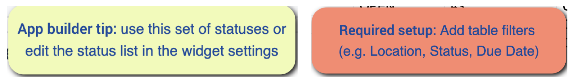
As with all applications in the Composable MES app suite, the Performance Visibility Dashboard app includes in-app help as well. These are short descriptions of the Required setup steps and App builder tips to support further customization. After downloading the app make sure to read these instructions and then delete them before running the application.
Tables that provide data input
To be able to use the application some tables need to be populated. Specifically, the user needs to populate both tables to enable the analytics. This can be achieved using another Tulip app, such as the Order Execution, Andon Terminal, Machine Monitoring Terminal, or Performance Visibility Terminal applications from the Composable MES app suite. Alternatively, it can be done manually in the Tulip Table, or by importing a CSV file into the table.
App Structure
The app contains two steps. On the first step there is five analytics. These analysis show typical examples of production visibility charts.
This weeks's daily status distribution
On this chart, the user can see the distribution of the different station statuses of all days.
Table: This analysis is based on the Station Activity History Table
Template: One Operation
Display as: Stack Column Bar
X-axis: Date Created grouped by “day”
Y-axis: Sum of Durations
Compare by: Status
This week's downtime reasons Pareto
On this chart, the user can view the number of downtime events by downtime reasons, so that it is easy to decide which are the most common reasons for downtime.
Table: This analysis is based on the Station Activity History Table
Template: One Operation
Display as: Pareto Chart
X-axis: Downtime reason
Y-axis: Count where true: Status equals DOWN
Today's uptime percentage
On this chart, the user can see how much of the station's time was spent running.
Table: This analysis is based on the Station Activity History Table
Template: Single number
The value is generated by an expression that divides the sum of all the durations of the Running events by the sum of the duration of all the events that are not in OFF status.
Station statuses
On this chart, the user can view the current status of all stations in table format
Table: This analysis is based on the Stations table
Template: Table
Operations: ID and Status
This week's running time of stations
On this donut chart, the user can compare the total running time of the stations.
Table: This analysis is based on the Station Activity History Table
Template: Universal
Display as: Bar
X-axis: Stations
Y-axis: An expression that sums the duration of RUNNING events.
The second steps displays OEE metrics: Availability, Performance, Quality, and OEE.
Availability
Availability is defined as the % of time the station is running compared to the total time the station is scheduled or on.
High-level expression used in the dashboard below:
In the dashboard, an expression is used to calculate availability.
Performance
Performance is defined as the % of products made as compared to the goal number of products made in a given time interval
High-level expression used in the dashboard below:
In the dashboard, an expression is used to calculate availability.
Quality
Quality is defined as the % of products that pass quality check as compared to all products made.
High-level expression used in the dashboard below:
In the dashboard, an expression is used to calculate availability.
OEE
Typically, OEE (Overall Equipment Effectiveness) is a very machine-centric view. In this, we are using similar metrics but are thinking about OEE more holistically across the operator and station.
OEE is Availability * Performance * Quality
In the dashboard, we combine all three expressions into a single expression
Extended App Connections
Examples for connecting apps to work with each other.
Order Execution
The Order Execution application logs station activity into the Station Activity History Table. The Performance Visibility Dashboard leverages this log in the analytics.
Andon Terminal
The Andon Terminal application logs station activity into the Station Activity History Table. The Performance Visibility Dashboard leverages this log in the analytics.
Performance Visibility Terminal
The Performance Visibility Terminal application logs station activity into the Station Activity History Table. The Performance Visibility Dashboard leverages this log in the analytics.
Machine Monitoring Terminal
The Machine Monitoring Terminal application logs station activity into the Station Activity History Table. The Performance Visibility Dashboard leverages this log in the analytics.