

Learn how to visualize data with dashboards, both in and out of your application.
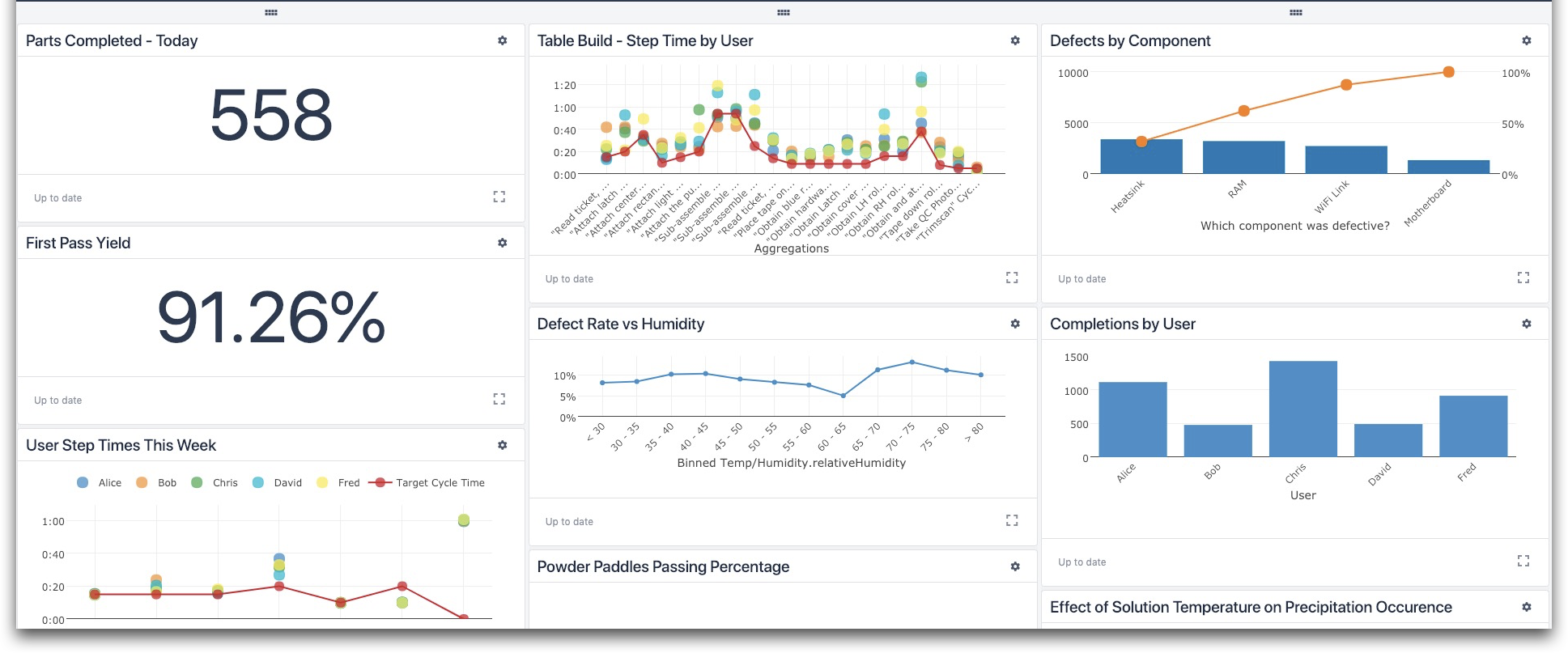
Utilizing Dashboards and {{glossary.Analytics}} in Tulip, data visualization is a helpful tool to understand the data gathered from your apps. You can create custom, centralized, and shareable reports for your production metrics and measure those to improve efforts. With various types of charts and graphs to choose from, dashboards can give insight at any point in your process.
Before going over dashboards, you should have a good understanding of analyses and how to create them. Find information about Analytics and how to create an analysis here:
What Are Dashboards?
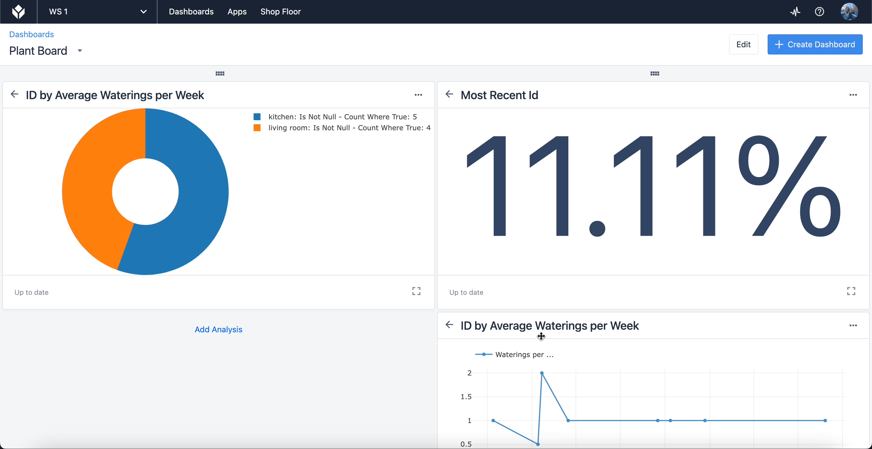
Dashboards are collections of an analyses. When visualizing success or failure, groups of analyses are used, instead of just one, in order to highlight a particular scope of performance. Pulling analyses from a table or app data gives you a view of your operations from any range. You can customize dashboards to arrange analyses in your preferred order.
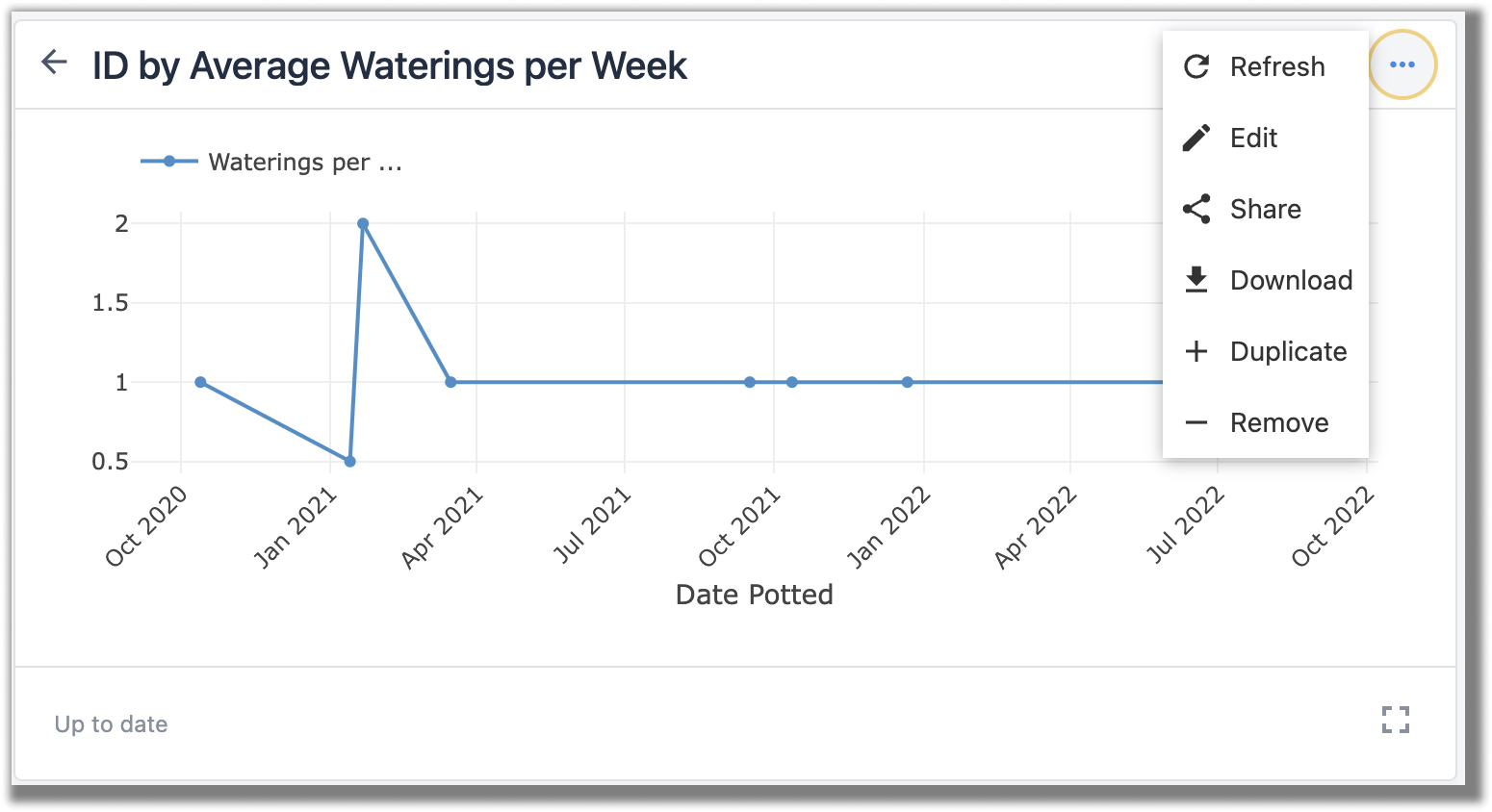
You can also edit an analysis from the dashboard by clicking on the three dots in the corner of the analysis.
Creating Dashboards
To create a new dashboard, navigate to the dashboard page by clicking the Dashboard tab in the top navigation bar.

Click Create Dashboard at the top right of the screen and name the dashboard. Here, you can select if you want to set it as your default dashboard, which is the first dashboard you see. Click Create and your dashboard will save to your instance.
Find a fully comprehensive guide on creating dashboards here.
In-App Dashboards
You can also use Analytics to create dashboards within your app.
To display an analysis in an app, select the embed {{glossary.Widget}} and select Analysis. In the widget, click Select an Analysis and from the pop-up window, select the datasource of your analysis from App, {{glossary.Table}}, or {{glossary.Machine}}. Scroll through the data sources available until you find the one you want. You can either select an existing analysis or create an analysis in the app. Click the blue plus sign in the corner of the analysis and then Add Analysis to add it to the widget in your step.
Managing Dashboards
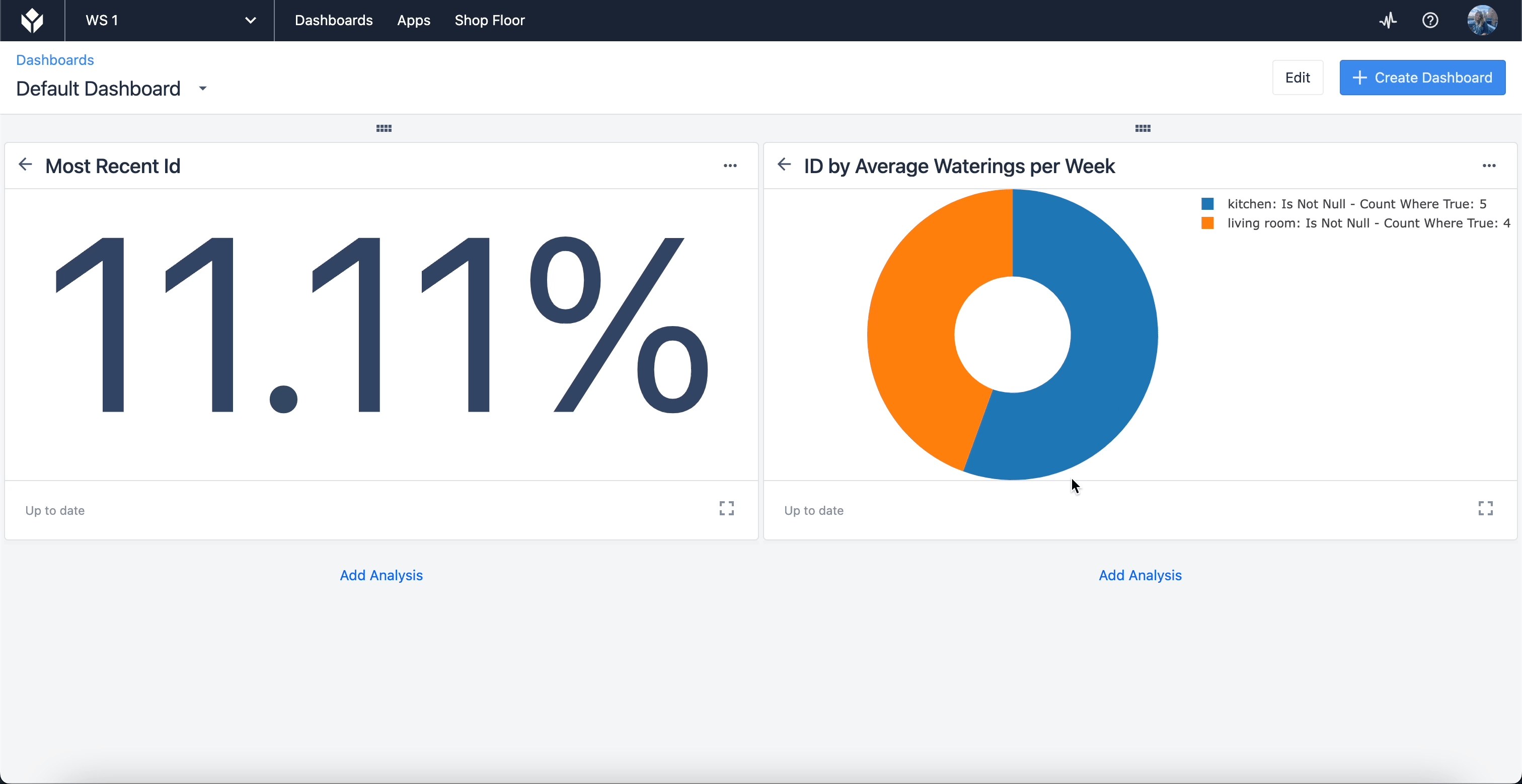
Arranging your analyses can alter the way you present information; to do it just click on the label of your chart and drag it to your desired location. Release your mouse when a light blue space is highlighted.
Sharing Dashboards
You can share dashboards with colleagues even if they don’t have a Tulip {{glossary.Instance}}. They will have “view only” permissions and access to look at your presented data.
To share a dashboard, navigate to the one you want to share and click Edit in the top right corner of the screen. A pop-up menu prompts you to click Share and provides a link to copy and send to those who wish to gain visibility.
For a detailed guide on sharing dashboards, see How to Share Analyses or Dashboards.
Next steps
Start visualizing data with guidance from Tulip experts:
Did you find what you were looking for?
You can also head to community.tulip.co to post your question or see if others have faced a similar question!