

Not all widgets are available on all instances and subscription plans. Reach out to support@tulip.co to enquire about enabling additional widgets.
Widgets are the building blocks of apps. Widgets are used to display information for users, collect data from users, and execute trigger logic.
Dozens of widgets can be combined within an app to configure app steps to build an app interface that streamlines your process.
Types of widgets
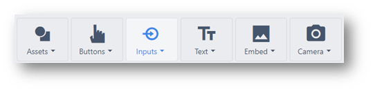
Button widgets
A button that displays text and can trigger an action. The button widget is a blank widget that is completely user configurable. The Next/Previous/Menu/Complete widgets include default triggers to streamline app building.
Button - A completely configurable button that can trigger any logic
Previous - Go to the last step users were on.
Menu - Open the menu where users can change apps, change the app language, and log out
Next - Advance to the next app step.
Complete - Execute an app completion storing the value of app variables and go back to the app splash screen.
Read more about button widgets here.
Input widgets
Collect data from your users with input widgets. Each input widget supports different types of variables.
Read more about input widgets here.
Text widgets
Display static or dynamic text including the values of Variables, plain static text, and entire Record Placeholder.
Embedded widgets
Embed video, CAD, Documents, and much much more into your application with embedded widgets.
Read more about embedded widgets here.
Camera widgets
Display your Tulip Vision camera feed or scan barcodes with the device camera with camera widgets.
Read about Tulip Vision here.
Custom widgets
When the default widgets don't perfectly fit your needs, custom widgets can be built to fill just about any use case. Combine HMTL, JavaScript, and CSS to extend the platform extensively.
Read more about custom widgets here.
Icons
Drag, drop, and resize vector images within your application to align your Tulip app with your brand.
Configure widgets
You can configure widgets to best suit the desired form and function.
Different widgets support different configuration options. These settings can impact many different attributes of widgets:
- Widget datasources
- ex: What text will be displayed on a button, What columns of a table will be displayed?
- ex: Where should the value of an input be stored, What table should be displayed?
- Styling
- ex: What color should a button be, Should a text widget be set to bold or italics?
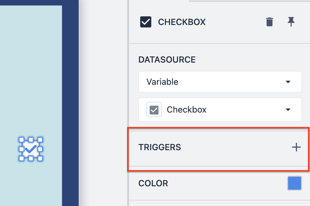
- Triggers
- ex: What happens when a user clicks [Enter], What happens when a user selects a row?
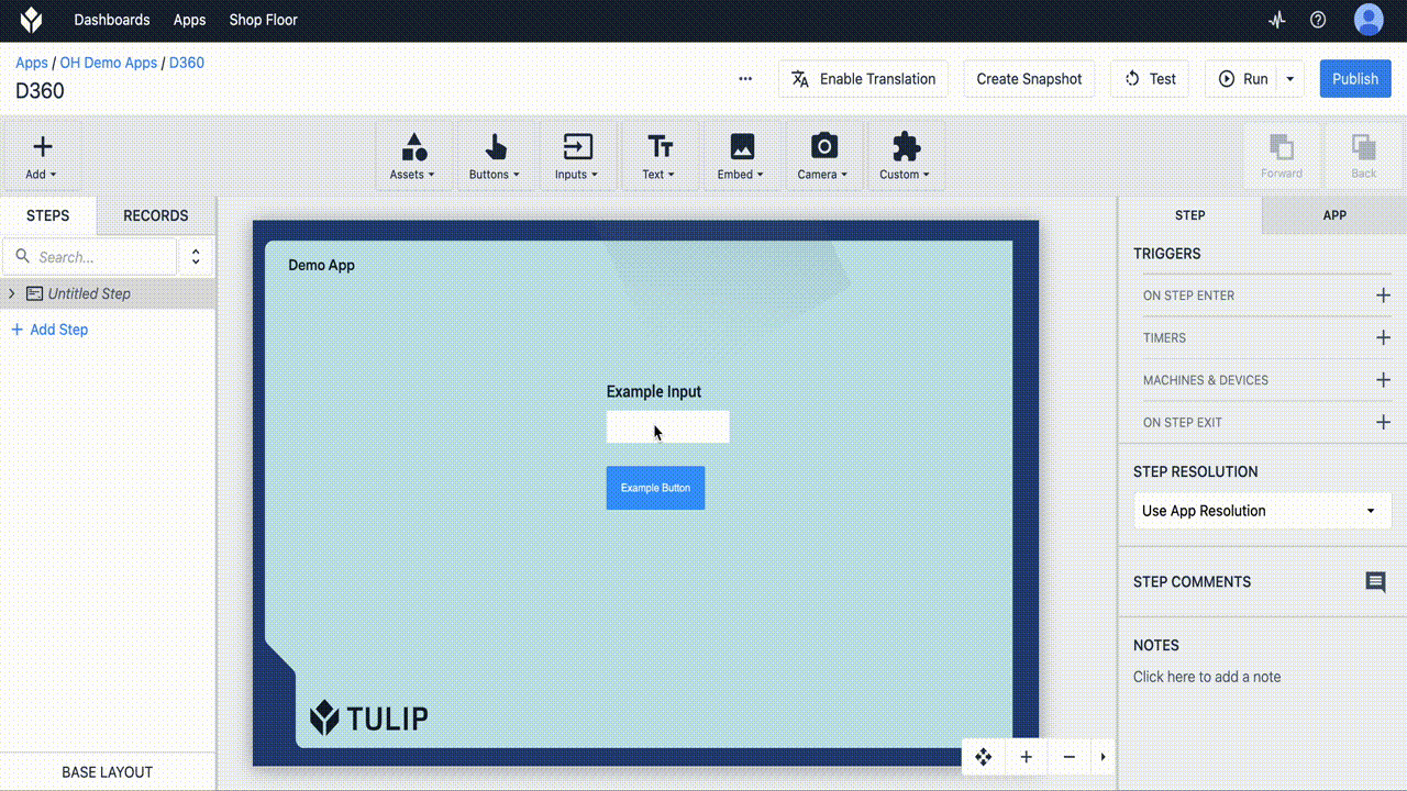
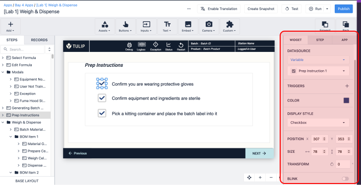
To edit a widget, you must select it.
- Select a Widget you would like to configure.
- The Widget tab opens in the Side Pane.
Widget datasources
The content displayed for Widgets differs for various widgets, but the process for mapping doesn't differ. The Datasource setting defines the source of the widget contents. When you first add widgets, their datasouce is unmapped.
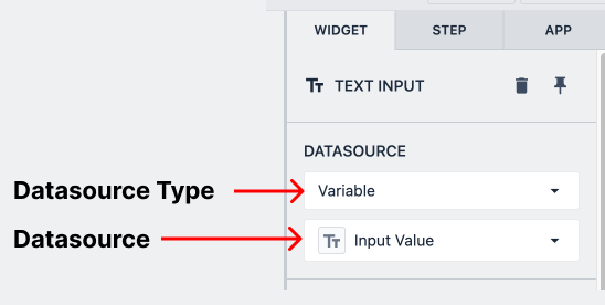
Datasource type is the broad type of source the widget is mapped to. Examples include Variables, Table Record Fields, Machine Attributes, and more.
Datasource is the specific attribute within that type that the widget is mapped to.
A warning icon appears in the corner of an input to indicate that no datasource is selected.
Data mapping
For input widgets, the datasource will represent the location where user input is stored. For all other widgets, the datasource represents the source of the data the widget displays.
Many widgets are tied to data. Widgets content can be driven by dynamic data, like Table Records or Variables. Input widgets can also be used to populate data into variables or table record fields.
Input widgets are read/write with their datasource, changes in the input will change the datasource's value. Most widgets are read-only, where they can be driven by dynamic data, but can't directly impact the value of their datasource.
Data driven widgets
Some widgets can be populated from dynamic data. In most dynamic widgets, the Datasource setting indicates what data is driving the widget state.
Color
All Color properties can either be set statically or dynamically based on a variable.
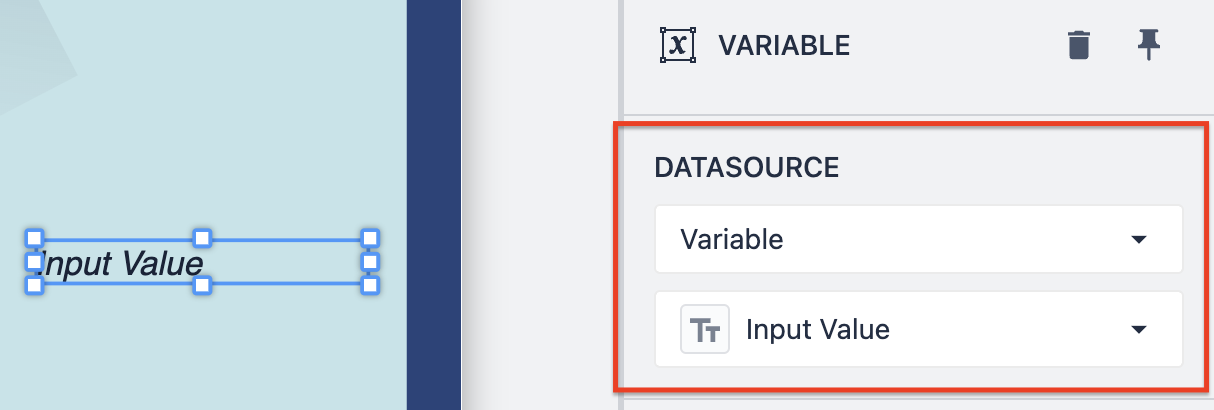
Variable
The Variable widget's contents can be tied to the value of any app variable, including colors. This widget will dynamically change as the source variable changes.
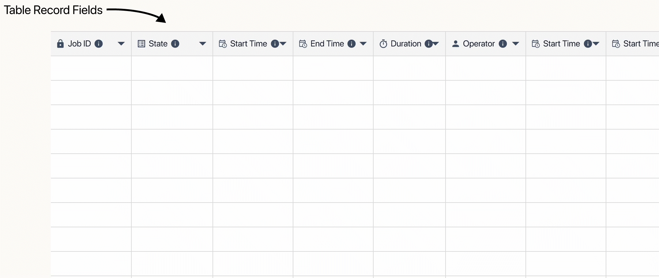
Table Record
The table record widget will reflect the current value of an entire record or an individual table record field.
Interactive Table
The interactive table widget displays the current state of a Table.
Styling
You can edit the following properties of widgets after they are uploaded to Tulip in the Side Pane on the right side of the screen. The options for styling vary based on the widget, but most widgets have the options listed below:
- Font Size
- Font Color
- Font Style
- Button Text Align
- Button Color
- Size
- Rotation
- Drop Shadow
- Border Radius
- Blinking
Widget triggers
Different widgets have certain behavior that determines Trigger logic.
Input Widgets
For all input widgets, when the input is changed, their triggers will run.
In the case of Number and Text input widgets, Triggers will fire on users clicking [Enter]
Interactive Table
When a user selects a row, its trigger will run. Additionally, that row will be loaded into the table record placeholder set in the Linked Record widget setting. Learn more about the interactive table widget here.
For rows in the interactive table widget to be selectable, its Linked Record field must be tied to a table record placeholder.
.gif)