x
Before diving into design best practices, learn how user research is the foundation for successful app design, enabling you to build the most effective apps for your operations and ensuring maximum value from your time investment.
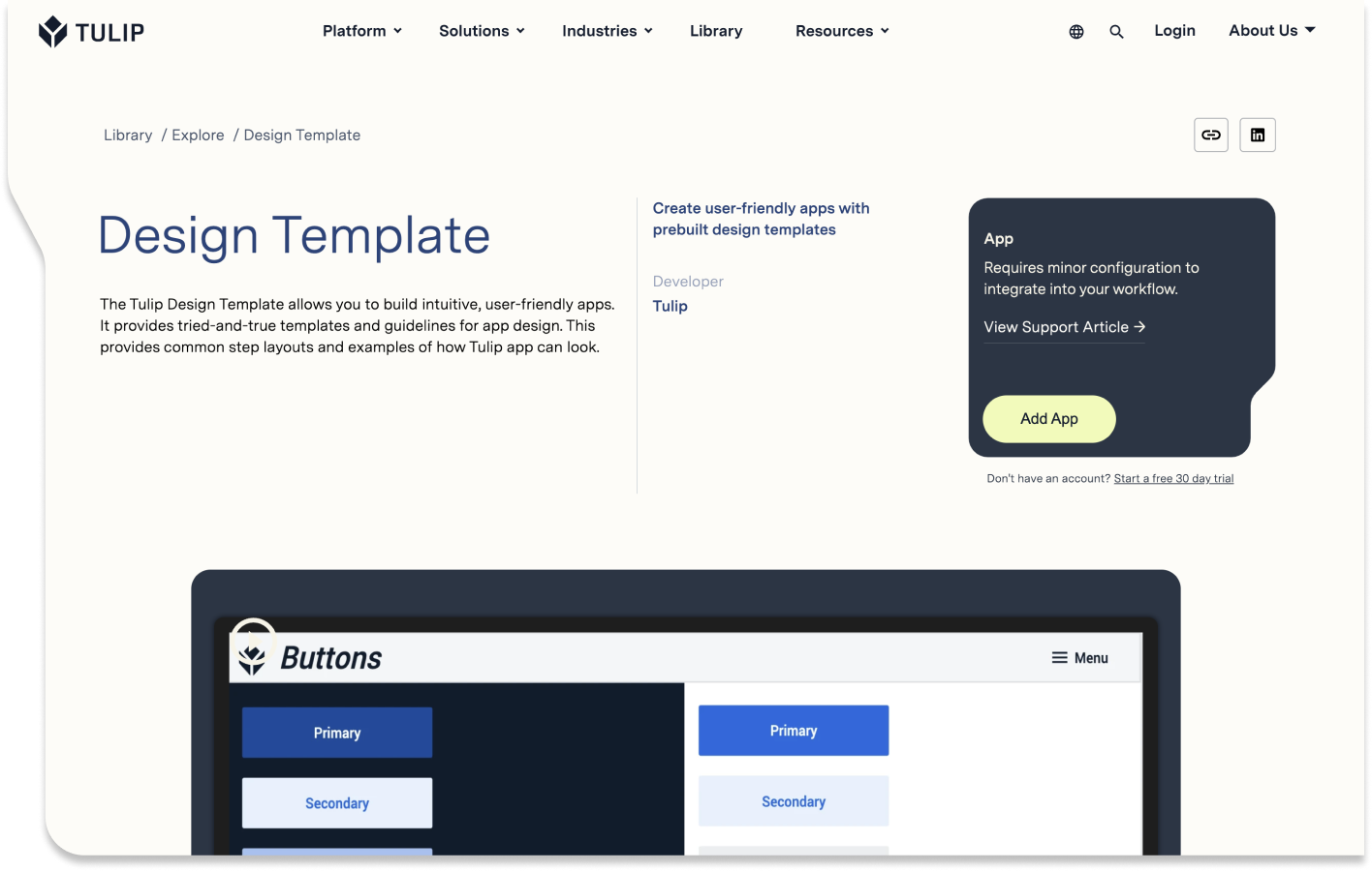
This article refers to two Tulip Library apps: App Design Templates and App Design Best Practices.
Good design is contextual, meaning decisions are made by considering the specific needs of your industry, operators, and process and will change depending on the purpose and function of each app and step. Best practices for Life Sciences apps will differ from best practices in general manufacturing design.
However, all industries will want to standardize app layouts and color schemes and create cloneable components wherever possible. App templates and style guides reduce the amount of decisions app builders need to make at any given moment, while a component library reduces rework and enables faster app building.
To get started, check out our design templates in Tulip Library and use the following best practices to help you customize these templates to build intuitive and navigable apps.
Standardize App Templates
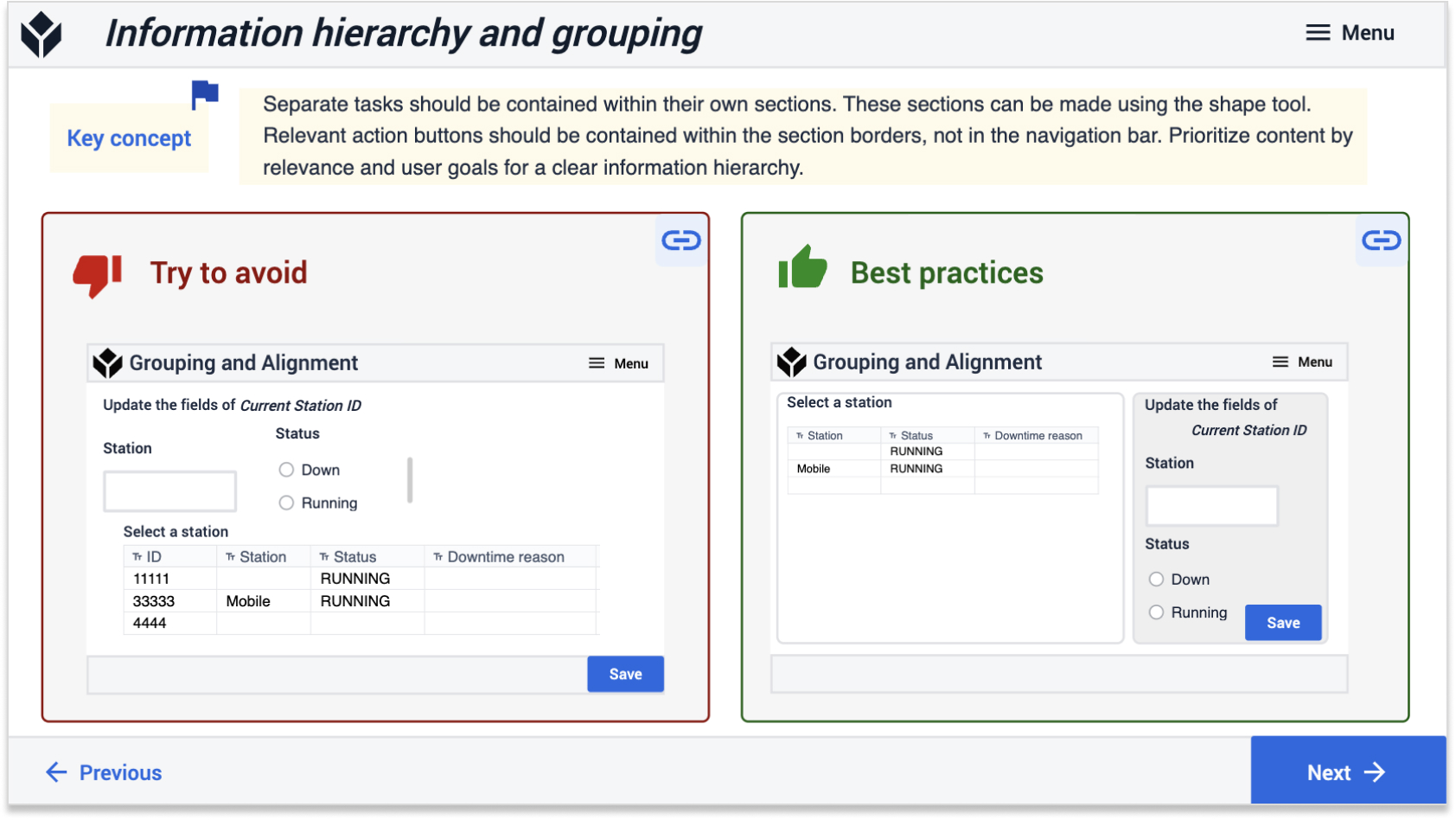
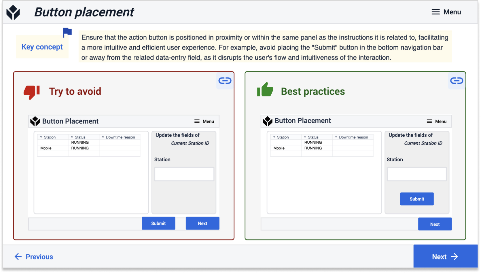
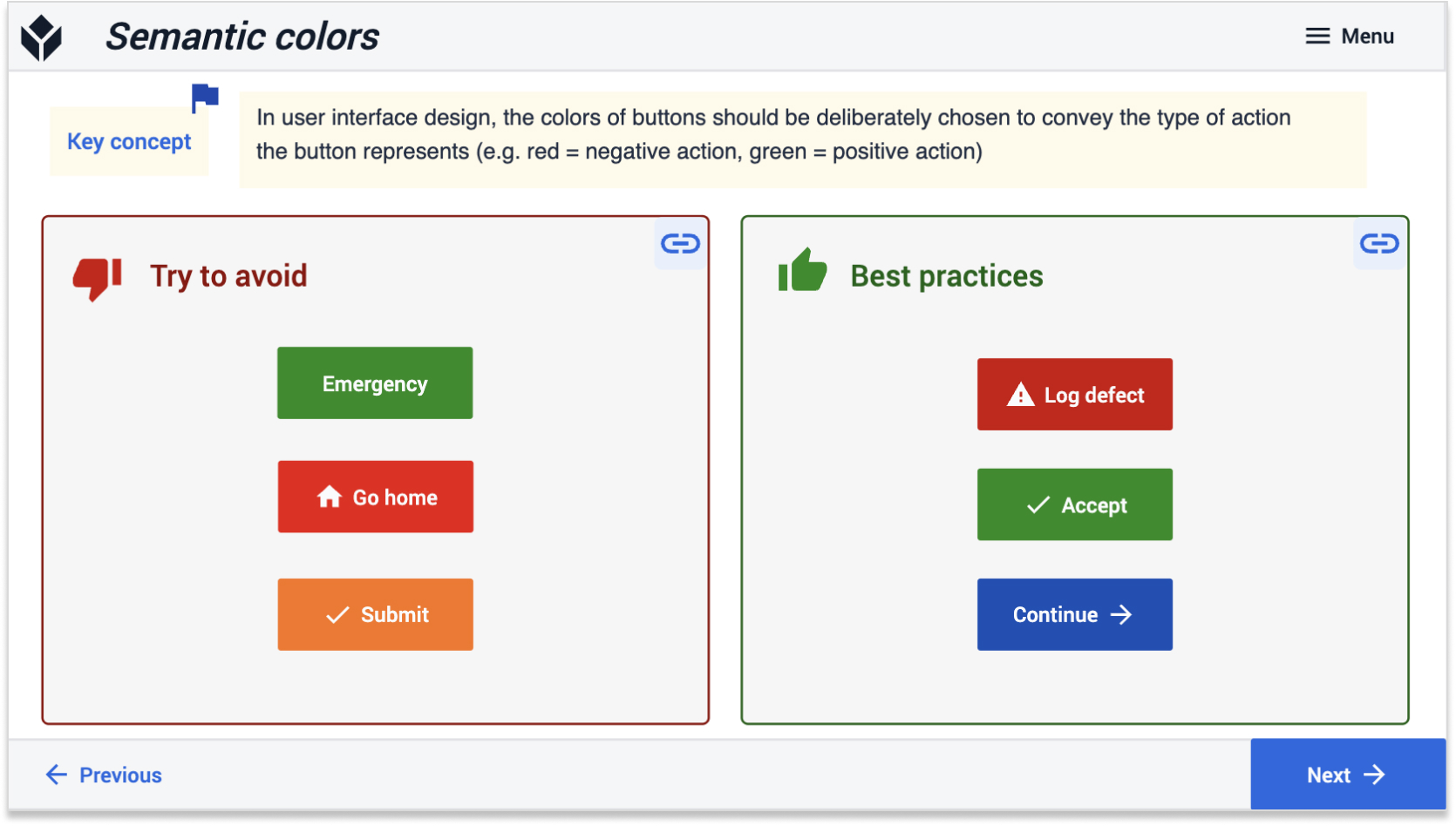
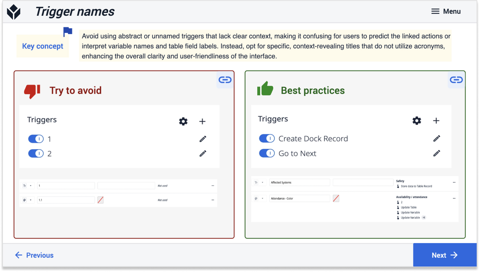
Consistency in app layout throughout your organization goes beyond aesthetic appeal. By crafting recognizable layouts and purposefully selecting colors to convey meaning, you can significantly reduce the need for end-user training.
You can use the following Tulip Library templates to get started.
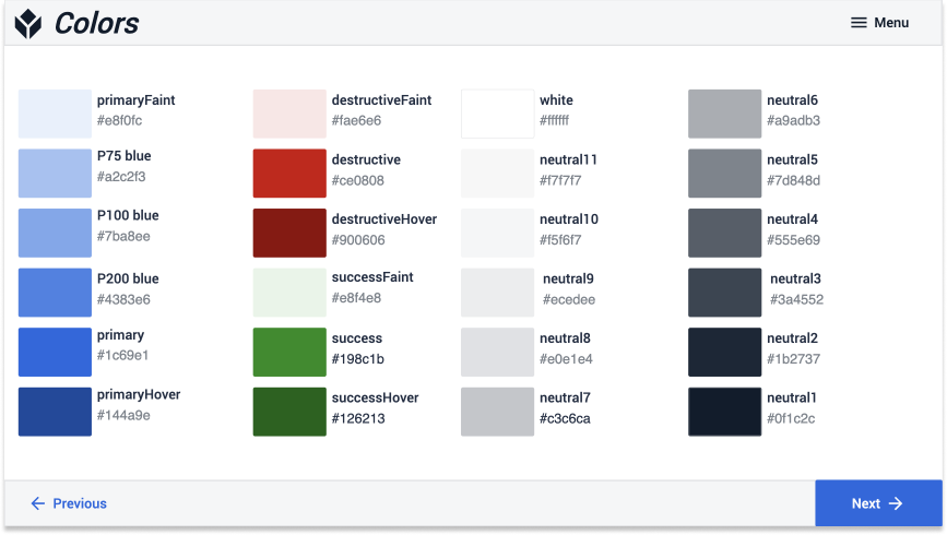
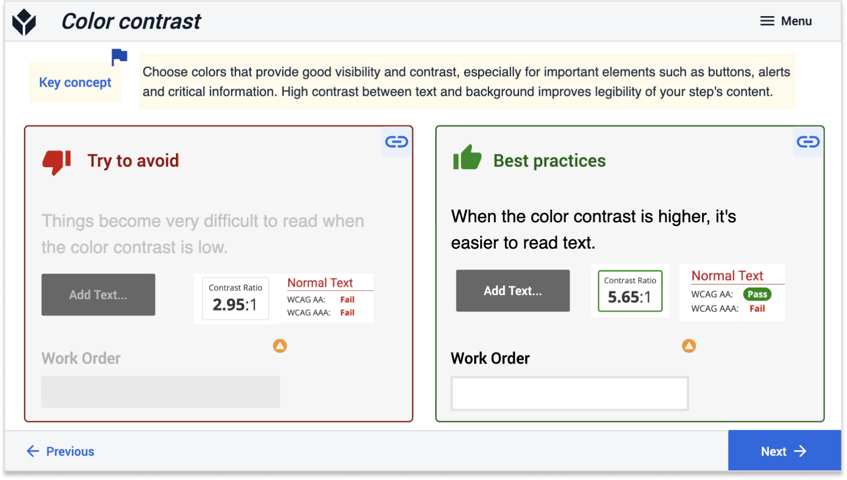
Standardized color schemes ensure apps are intuitive and operators can quickly and easily navigate screens.
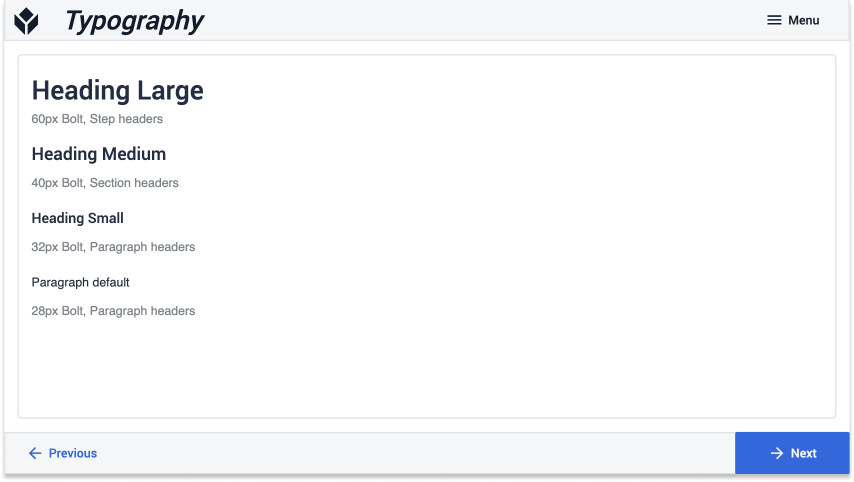
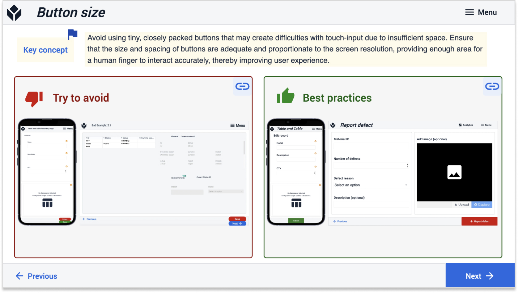
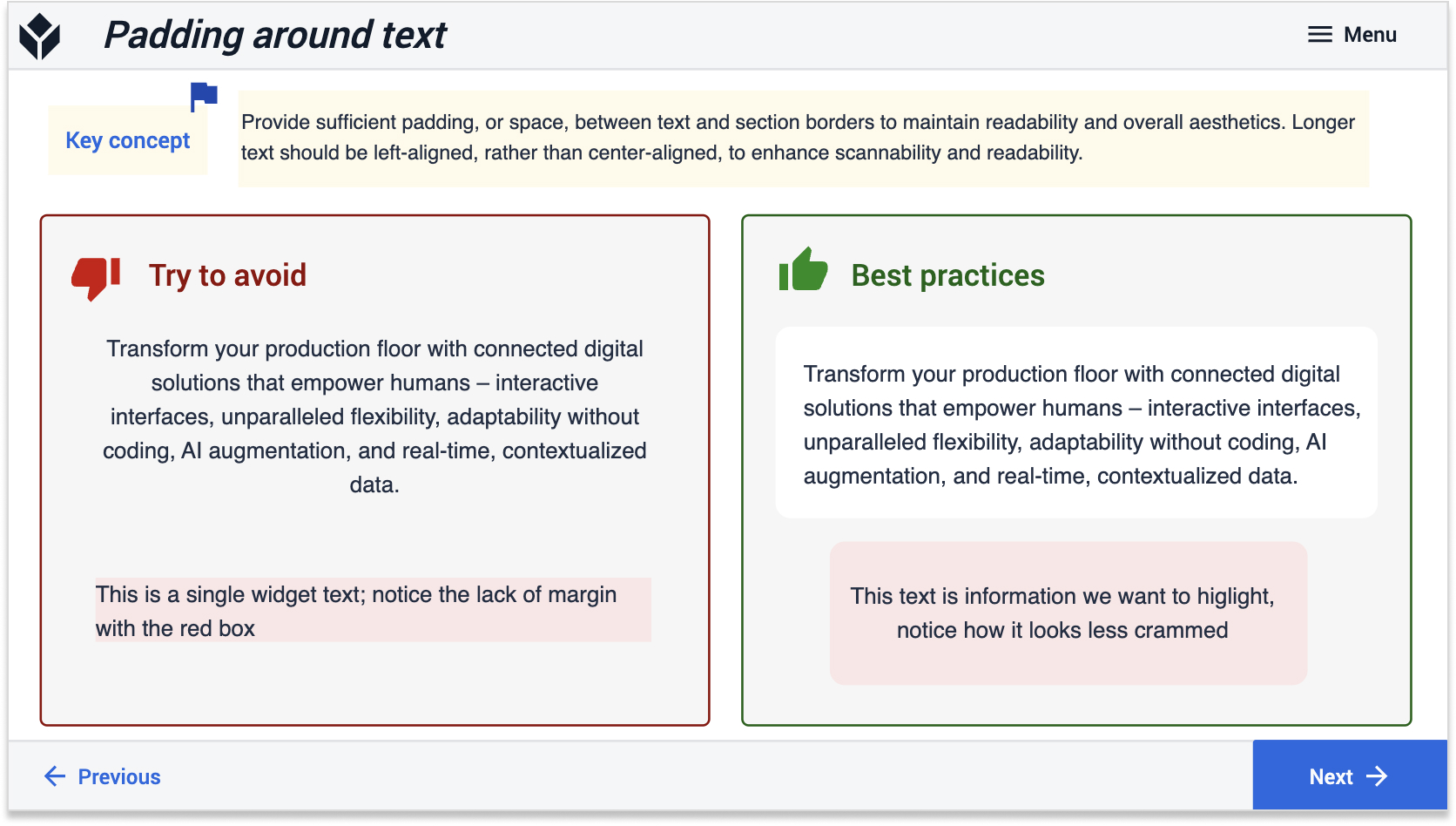
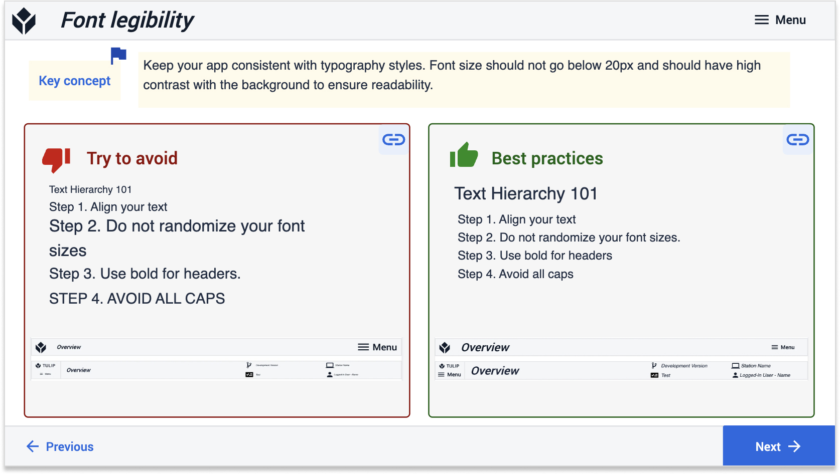
Font sizes should be consistent and human readable. Tailor your font size to the resolution of your Interface (display device).
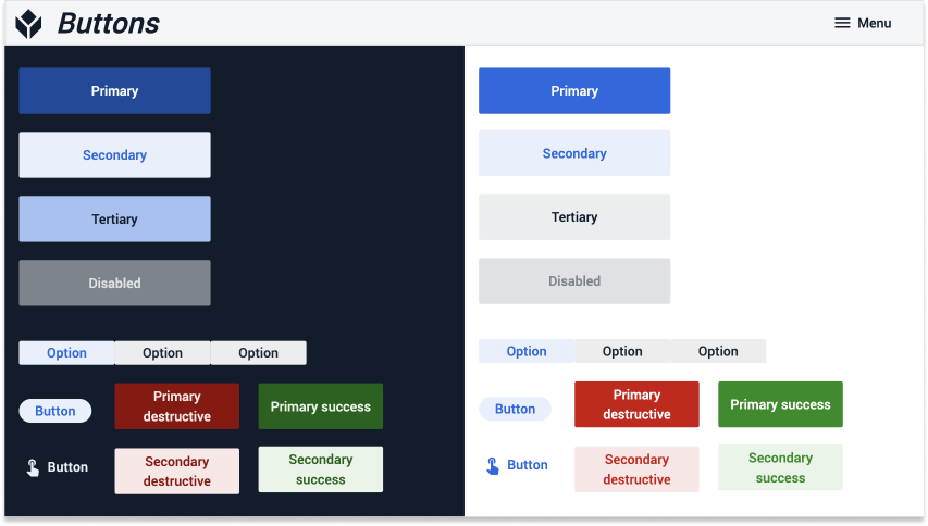
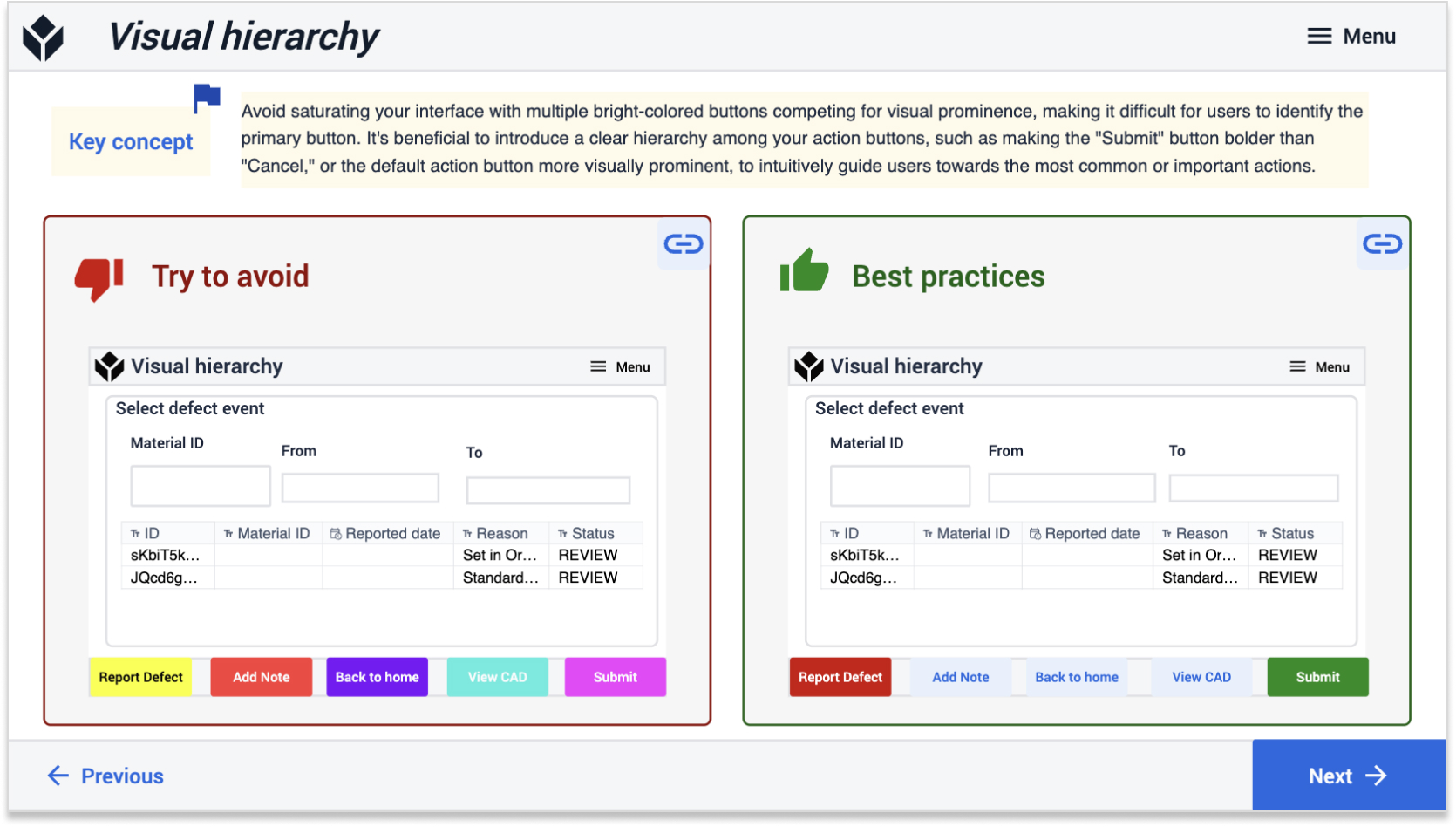
Primary action buttons should be the boldest color on the screen and should not blend in with the background. You don't want operators to waste time looking for what they need.
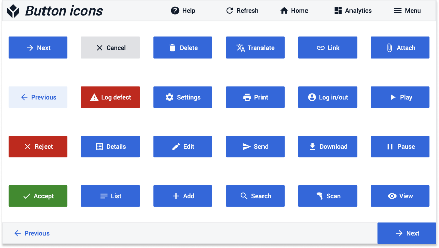
Adding icons to buttons provides visual context to the action the button performs.
Create a Component Library
Building components or templates that app builders can effortlessly copy and paste drastically speeds up development. Consider building a library of the following commonly used app components:
- App base layouts (e.g. tablet vs. mobile)
- Step layouts (e.g. container and panel alignments)
- Top and bottom navigation bars
- Menu bars
- Routing or terminal screens
- Dashboards
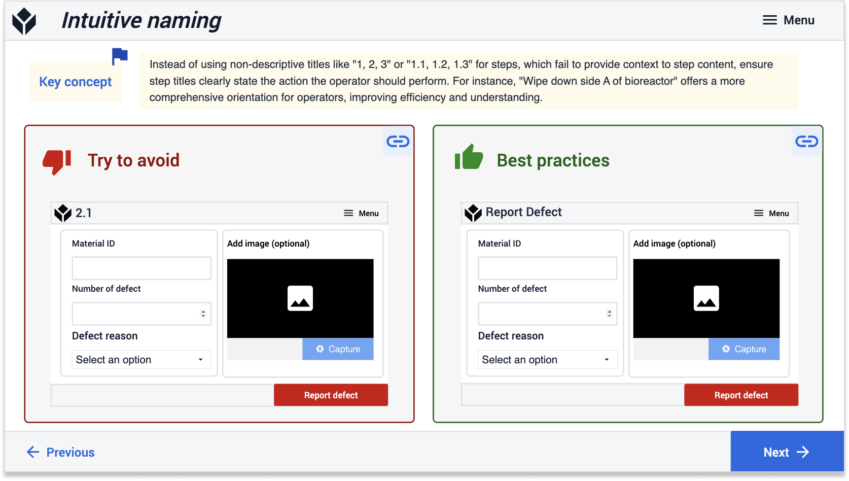
- Forms (e.g. event or defect forms)
- Checklists
- Measurement captures
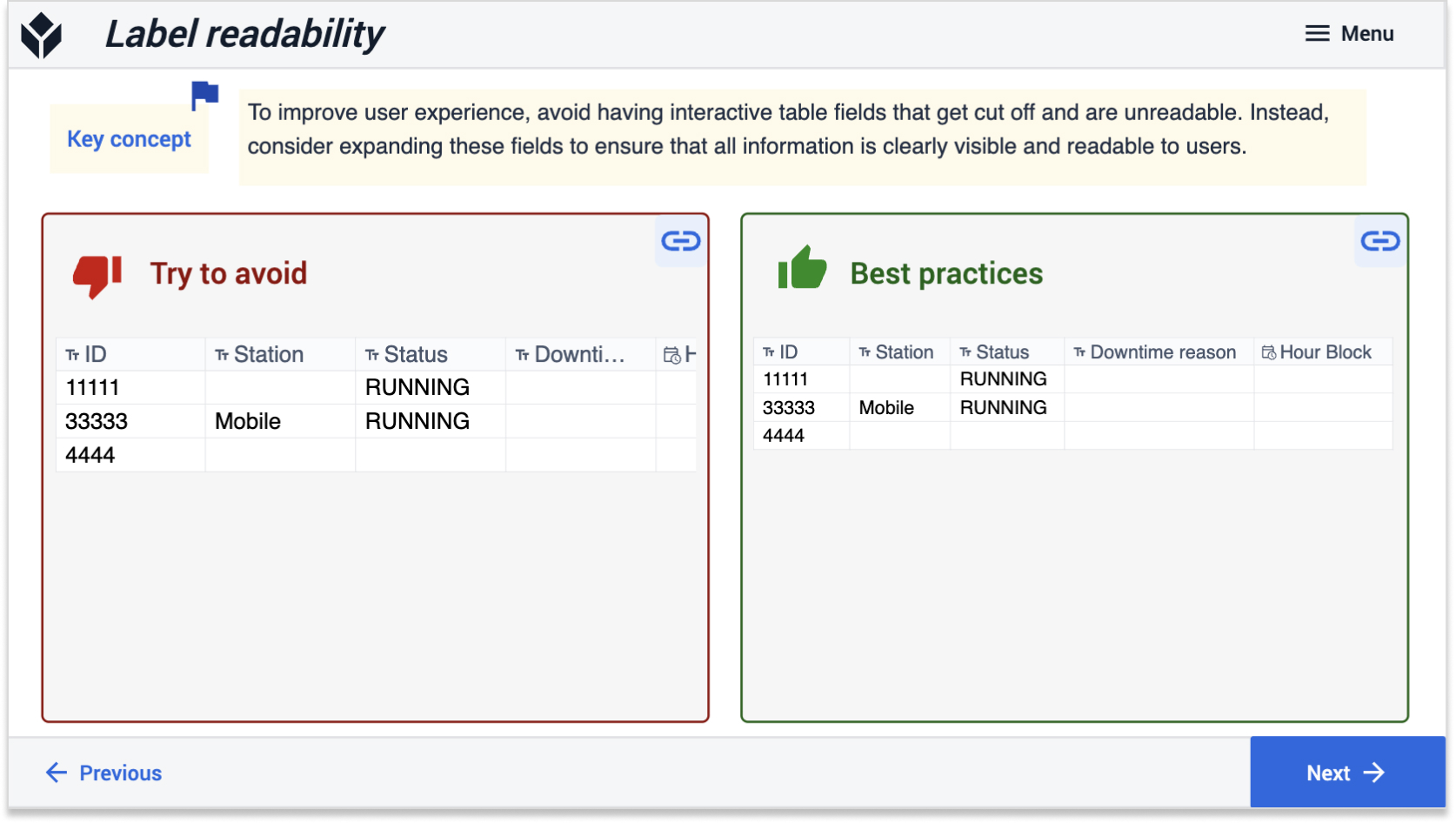
- Common side-by-side information (e.g. an interactive table often appears next to embedded table records)
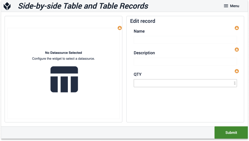
Example of a 2 panel screen that allows users to view data in a table and edit fields using a form
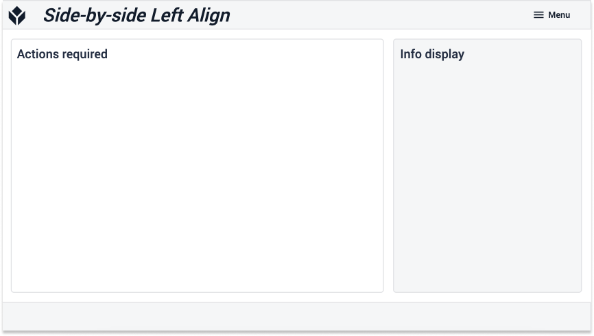
Example of a 2 panel screen in which the primary information is entered in the leftmost panel
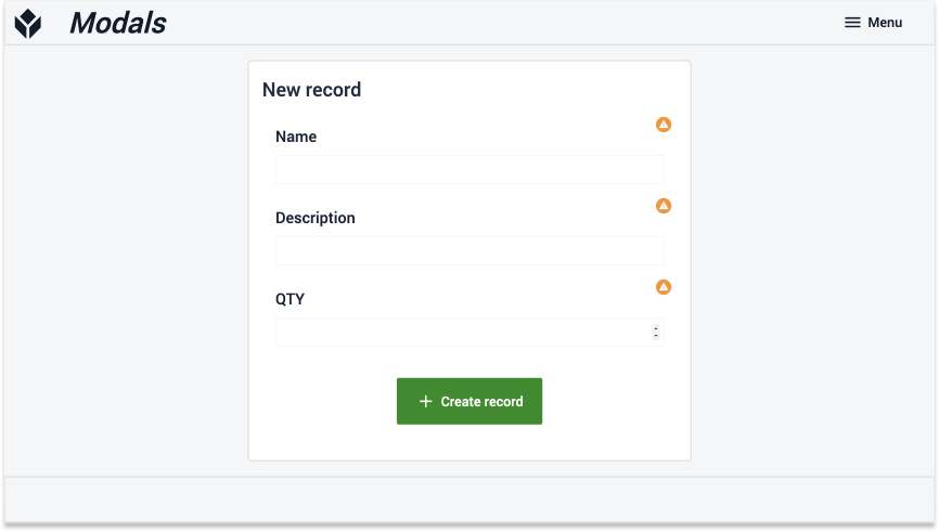
Example of a modal step that draws users' full attention to the task at hand
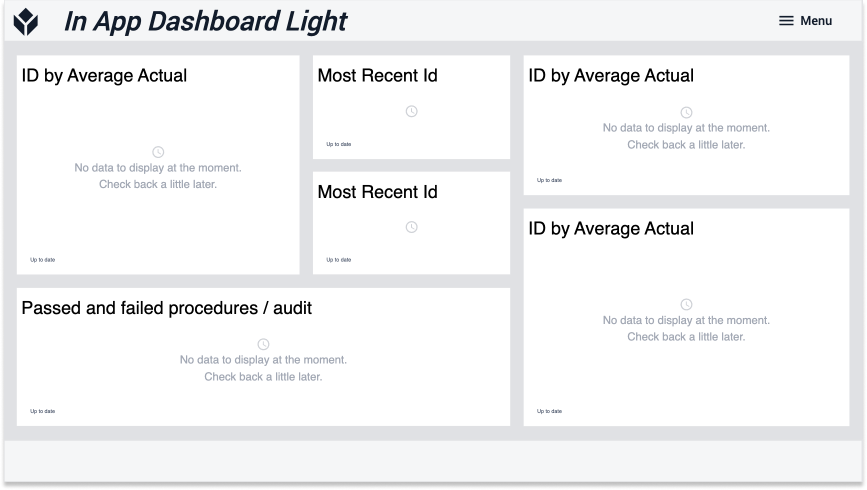
Example of a dashboard setup to display analyses
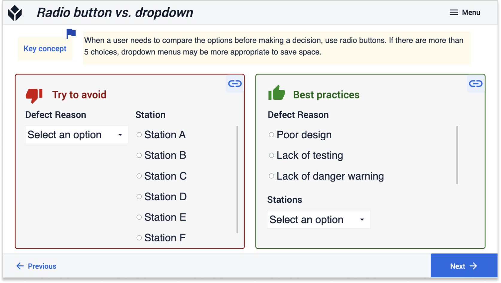
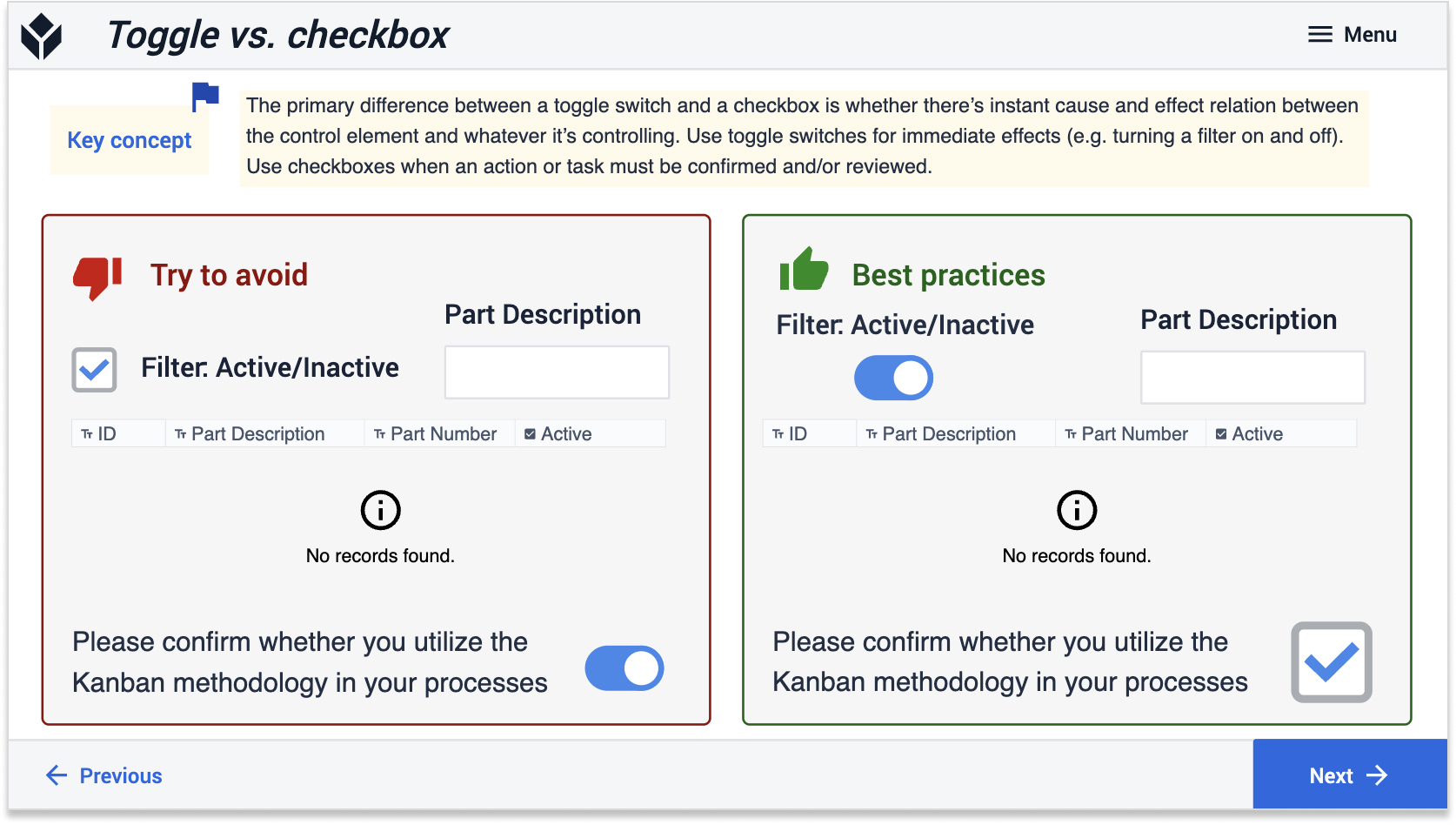
Follow Design Best Practices
Discover expert app design insights in the Tulip Library's App Design Best Practices guide. Dive into color, text, and widget tips to enhance your app's appeal and user experience.
Color
Text
Widget