
Visually represent your values on a radial scale and make it clear for the operator when values approach limits.
Purpose
The Radial gauge custom widgets Display numerical values and ranges on a radial scale. Radial Gauge is a multi-purpose data visualisation control that displays numerical values on a Semi-Circular scale. It has a rich set of features such as ranges, pointers, and colours that are fully customizable and extendable. Use it to create speedometers, temperature monitors, dashboards, activity gauges, compasses, and more.
Radial Gauges are designed to make a way to display numerical values and ranges on a radial scale. Radial gauge can have a minimum value (starting value to the left) and maximum value (ending value to the right) set. When you set up the Value prop, this will determine the pointer position compared to the Max and Min props.
Setup
Radial Gauges are designed to make a way to display numerical values and ranges on a radial scale. Radial gauge can have a minimum value (starting value to the left) and maximum value (ending value to the right) set. When you set up the Value prop, this will determine the pointer position compared to the Max and Min props.
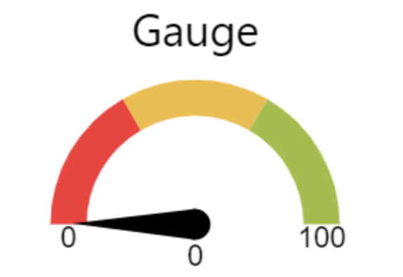
Gauge SVG:
this segmented gauge will have 3 colour background with ranges 0-33 (Red) , 33-67 (Yellow), 67-100 (Green).
Properties
Value - Value the needle should point to.
Min Value - Value to be used as Minimum Value
Max Value - Value to be used as Maximum Value
Title - Text to be displayed as Gauge Title
Events
Error - Fires when value is outside Min Value and Max Value range
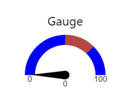
Gauge with Region
If region lower limit and upper limits are provided, it can be highlighted in a different colour. The event will return true or false based on whether the value falls within the inner region or not. For eg., 50-75 is an inner region highlighted with a different Custom colour.
Properties
Value - Value the needle should point to.
Min Value - Value to be used as Minimum Value
Max Value - Value to be used as Maximum Value
Title - Text to be displayed as Gauge Title
Lower Limit - Value for Lower Limit of Inner Region
Upper Limit - Value for Upper Limit of Inner Region
Background - Color for Gauge Background
Region - Color for Inner Region Background
Events
Error - Fires when value is outside Min Value and Max Value range
Status - Returns true when the value falls within the inner region, false otherwise
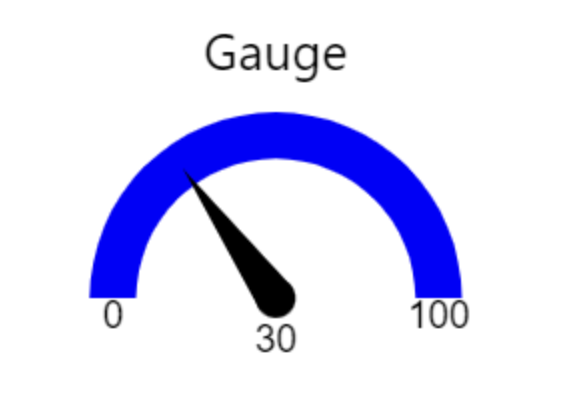
Gauge with Background Color
Gauge with background can be used to set custom colour background to the gauge.
Value - Value the needle should point to.
Min Value - Value to be used as Minimum Value
Max Value - Value to be used as Maximum Value
Title - Text to be displayed as Gauge Title
Background - Color for Gauge Background
Events
Error - Fires when value is outside Min Value and Max Value range
How it works
You should configure the properties and events of your custom widgets to take as input a static value, a variable or a table record value used in your application.
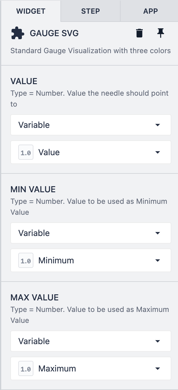
You can configure the properties of your custom widget in the Widget pane of your app editor. In this example, the custom widgets properties are configured to take the variables Value, Minimum and Maximum as inputs. However, these can be also a static value or a table record value.*