To download the app, visit: Library
This article presents what the UI template contains and what it can be used for.
Purpose
The purpose of this app is to help app builders create user-friendly, consistent, and streamlined mobile applications. By building apps with the mobile experience in mind, they become more useful on mobile devices.
The app provides an example of what a Tulip application looks like and showcases common step layouts that can be used in applications. It outlines the elements a base layout, header, and footer should contain, making it easy for app builders to get started with Tulip applications. The template significantly simplifies app building by allowing app builders to copy-and-paste step layouts into their applications. This not only saves time but also ensures a unified look for all the apps built using this guide.
Setup
Resolution is crucial for mobile apps due to the wide range of screen sizes on different devices. The app currently offers two options for mobile settings: Mobile Landscape and Mobile Portrait. For newer mobile devices, we recommend using the 19.5:9 Portrait and 19.5:9 Landscape resolutions.
Features Overview
The first 6 steps serve as a design guide, showcasing the colors, buttons, button icons, and typography used in applications. By defining these elements, it becomes easier to maintain a consistent interface across a company or instance.
In the Colors step, users can view all the colors used in application building, along with their corresponding Hex Codes. If a color change needs to be applied across multiple steps, it is possible to save any color as a variable to ensure consistency throughout the app.
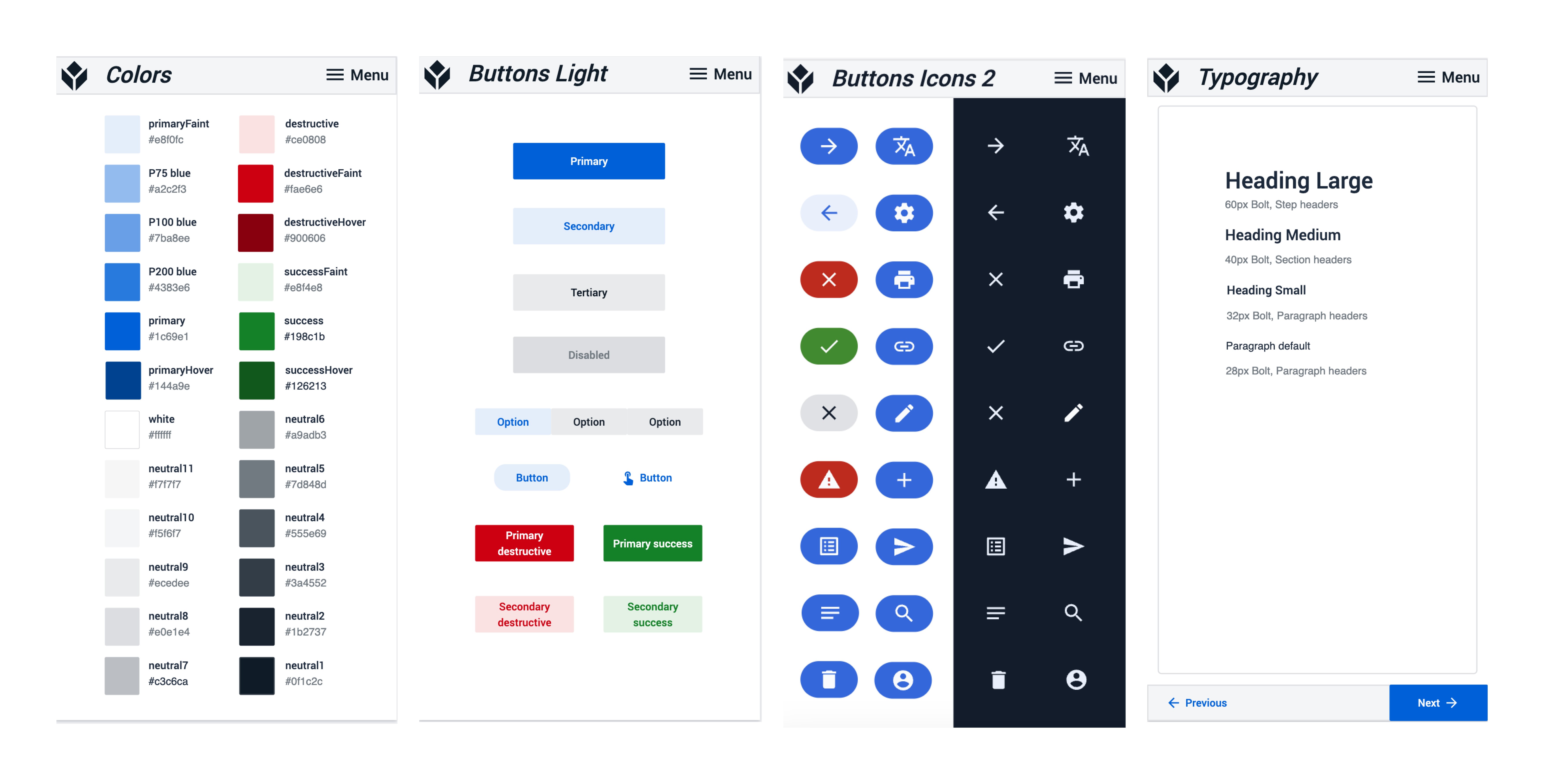
The Buttons and Button Icons steps define commonly used buttons for both light and dark mode apps, along with their associated icons. Button icons can be used with text to improve scannability and save space when the icon's meaning is immediately clear. Each icon should have a consistent meaning across all app steps and ideally across all apps in the workspace.
The last step in this section is the Typography step, which defines the font sizes and styles for titles and paragraph texts. For mobile apps, it's recommended to keep the font size above 20px and ensure high contrast with the background for better readability.
The next section helps app builders design the base layout that best fits their app. It provides different headers and footers that can be copied and pasted onto the base layout. Adding a navigation bar to the base layout enhances user workflow by allowing them to jump to different steps, refresh, or check machine statuses. The app builder can choose between using the light or dark-themed base layout.
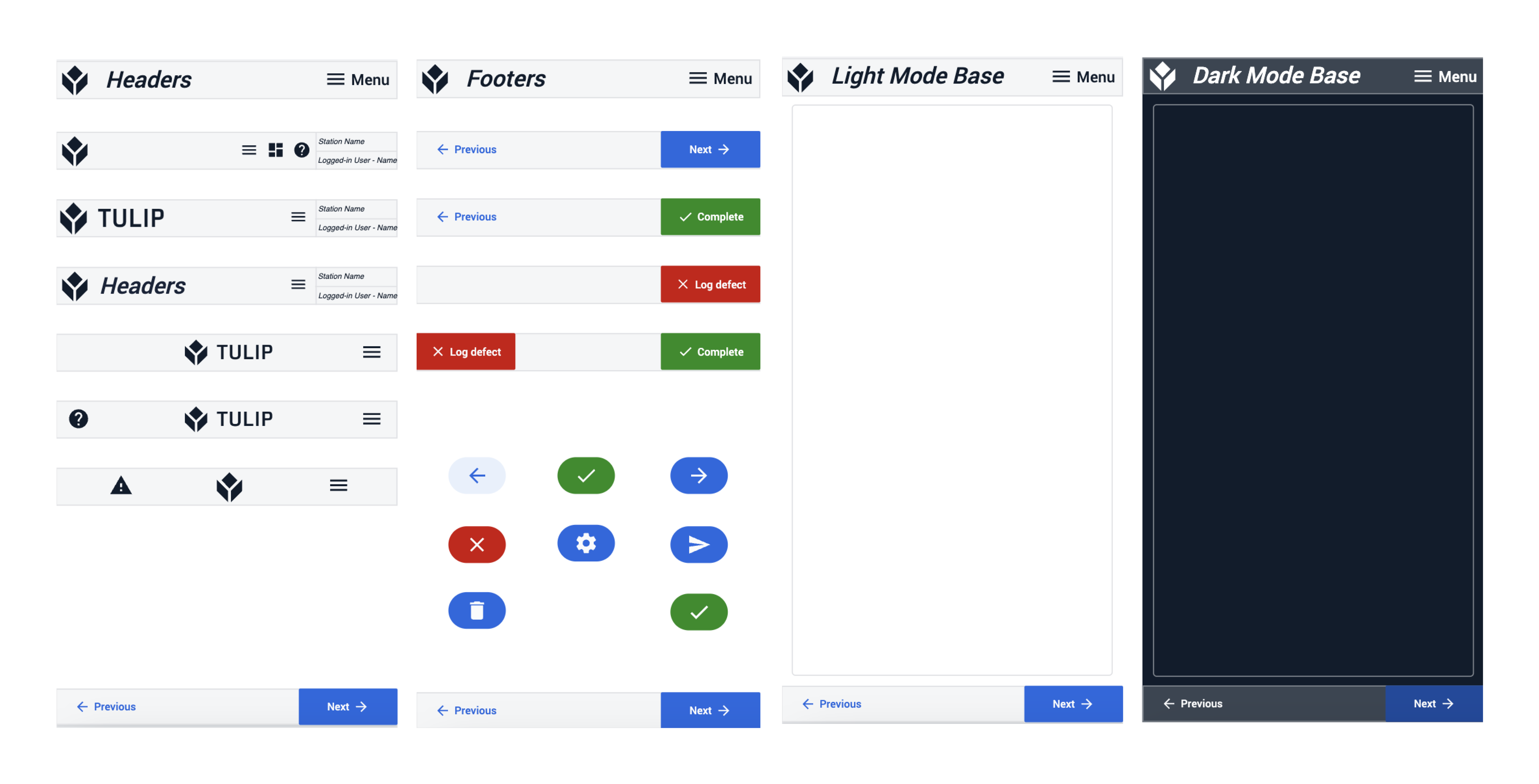
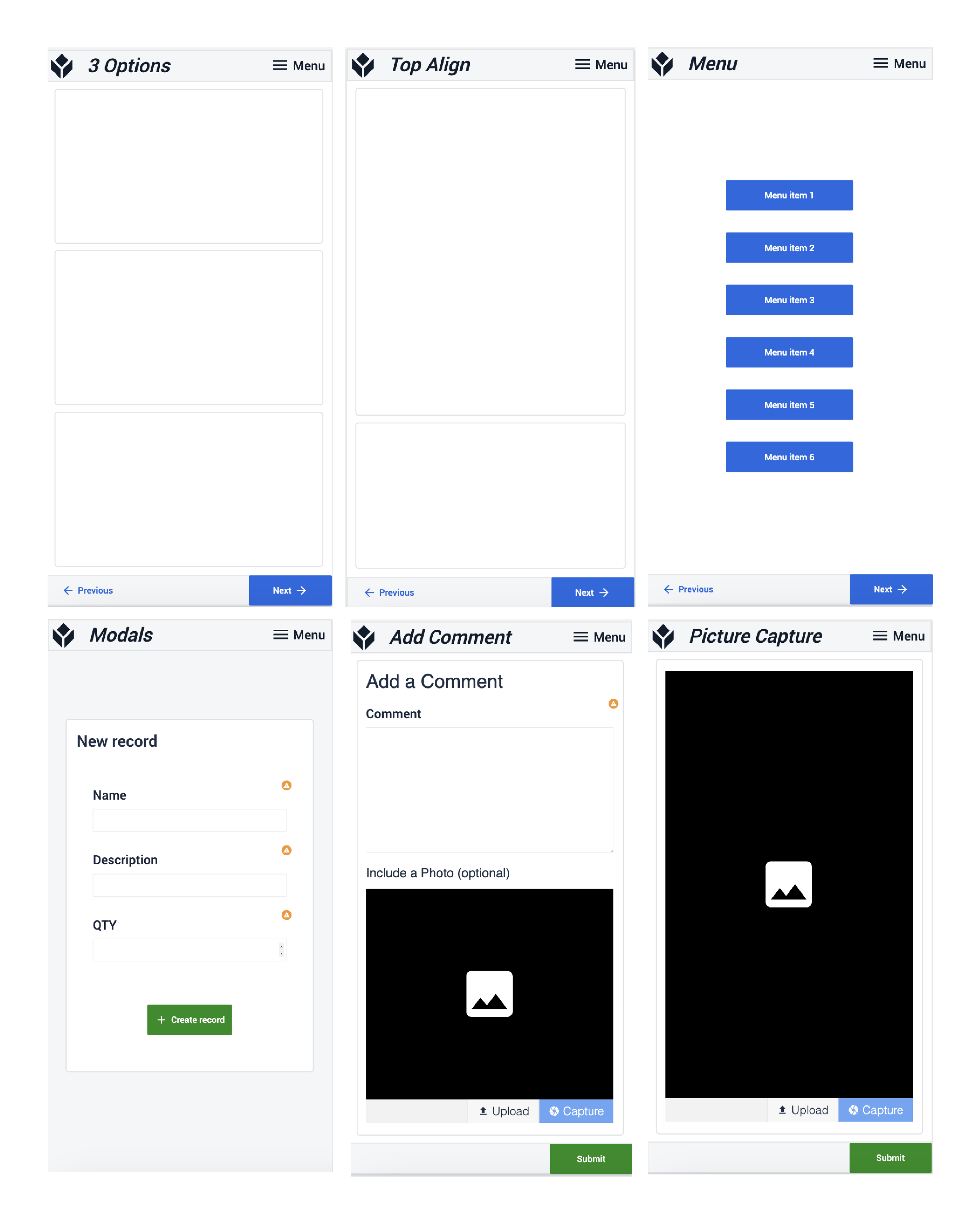
The app also includes a set of steps for Step Templates and a set of steps for Step Layouts. These include Menu, Modals, Work Instructions, Picture Capture, and more.
Further Reading
To learn about App Design best practices check out the article here.
To learn more about designing applications for mobile devices check out the Community Discussion on mobile UI/UX best practices.