

Collect data from your users with input Widgets. Each Input Widget supports different types of Variables. All inputs must be tied to the location where their value will be stored.
Map input widgets to a datasource
Input widgets data can be stored to either variables or Fields in Table Records. The Datasource is determines the destination of the input data.
Inputs that are not tied to a datasource will not be selectable when running in the Player.
Variable
Choose an existing variable, or create a new variable to assign to the input Widget:
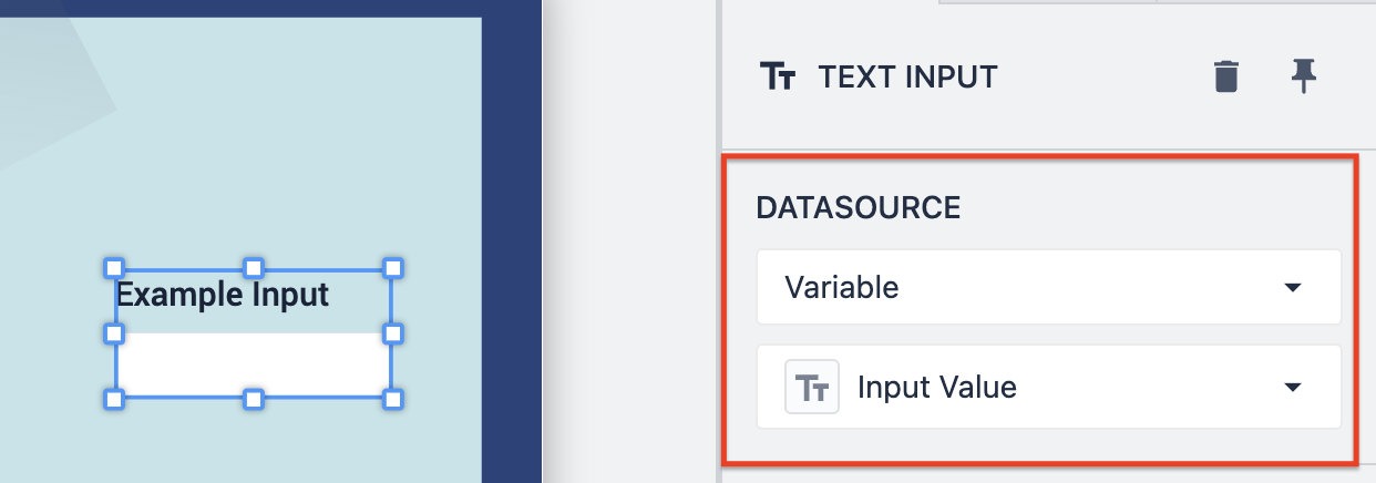
By assigning a Variable to the input, the input value can be referenced throughout the app to build various logic.
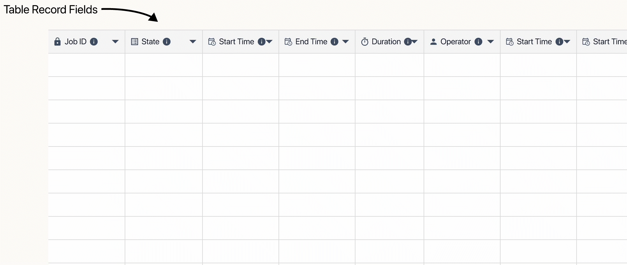
Tulip table record
By assigning your input widget to a Tulip Table Record, you can directly edit a table record. Specify the column of the table record in the dropdown:
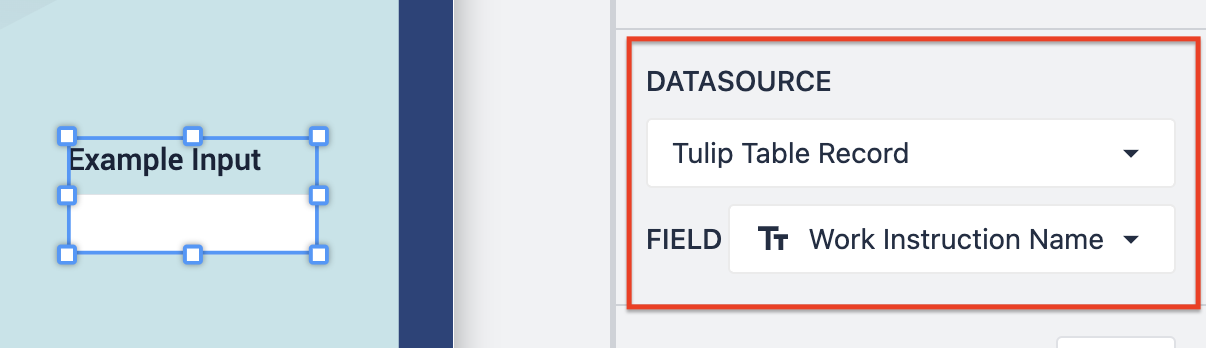
This automatically saves the value of the input widget to the table record.
When tied to a Table Record Field, there must be a Record loaded into the Table Record Placeholder.
Types of input widgets
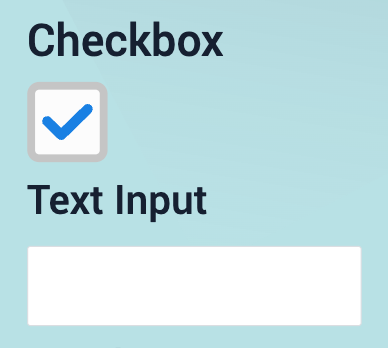
Checkbox
Collect True/False values from users. Data can be stored in a Boolean variable
ex. In an audit app, users need to confirm that they have executed a process.
Read more about checkbox widgets here.
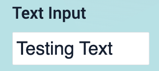
Text
Collect non-numeric data from users. Data can be stored in a text Variable
ex. In a work instruction app, users can add a note in a text field about a defect they found.
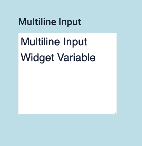
Multiline
An expanded version of the text input, allowing for a bigger response. Select this widget when the input is a significant amount of text.
File
The file input widget is similar to a text input, with the ability to assign the input to a column of a Tulip Table or a Variable. A variable needs to be assigned to the File Input Widget in order to use the data later in the app.
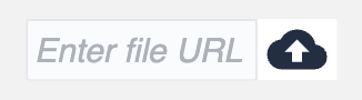
Use the cloud button to import a file from your device to the file widget, or enter the file URL directly.
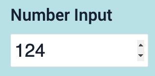
Number
Collect decimal or whole number input from users. Data can be stored in a Number variable or Integer variable.
ex. At the end of a production run, users need to populate how many parts they finished.
Speech-to-text
Users can transcribe voice memos to enter data into applications. This widget works along with other input widgets, (e.g. text, number)
ex: A user audibly describes an issue with a part, which is automatically transcribed as text into a report.

Read more about the speech-to-text widget here.
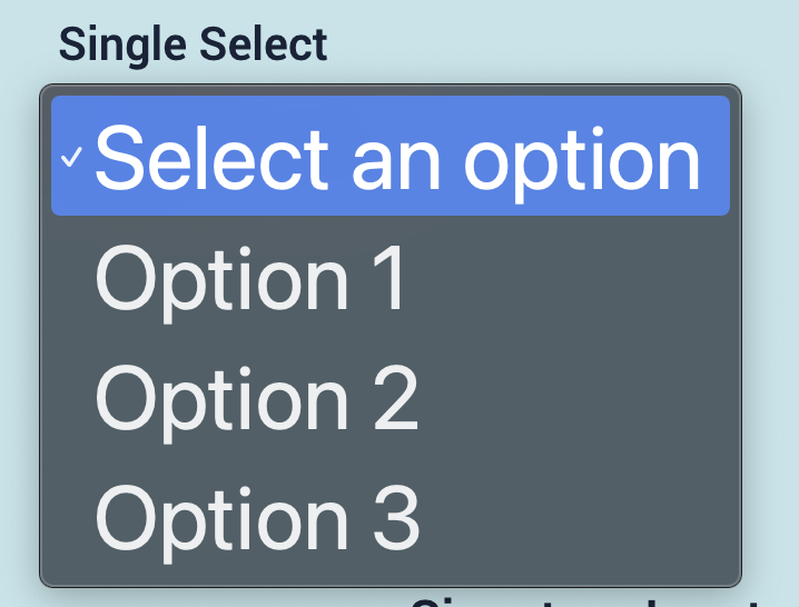
Single Select
Users can select one value from a list of options. That list can be statically or dynamically set. Data can be stored in any variable type.
ex. When starting a process, users need to select the line they are working on, they need to select from a list of valid values.
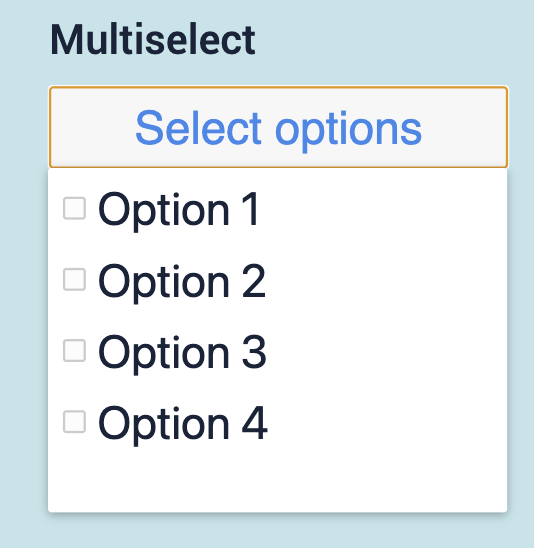
Multiselect
Users can select multiple values from a list of options. Data can be stored in an Array of any variable type.
ex. When a defect is found users must select all of the defect types that apply to that part.
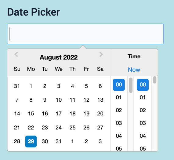
Date Picker
Collect a date and time from users. Data can be stored in a Datetime variable
ex. Maintenance staff can select the date for the next maintenance order for preventative maintenance on a machine
Image
Display a camera where operators can use the device camera to capture an image. Data can be stored in a Image variable
ex. When a defect is found, users snap a picture of the anomaly
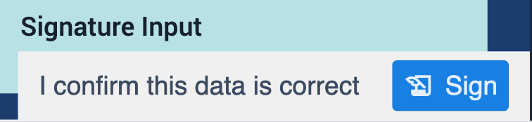
Signature
Collect a digital user Signature to verify the accuracy of data.
ex. At the end of a batch mixing process, users need to sign off that the recipe used matches the work order
Read more about the signature widget here.
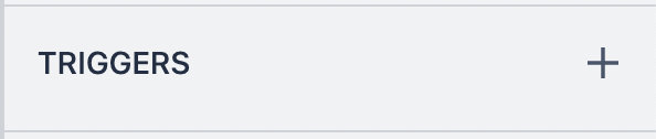
Configure input widget triggers
Many of the input widgets have an option to configure a trigger to fire when an action occurs. The types of actions and the associated widgets are described below.
Enter key
The Enter Key trigger follows the logic of: when the enter key is pressed, if conditions are met, then perform an action. This option is associated with the text and number input widgets.
Input change
The Input Change trigger follows the logic of: when input changes, if conditions are met, then perform an action. This option is associated with the checkbox, single select, multiselect, date picker, and image input widgets.
In the case of Number and Text input widgets, triggers will fire when users click Enter.
Read more about widget triggers here.
Further Reading
Did you find what you were looking for?
You can also head to community.tulip.co to post your question or see if others have faced a similar question!
.gif)
.gif)