Learn about ways to validate data in Tulip using widgets, buttons, and triggers.
Using data validation for operator inputs reduces quality issues and standardizes forms used in your process. If a user enters a data value that doesn’t match the validation requirements, an error message will appear. Additionally, you can use trigger logic to prevent an operator from continuing the app if the entered data does not meet requirements.
Data validation makes app building much more seamless with the following advantages:
-
Simplify Trigger Management
Reduce the quantity and complexity of triggers to streamline app development and maintenance. Spend less time developing apps. -
Create Dynamic Steps
Add dynamic control to apps through the enable/disable functionality of buttons, enabling greater interactivity and flexibility. -
Less App Maintenance
Spend less time reviewing and understanding apps. Copy and paste widgets without concern for trigger implications.
You can also provide an intuitive app experience with dynamically enabled and disabled buttons.
Validation Rules available by Input Widget
While you can use every input widget for data validation, some inputs have validation rules to set parameters of data. The table below outlines the validation rules available for each Input Widget.
| Input widget | Validation rules |
|---|---|
| Checkbox | N/A |
| Text | Contains, Doesn't contain, Starts with, Ends with, Maximum character limit, Minimum character limit, Is email, Is URL (according to here) |
| Multiline | Contains, Starts with, Ends with, Maximum character limit, Minimum character limit, Doesn't contain |
| File | N/A |
| Number | Equal, Doesn’t equal, Greater than, Greater than or equal to, Less than, Less than or equal to, Inside range (inclusive), Outside range (exclusive), Exact decimal places |
| Single select | N/A |
| Multiselect | Minimum selected, Maximum selected |
| Datapicker | Is, Before, After, Inside range (inclusive), Outside range (exclusive), On or before, On or after |
| Image | N/A |
| eSignature | N/A |
Create a Validation Rule
- Select an input widget that has validation rules available (see table above).
- In the Side Pane, click the + icon next to Validation rules.
- Select the rule you want to add to the input widget.
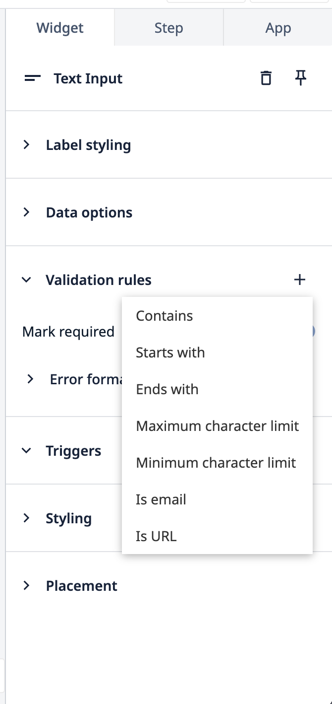
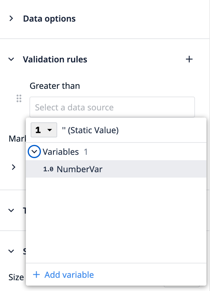
- Select a data source for the rule to validate. This can be a static value or a Variable.
- Click the + button to add additional rules.
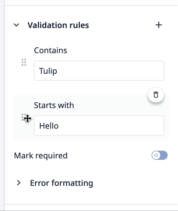
Reorder Validation Rules
The order of validation rules corresponds to the first error message presented if the entered data value fails.
In the examples below, the data entered fails both validation rules. However, the error message shown relates to the first rule configured.
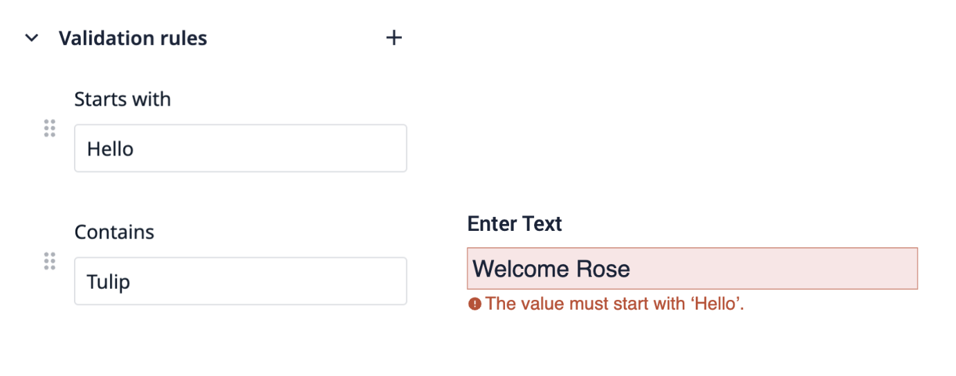
Example 1
“Contains Tulip” is the first rule to fail, so the error message appears accordingly.
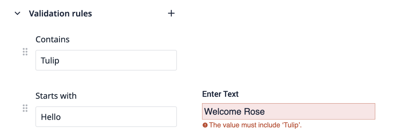
Example 2
“Starts with Hello” is the first rule to fail, so the error message appears accordingly.
This allows app builders to specify a priority of which error messages to present to an operator.
To reorder the validation rules, click on the six dots icon and drag it before or after a rule.
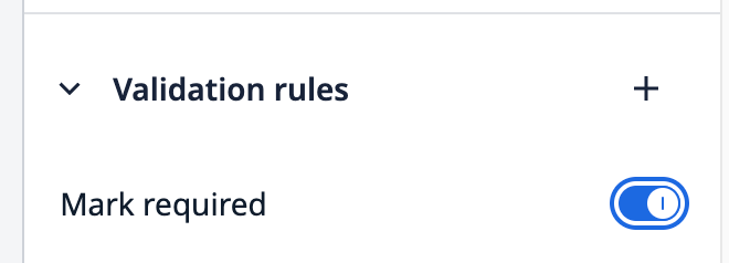
Require Input Data
Marking validation rules as required adds a rule that the input must be completed by the operator for the input to be considered valid. You can use this for all input widget types. When an input widget is marked as required, a red asterisk will appear next to the input widget in the app.
To do this, toggle the Mark required slider located below the Validation rules section header of the side pane.
Input Validation Error Prompts
The Error formatting dropdown inside the Validation rules section of the side pane offers options for how an error with input data appears to the operator when the app is running in Player.
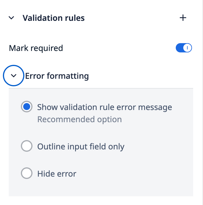
The three options for visualizing errors to the operator:
- Show validation rule error message
- Outlines the input field in red and presents an error message to the operator
- Outline input field only
- Outlines the input field in red
- Hide error
- No visual indication provided
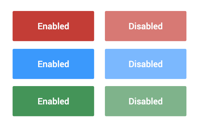
Dynamically Enable and Disable Buttons
Decide when operators can press a button with dynamic controls. When a button is disabled, it is displayed with muted colors and an operator will not be able to press it.
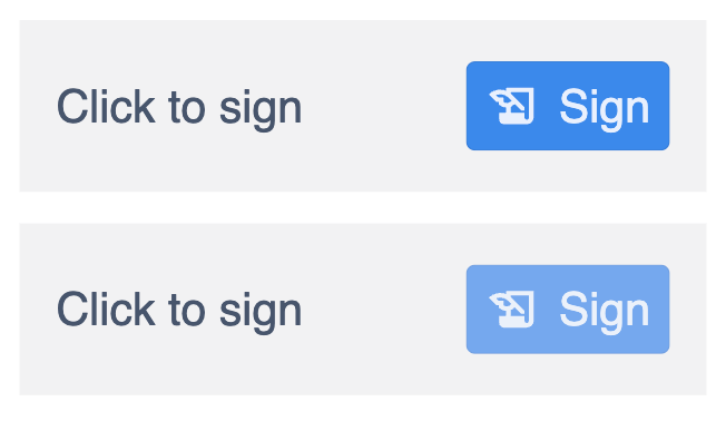
You can even use this control on Electronic Signature widgets.
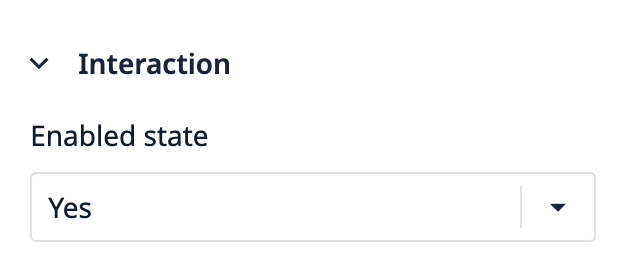
Buttons can be dynamically enabled or disabled by setting the Enabled state in the Interaction section of the side pane for a selected button. By default, a button’s enabled state is set to Yes.
There are a few ways to add dynamic control to determine the enabled state of a button:
- Specify a Boolean variable
- Validity of user input on the Step with input widgets that have validation rules
- The All widgets option, which checks if all inputs entered meet the validation rules
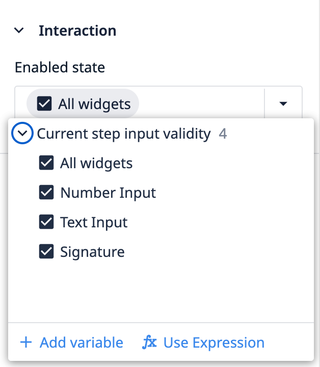
- Use an Expression
Use Expressions to Enable/Disable Buttons
If you would like to enable or disable a button based on a subset of widgets, select Use Expression to write a custom condition.
You must write an expression that evaluates to a boolean condition (true or false). If you correctly construct a valid expression, the expression editor will indicate this at the bottom left.
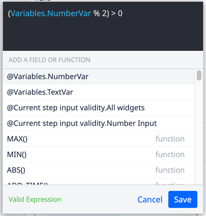
Example 1
The example below uses the modulo operation to determine if the value entered into a number input widget is odd or even. If the value is odd, the button will be enabled. If the value is even, the button will be disabled.
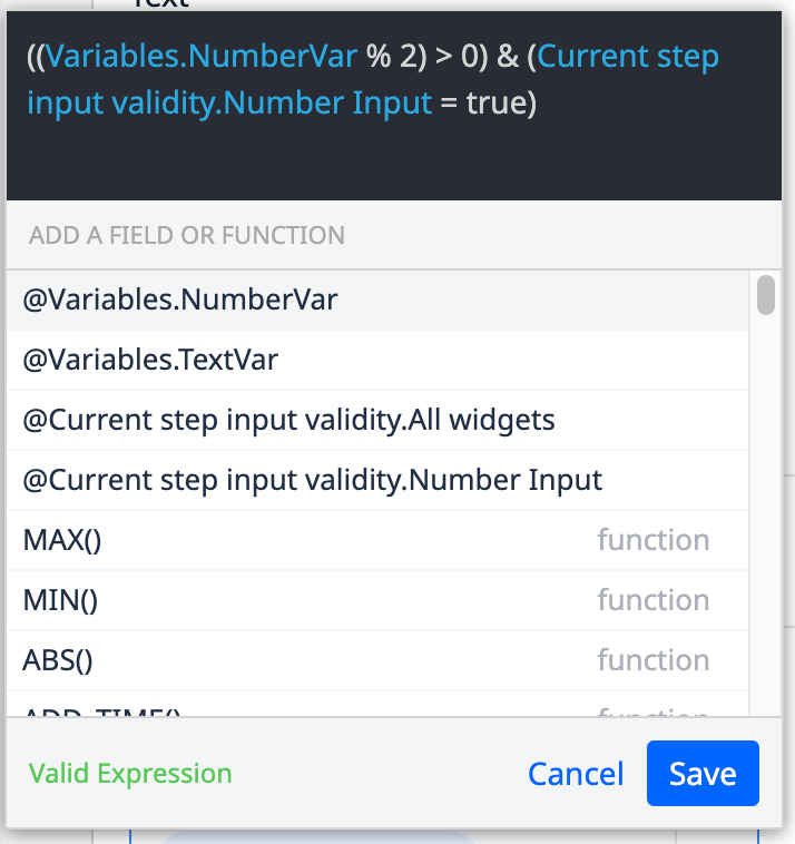
Example 2
Using expressions can also allow you to combine additional conditions together.
In the example below, for the button to be enabled the value must be odd and meet the validation conditions set on the number input widget.
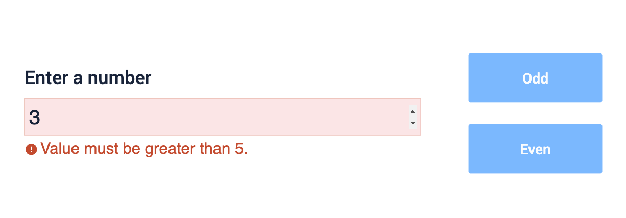
The input value below results in the button being disabled. Even though the value entered is odd, it doesn’t meet the input widget validation rules.
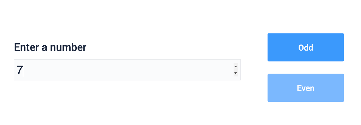
The input value below results in the button being enabled, because the value entered is both odd and meets the input widget validation rules.
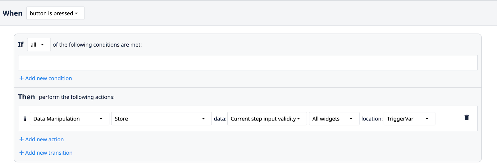
Input Widget Validation in Triggers
You can use input widget validation as part of an If condition in a Trigger. This allows app builders to quickly create logic that is not dependent on the specific values entered by operators but on the validity of those values.
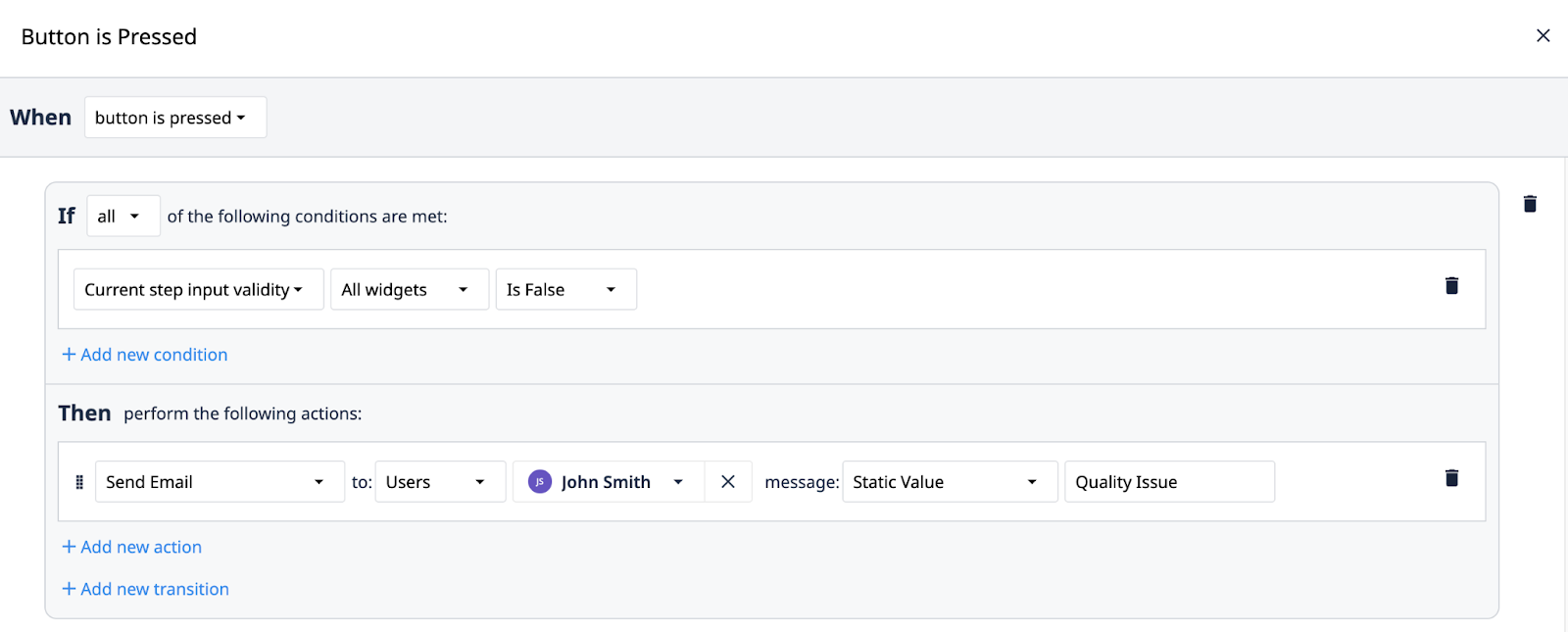
Widget validity information can also be stored into variables and Table Records using triggers.
Did you find what you were looking for?
You can also head to community.tulip.co to post your question or see if others have faced a similar question!