Here's the range of features within Tulip's Analytics Editor.
Overview
Tulip provides a centralized hub for all of your factory’s operational data.
When you collect a piece of data in Tulip, like...
- an operator’s completion data with a tablet,
- a stream of data from a CNC machine
- a connector reading from your MES/ERP system
This data is analyzed and shared using the Analytics Editor.
The Analytics Editor has powerful statistical tools to help you understand and analyze the data collected with Tulip.
The Analytics Editor is designed similar to business intelligence (BI) systems like Tableau, Spotfire, and even Excel, so you’ll find Tulip Analytics easy and intuitive to use. To get started, we recommend you becomes acquainted with what Analytics can do here.
We believe that data is most useful when you can share your insights with the rest of your company in a convenient and secure way.
Tulip allows you to do this by creating Dashboards and sharing them with your colleagues.
You can also export your data to other systems besides Tulip, by means of exporting to CSV or through a connector function mid-way through an app.
Before using the Analytics Editor, you should plan out which analyses you need. Some common ways to narrow the focus of your analysis:
Step 1: What problem are you trying to solve with this app?
Step 2: What metrics will determine success or failure of solving those problems?
Step 3: Which data points are being collected by the app that will allow you to track these metrics? Are these stored in custom variables, table records or default app fields like user, station etc.?
For a more detailed guide on planning out your analyses, check out our guide to building a shop floor dashboard
The Tulip Analytics Builder provides various options to customize the data used in an analysis. Different versions of the Side Pane are available for each template option
In general, the Apps, Date Range, and Filters fields will always be available. Fields such as X Axis, Y Axis, or Compare By are available depending on the template selected.
Create an analysis
To create a new analysis, you first need to have an app with user completion data, a Tulip Table with data, or a machine configured in Tulip.
With the Tulip Analytics Builder, you can create and share analyses or dashboards to analyze your factory’s performance.
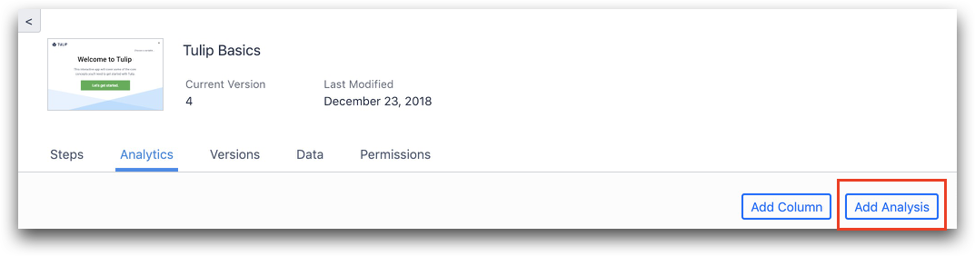
Click the Analytics tab, and select Add Analysis.
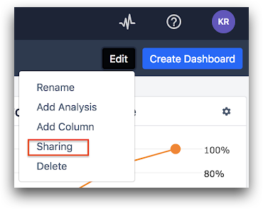
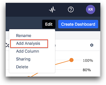
Alternatively, from a dashboard, click Edit then Add Analysis.
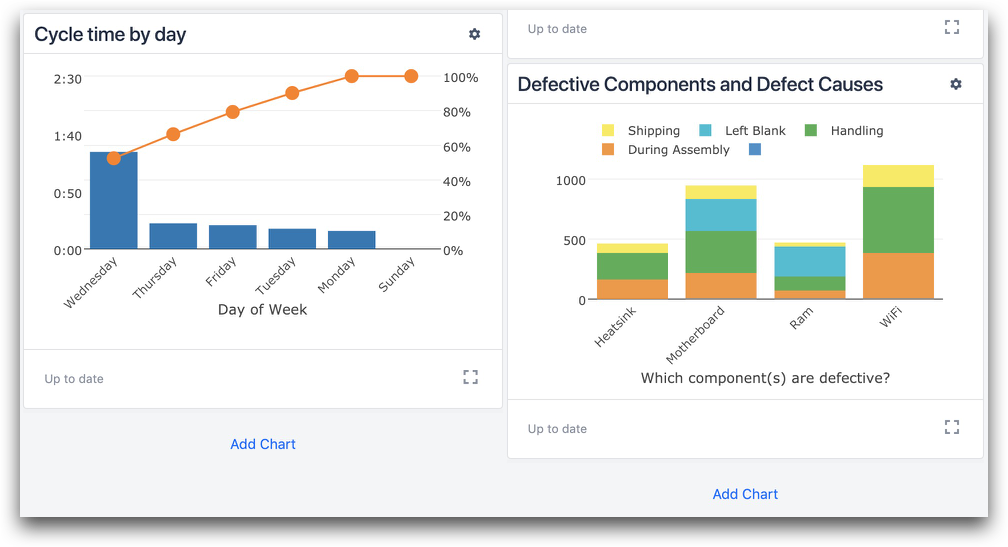
Or, click Add Chart at the bottom of any column.
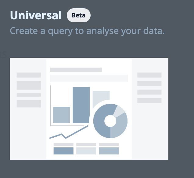
Once you have begun creating a new analysis, you will be prompted to select one of 7 different templates. The templates represent types of charts. The Universal Template provides the most customization.
Once you select a template you can select the display type.
Different analysis datasources have different display type options.
Edit an analysis
In general, the Apps, Date Range, and Filters fields will always be available. Fields such as X Axis, Y Axis, or Compare By are available depending on the template selected.
Datasource
The datasource field allows you to configure where your analysis will gather its data.
You might want to add multiple apps to an analysis if, for instance, you have an app for two different products, and you want to see your total production count today.
You can add or remove apps by selecting the Apps field and selecting the app you want to add from the list, or selecting the X next to the app you want to remove:
This is generally referred to as Cross-App Analysis and is a very powerful tool to create actionable insights by piecing together information from multiple apps.
Template-specific fields
The Universal Template uses groupings and operations.
Other templates group data differently, such as X Axis, Y Axis, or Compare By to select measurements and attributes to display on the graph’s axes or color the data points.
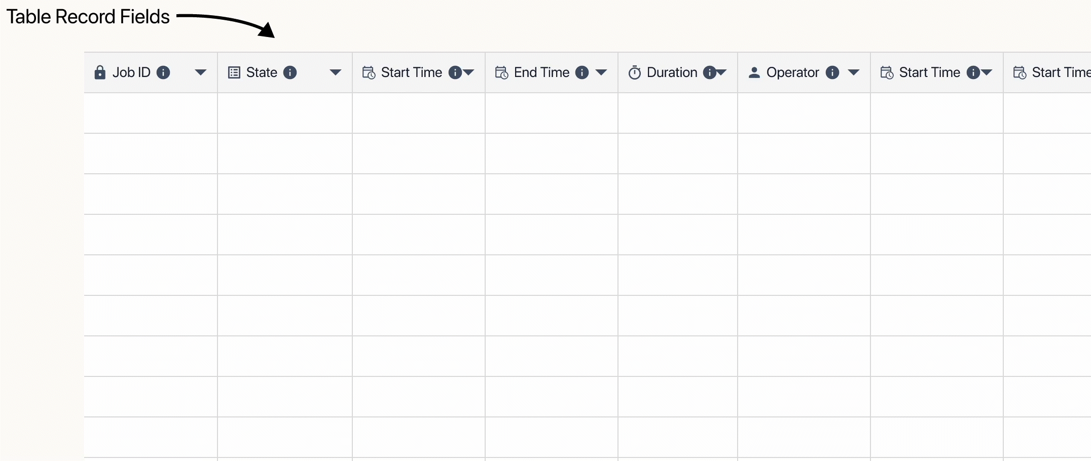
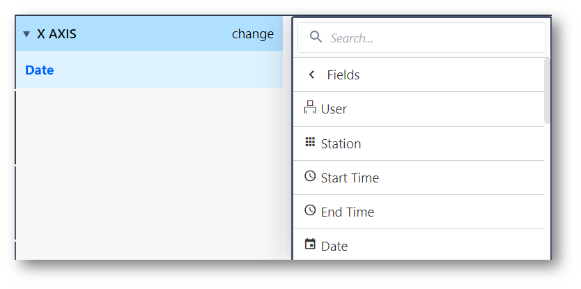
In general, these will present you with a list of your App’s Step times, form inputs, Variables, database records at time of completion as well as various pieces of metadata like User or Datetime:
For a list of fields for grouping data, see the heading: List of fields.
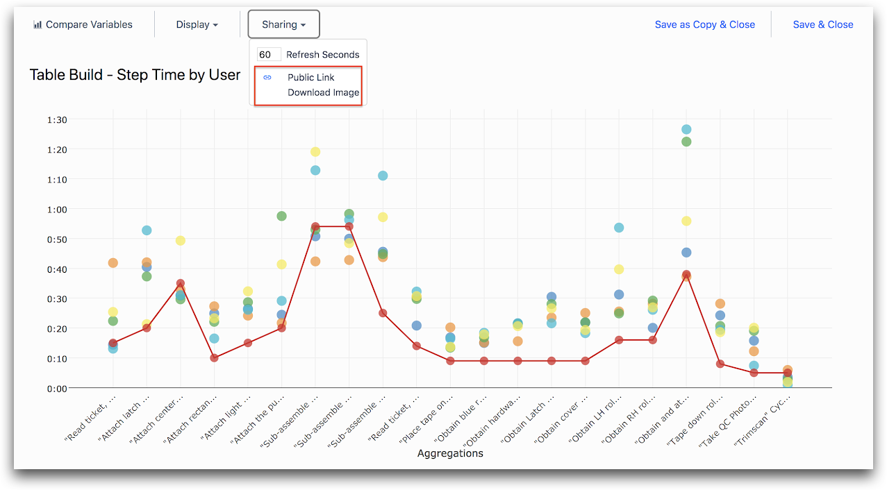
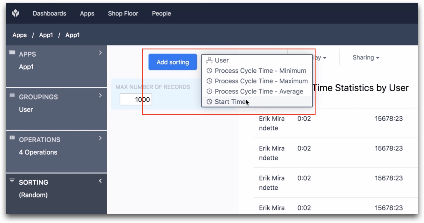
Sorting
Sorting is available in the Table and Scatter Plot analyses. You can sort by number, by date/time and alphabetically. You can combine this with limits on your data.
For example, if you want to see data for the 5 most recent completions of an app, you can set a limit of "5" and sort the data by date/time.
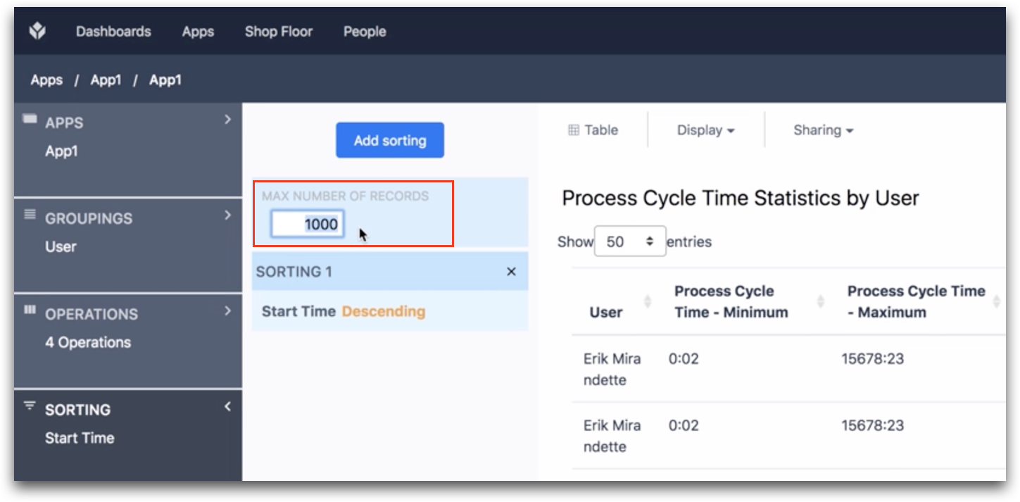
To choose the Variable that will determine the sorting, click the Add Sorting button and choose from the list. That variable must be already included in the Table. You can add variables to your table via the Operations field.
Date range
The Date Range context pane allows you to configure the date range for your analysis. You can select options for a relative range (like “past 5 days”), a fixed date range (“from September 1 2017 to October 5 2017”), a range that ends at a fixed date (“before September 1 2017”), a range that starts at a fixed date (“after September 1 2017”), and all time.
There are three types of date ranges in the Analytics Editor:
Calendar Ranges
Calendar ranges account for time easily in reference to the current date and time.
-
Today: A range of time referring to the current day. This range will pull the data from midnight (12:00 AM or 0000) to the current time of day (based on the Completion date, date created, or date updated).
-
Yesterday: The previous day of data (based on the Completion date, date created, or date updated). This will reference from the previous day's beginning to end (midnight-midnight).
-
Current Hour: Data between the current time to the last hour. For example, if it is 12:18, the analysis will display the past 18 minutes of data.
-
Current Week: Data between the current time and the very start of the week (Monday at Midnight).
-
Current Month: Data between the beginning of the current month and the current day and time. (based on the Completion date, date created, or date updated)
-
Last 60 Minutes: Rolling data from the past hour.
-
Last 7 days: Rolling data from the last 7 days from the current date and time.
-
Last 30 Days: Data from the past 30 days relative to the current date and time.
Fixed ranges
Fixed ranges create a range based around an unchanging time frame. This range is ideal if you're interested about a specfic time period (ex: 2023, the month of June, etc.)
-
Fixed: Date Range: Select the beginning and end of the range you are interested in viewing. For example, data between the beginning of the day on 12/05/2019, and the end of the day on 12/09/2019.
-
Fixed: All Dates Before: Select and filter data before the selected date. For example, all data prior to 12/09/2019.
-
Fixed: All Dates After: Select and filter data after the selected date.
There is also a Filter option to view only the data set by the Week Number that the completion was logged.
Relative ranges
Relative ranges create a range that moves with time. These ranges are useful if you want a time range that isn't included in the calendar ranges. They are also useful for ranges that are relative to a different time frame. For example, a time range between 30 days ago and 15 days ago.
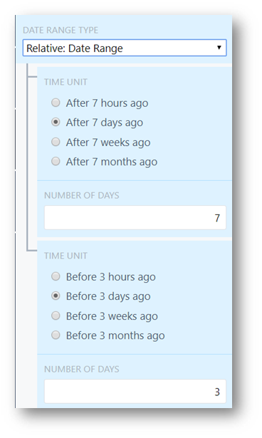
- Relative: Date Range: Set the amount of time the analysis checks for, as well as the time relative to the current day. For example, data in the range between 7 days ago, and 3 days ago. You can expand this to check the previous month (between 60 days ago and 30 days ago) for example, which shifts as time progresses.
It is important to note that hours are also an available setting, opening up the possibility for the past 24 hours, or any time period that may be important but not included in other ranges.
-
Relative: All Dates Before: Shift the data as time progresses, unlike the fixed option. For example, display data from the past 3 days, relative to the current day.
-
Relative: All Dates After: Only display data from after X hours/days/weeks/months. For example, the analysis will only display data that has came in within the past 3 days, relative to the current day.
This range can also be useful to establish analyses for the past 7 days (1 week), or past 365 days (1 year).
All time
The All time option creates no date range and displays all data that has been collected.
Filters
The Filters context pane allows you to add conditions to the data set you are analyzing.
For example, you might filter your analysis to only show data for a few users, or to filter out outliers (ex: only show data when the process cycle time was greater than 5 minutes). You may add as many filters as you want.
List of fields for groupings and operations
Here is a list of the aggregation functions and fields available in the Analytics editor.
Aggregation functions
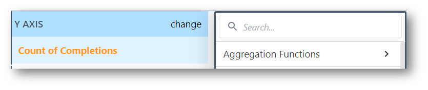
Aggregation functions marked with * can also be utilized in an expressions for more complex analyses.
| Aggregation function | Description |
|---|---|
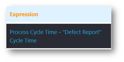
| Expression | Expressions allows use of the Expression Editor to write custom expressions. Learn about using the expression editor in analytics here. |
| Count of Completions* | A summation of all the Completions that have successfully run in a given app or apps with the selected criteria. If there is no set criteria, this will return the total number of completions. |
| Percent of Completions | Percentage of Completions that match a given criteria. |
| Percent Where True | Frequency that the given criteria is True. Often, this is a good place to check for FPY using a Boolean "Pass/Fail" Variable. |
| Percent Where False | Frequency that given criteria is False. The is the inverse Percent Where True. Percent Where False added to Percent Where True on the same data set should equal 100%. |
| Count Where True | Returns the total count of Completions that match a given criteria. |
| Count Where False | Returns the total count of datapoints that match a given criteria that is False. |
| Average* | Gives the average of a number Variable. |
| Median | Gives the median value of a number value. |
| Sum* | Provides the summation for a Variable. For more complex and conditional sum statements, SUM() can be used as a function in the Expression Editor. |
| Minimum* | Returns the minimum historical value of a given Variable or Table Record Field. |
| Maximum* | Returns the maximum historical value of a given variable or Table Record Field. |
| Mode | Returns the most frequent value of a given Variable or Table Record Field. |
| Standard Deviation | Returns the standard deviation of a number Variable or Expression, categorized by the X axis. |
| 95th Percentile | Returns the 95th percentile of a numerical data set. This value means that 95% of the values are below this number. |
| 5th Percentile | Returns the 5th percentile of a numerical data set. This value means that only 5% of the values are below this number. |
| Ratio | Returns the ratio of one number Variable or Expression to another. This takes in two number variables (or expressions), where the first acts as the numerator, and the second as the denominator. |
| Ratio Complement | Similar to ratio, but takes in two conditions of any type. These conditions may be set when one variable or field is equal to a given condition. It may also be a number variable or an expression. This also takes the first argument as a numerator, and the second as a denominator. |
Fields
Fields are best used as an X axis, or something to compare by in analyses.
Learn more about fields here.
Not all of this data is available for Table Data analyses. Each field used in sorting must be added to a column in your Table to be accessable in analyses.
| Fields | Description |
|---|---|
| User | The logged in user who Completed the app. |
| Badge ID | Similar to User, but gives the assigned Badge ID instead of the name. |
| Station | Which station the app completed at. |
| Start Time | When the app began working towards a completion. |
| End Time | When the app completed. |
| Week | Groups app completions by the week they completed. Useful for viewing aggregations on a week-by-week basis. |
| Month | Groups app completions by month. |
| Year | Groups app completions by year. |
| Shift Type | Categorizes data by the Shift Type worked. Only applicable to Enterprise Accounts. |
| Shift Duration | Displays or categorizes the duration of the Shift Type. Only applicable to Enterprise Accounts. |
| Is Working Day | Categorizes completions by the status of being a scheduled workday or not. Only applicable to Enterprise Accounts. |
| Day of Week | Categorizes completion data by the day of the week. This will aggregate matching days. For example, if given an All Time range, the analysis will stack all Monday values together. |
| Hour of Day | Categorizes completion data by hour of the day. Aggregates similarly to Day of Week. |
| Hour | Distills all data to the hour it was completed. This field gives all historical data by hour, and is not aggregated like Hour of Day. |
| Process Cycle Time | Displays the overall runtime of the App completion. |
| App | Categorizes data by which app the data came from. Applicable only to analyzing data from multiple apps. |
| App Version | Groups app data by the Version of the App ran to create the Completion. |
Table records
Here, you can select any table field that is used within the app in the analysis. For more detailed information, check out this article on Table Analyses.
App variables
A list of all app Variables used within the target app can be found here.
App steps
All Steps within the app are listed here, in the form of cycle time spent on the steps.
Example 1: find the average time spent on a given step.
Example 2: filter out undesired step times from Process Cycle Time.
App forms
Provides a list of all the fields used within application form steps.
Form steps have been disabled for all new instances as of r234.
Functions
Functions vary slightly in each place used. The entries for variables and expressions may differ slightly when used in the X-axis, Y-axis, or Compare By fields. The following will outline what each function does.
| Functions | Description |
|---|---|
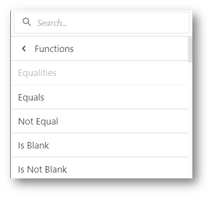
| Equals | Checks for equivalency between a Variable or Table Record Field or expression to a given state or value. |
| Not Equal | Checks that a Variable or Table Record Field or expression is not equivalent to a given state or value. |
| Is Blank | Checks for completions where the given variable is blank. |
| Is Not Blank | Checks for completions where the given variable has a value. |
| Not | Not acts as a modifier to use another Function. It will check for completions where the inverse of the given Function(s) is satisfied. |
| And | And is another modifier which allows for multiple Functions to be checked, and returns completions where both statements are satisfied. |
| Or | Or is a third modifier which allows for multiple functions, and returns completions where any of them are satisfied. |
| Greater Than | Checks that a numeric value is greater than a given value or expression. |
| Greater Than Or Equal To | Checks that a numeric value is greater than or equal to a given value or expression. |
| Less Than | Checks that a numeric value is less than a given value or expression. |
| Less Than or Equal To | Checks that a numeric value is less than or equal to a given value or expression. |
| In Last N Working Days | Checks completions that were in the previous N days. Working days are set on a default, unless defined by Schedules (Enterprise Accounts). |
| Bins | Allows binned separation of a numeric value. This allows a histogram to be made in any number of bucketed value ranges with a selected minimum and maximum range. |
| Link Fields | Returns the data of the first Variable or Table Record Field unless it is null. In that case, the second given variable is returned. |
| Length Of | On the X-axis, groups completions by the length of a variable in digits. On the Y axis, can be used with an aggregation function to check a given length. |
| Starts With | Checks that a Variable or Table Record Field begins with a given value. |
| Ends With | Checks that a Variable or Table Record Field ends with a given value. |
| Contains | Checks a Variable or Table Record Field contains a given value. |
| Is Exactly | Checks that a Variable or Table Record Field matches completely with a given value. |
| Is Not Exactly | Checks that a Variable or Table Record Field is anything other than a perfect match to a given value. |
| Contains All Of | Not yet released. Checks that the contents of a variable matches the given value anywhere. Example - Variable value 'ABCDE' contains all of 'BCD' |
| Does Not Contain All Of | Not yet released. Checks that a variable's contents do not match the given value anywhere. |
Did you find what you were looking for?
You can also head to community.tulip.co to post your question or see if others have faced a similar question!
.gif)