
A guide to the Universal Template and how to optimize your feature experience.
The Universal Template is a single experience to build analyses seamlessly. It allows you to switch between visualization types by decoupling query and visualization of the data. The Universal Template supports all analysis types and Tulip data sources (Completions, Table data, and Machine data).
Using Queries and Visualizations
The query is like an instruction you give the system detailing what you want it to do with your “raw” data from an App, a machine or in a Tulip Table. The query result is a tabular representation of data created by Tulip Analytics based on how you configured the query. You configure the query on the left side panel of the Analytics Editor.
You can visualize the data from that query with different visualizations, showing all or just selected parts of it. The visualization is selected on the top of the Analytics Editor and further configured in the right side panel of the Analytics Editor.
You can always see the query result below the visualization if you click on Show Query Result unless you have the “Table” visualization selected.
Query Building
Data Source
A data source is what the analysis is built on. You can choose from an app’s completion data, table data, or machine data.
If you are building an analysis for App Completion data, you can select multiple apps. This will make the analysis consider completion records from all selected Apps.
Note that if multiple Apps are selected, data will not be joined, but each completion will be treated as a separate row. This means you will be able to jointly analyze the "Fields" of the completions (e.g. User, Start Time and Station). Other data like App Variables will be treated separately for each App and have “null” as the value for the completion records of all other apps.
If you are building an analysis for machines, you can select one or multiple machine types. If you want to build an analysis for a specific machine, add an additional filter.
Groupings and Operations
Groupings and operations are the core areas of building your query. This is where you define which of your data options you want to show and in what form.
Groupings
Groupings give an instruction in order to combine the groups as much as possible. If you are familiar with the GROUP BY function in common QL and BI tools, the grouping process behaves nearly identically. Groupings determine the fields and types of data to find similar values. They enable you to get a more and more granular view of the data that you want to see.
Groupings give more control to define which rows should be combined. A grouping can be any Field of any type. Depending on which operations you have configured, adding one or multiple groupings will lead to different outcomes.
Let’s go through a few grouping combinations.
| One Grouping | Multiple Groupings | |
|---|---|---|
| Only Distinct Values | One row for each row in the source data showing the values for the grouping field and the distinct values for that row | One row for each row in the source data showing the values for the grouping fields and the distinct values for that row |
| Only Aggregations | One row for each distinct entry in the grouping field with that value for the grouping and the aggregated values of all rows from the source data with that grouping value | One row for each combination of the groupings fields distinct entries with the respective values for the groupings and the aggregated values of all rows from the source data with the respective grouping values |
| Distinct values and aggregations | One row for each row in the source data showing the values of the groupings and the distinct values and the aggregated values of all rows from the source data with that grouping value (i.e. the aggregated values are the same across all rows with the same grouping value) | One row for each row in the source data showing the values of the groupings and the aggregated values of all rows from the source data with the respective grouping values (i.e. the aggregated values are the same across all rows with the same grouping values) |
It’s important to note that data will only be shown if a row with any relevant information exists. If there is no data in the source data for a specific day, the analysis will appear blank.
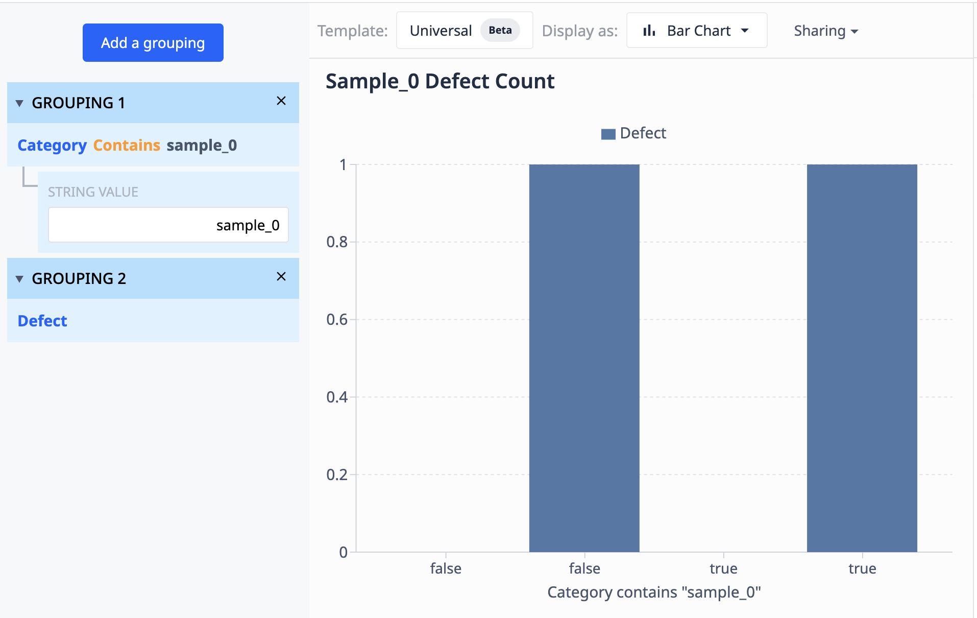
Let’s look at an example of how groupings work:
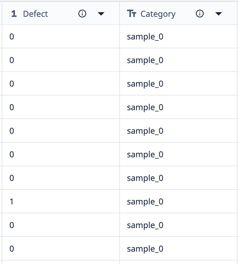
Data from this table shows that there are 10 records labeled “sample_0”. All but one of those sample_0 data points have no defects.
If we want to group this data into a visualization that only shows different sample_0 points where the defect count differs, we can use groupings to combine like data sets.
Operations
Operations can either be a single field or an Aggregation, which combines multiple records.
Operations come in two general categories:
- Distinct values
Distinct values represent individual data points from your source data. In the simplest case this is one value of a variable from a completion record, a field from a table, or a machine attribute.
But this can also be a more advanced data point, like the sum of two fields from the same record, a combination of multiple strings, or an expression that does not include an aggregation function.
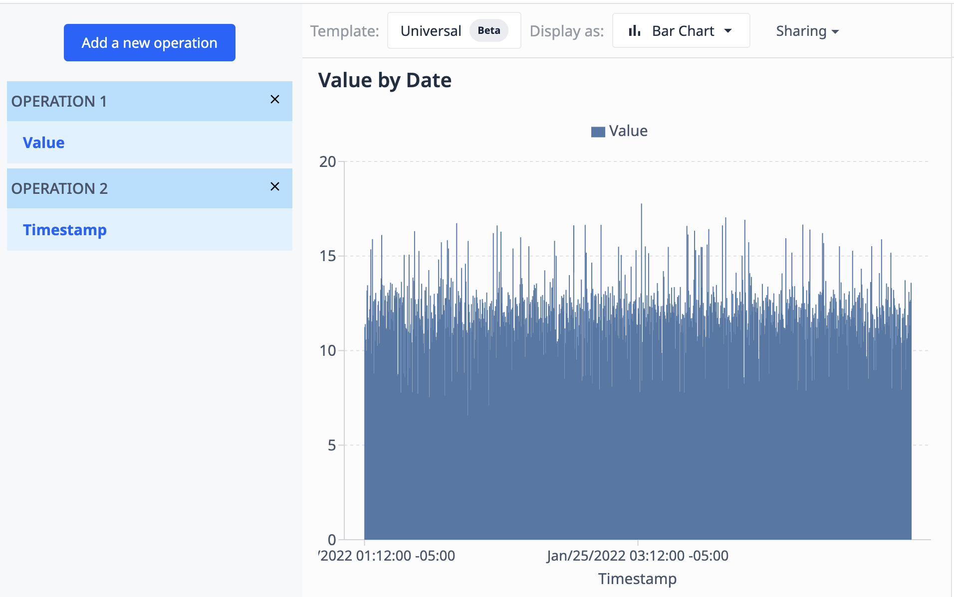
Using a table containing a field of values (numeric) and a field of timestamps (datetime), we can visualize the values by timestamp to appear as such:
- Aggregations
Aggregations are functions that take data from multiple rows and combine them based on set logic. There is a set of aggregation functions available as preconfigured selections, or you can also use aggregation functions within the expression editor to build your own advanced aggregations. Different aggregation functions work for different data types. See below which functions are available and which data types they support.
Directly Accessible Aggregation Functions
These allow the combining of rows:
- Average
- Median
- Sum
- Minimum
- Maximum
- Mode
- Standard Deviation
- 95th Percentile
- 5th Percentile
- Ratio
- Ratio Complement
Aggregation Functions Available in the Expression Editor
Aggregation functions in the expression editor can provide more granular data based on your specific requirements. For a complete guide to all the available expressions you can use in your analyses, see Full List of Expressions in the Analytics Editor.
Limit and Sorting
You can define the maximum number of rows that the query result contains by adding a limit. With limits, you can focus on specific data or cap the amount of data shown in a chart. For example, you can add a limit to show the three production lines which had the most defects in the past month.
The sorting data defines which rows are included when evaluating the limit. You can add ascending or descending sorting for any field that’s part of the query result. If you add multiple fields for sorting, the data will be sorted by the first one first. The resulting groups for each value of the first field will then be sorted by the second etc.
Note that if you do not define sorting explicitly, the sorting of your query result might vary based on the available data. When using limiting or charts with ordinal axes, this can lead to varying visualizations. We recommend adding an appropriate sorting in those cases.
The following example uses the graph we saw using Operations. Here, we limit the results to 100 data points and sort them in descending order based on their datetime.
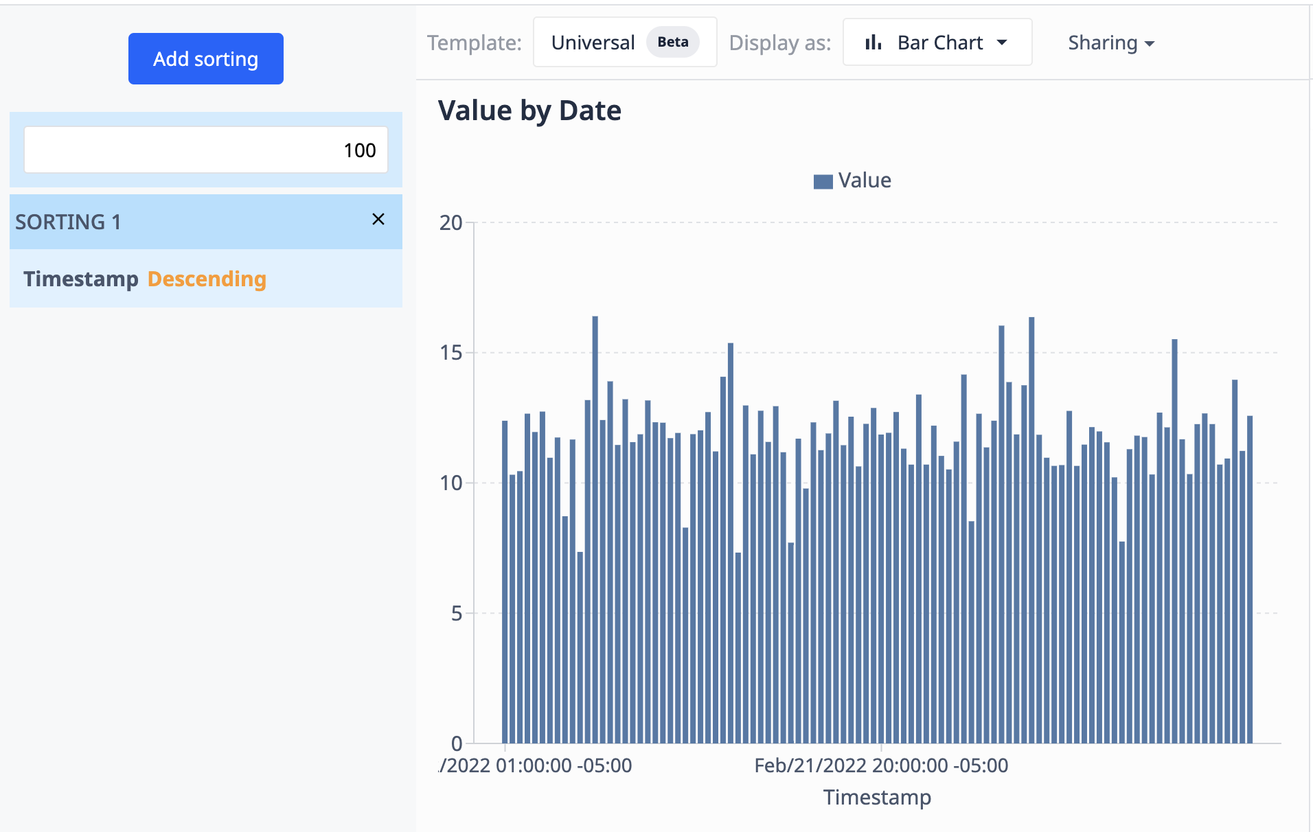
As the data source (the table) updates with new records, the visualization will only show the 100 most recent ones.
Date Range
The date range defines what data is included in the evaluation of the analysis. Think of this like a filter for a datetime value in the data set. The date range restricts the analysis to the data that is relevant for a specified period of time.
For performance reasons, we recommend using the shortest date range possible for your use case instead of adding additional filters later to narrow down the time.
The following datetime values are used for the Date Range for the various data sources:
- App Completion Data
- “Start Time” of the app Completion
- Table Date, user selectable
- Date Created
- Date Updated
- Machine Data
- Start Time of machine activity entry
Filters
Filters define which data to include in the query result.
Typical use cases include:
- Showing data for only a specific production line
- Excluding a specific machine from an analysis
- Showing only data points with a value higher than a specific threshold
Filters are configured like a condition. All data that fulfills the condition is included in the analysis. Let’s look at some examples:
-
Production Line equals A
- Will include all records that have “A” in the “Production Line” field
-
Machine ID does not equal “Machine 1”
- Will include all machines that are not equal to “Machine 1”
-
Testing Duration > 55
- Will include all records where the testing took longer than 55 seconds
Filters can be defined in two different ways:
- Using the preconfigured filter functions in combination with a field from your source data
- Configuring an expression that evaluates to a boolean.
Visualizations
When a new analysis is created using the Universal Template the Table visualization is selected by default. You can at any point switch to a different visualization type using the Display As setting at the top of the screen. The options in addition to “Table” are:
- Bar
- Line
- Scatter
- Histogram
- Donut
- Gauge
- Box
- Single Value
- Slideshow
- Pareto
Configuring a Visualization
For most visualization types you can freely select which fields of your query result you want to visualize in what way. This is done in the Data panel on the right side of the Analytics Editor. When switching to a different visualization for the first time, the configuration is empty. You can set up your visualization either manually in the Data panel or start with a suggestion by clicking the Start with suggestion button in the center of the screen.
The prerequisites for being able to configure a visualization are:
- There is data in your query result
- You have the right fields available for the visualization. For example, a bar chart requires at least one numeric field
If both of these requirements are not fulfilled, the Analytics Editor will show a warning message.
Data Panel Options
The following list gives an overview of the configuration options for the different visualization types:
Bar, Line, Scatter
- X Axis
- The field whose values should be shown on the X Axis
- Y Axis
- One or multiple numeric fields whose values should be shown on the Y Axis.
- Compare By
- The field used to show values as the same series in the chart
If you want to show multiple series, you can do so either by selecting multiple fields for the Y Axis or one field for the Y Axis and a field for Compare By. Combining multiple fields for the Y Axis and Compare By is not possible.
A “Compare field values” mode is available for these visualization types in the “...” menu of the X Axis setting. This allows to visualize numeric values of multiple fields side-by-side. When the option is turned on, the following options are available:
- X Axis
- The numeric fields to be compared
- Compare By
- The field used to show values as the same series in the chart
- Defaults to the row index of the data
Histogram
- Values
- The numeric field containing the values for which the histogram is shown
- This field should contain all values in an unaggregated fashion. The visualization takes care of calculating the histogram values.
- Compare By
- The field used to split the “Values” into multiple series, each shown as a separate histogram in the visualization
Donut
- Values
- The numeric fields containing the values to be visualized
- Labels
- The field used for the labels of the different donut segments. These will show up in the tooltip and the legend
- Defaults to the row index of the visualized data
Single value, Gauge
- Value
- The numeric fields containing the value to be visualized
Note: The value of the first row in the query result will be visualized. If your query returns multiple rows you can add sorting to change which value this is. We recommend to use the “Show query result” button on the bottom to check the data if you don’t see the expected value in the visualization.
Box
- X Axis
- The field whose values should be shown on the X Axis
- A separate “box” will be visualized for each value in this field
- Y Axis
- The numeric field containing the values to be visualized in the box plot is shown
- This field should contain all values in an unaggregated fashion. The visualization takes care of calculating the box values.
Pareto
- X Axis
- The field whose values should be shown on the X Axis
- Y Axis
- The numeric field whose values should be shown on the Y Axis.
The cumulative percentage line is automatically calculated in visualization.
Switching Between Visualization Types
When switching between any of the visualization types configured in the data panel, any compatible configuration is carried over. This minimizes the effort for switching and allows you to easily try out different visualization options for your data.
Table and Slideshow
The Table and Slideshow visualizations do not have a data panel and are automatically configured.
This Table shows all groupings and operations configured in the query. They are ordered in the sequence they appear in the query builder on the left.
The Slideshow shows all images that are in any image field in the query result as individual slides. Any additional fields configured in the query are shown in a table below the image.
Did you find what you were looking for?
You can also head to community.tulip.co to post your question or see if others have faced a similar question!
.gif)
.gif)