Learn how to toggle the data visualization in your analyses.
This article describes the various options that the Tulip Analytics Editor provides to customize the display options used for an analysis.
You may also wish to change the structure of the analysis, or change the data being displayed using the left-hand Context Pane.
How To Use the "Display" Dropdown in the Analytics Editor
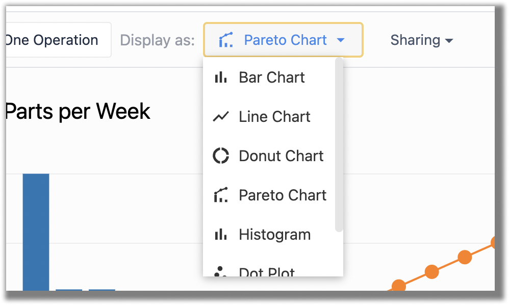
In general, you can open the Display dropdown from the Toolbar:
Not all display options will be available for every configuration of templates and data. The Analytics Editor will automatically display only the display options appropriate for the current analysis.
Visualization Types
Analyses can be configered many different visualization types, such as bar charts or line types. Each template has a different set of possible visualization types associated with it.
The display options dropdown will show you the chart types available for the analysis you have built. Below is a summary of the different chart types, and when they will be available. You can find more information about the different templates available here.
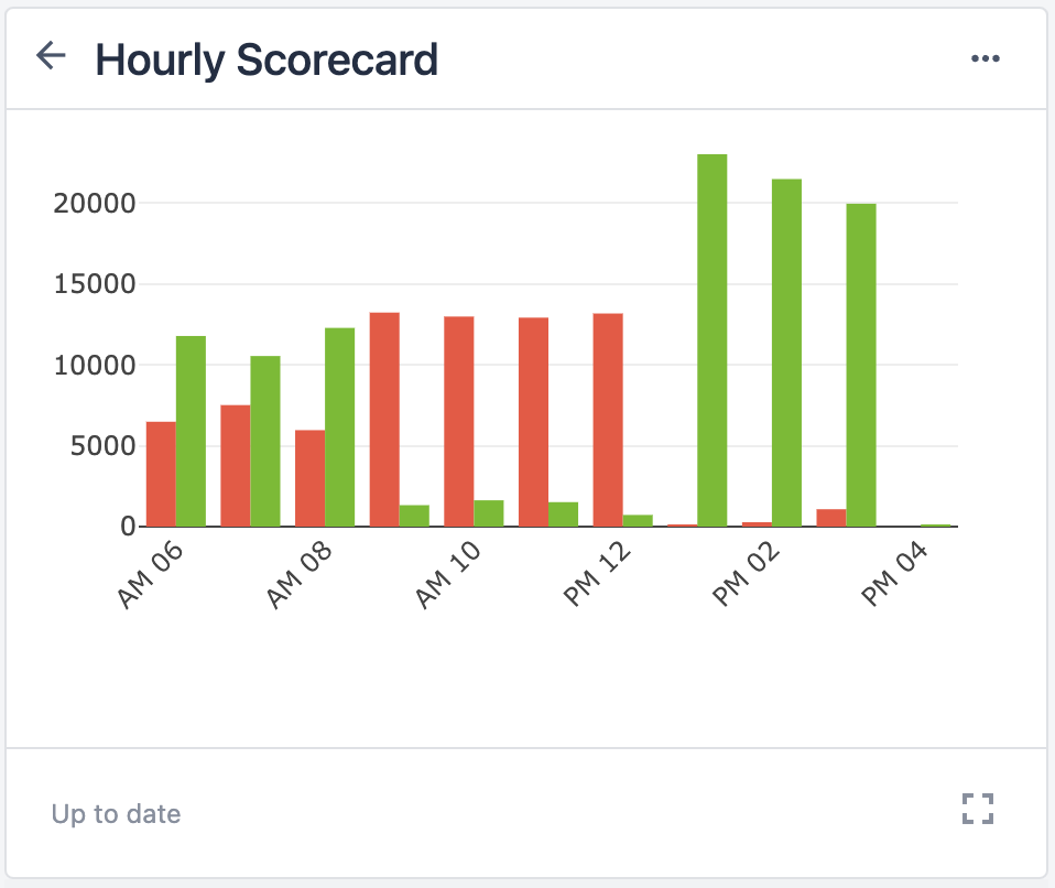
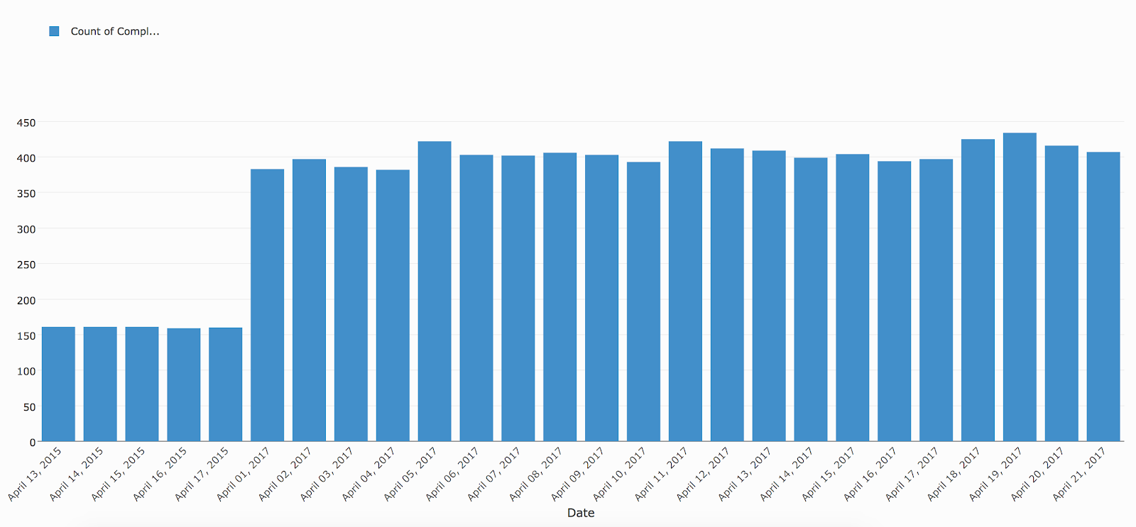
Bar Chart
Templates available for: One Operation (no comparison), Multiple Axes (one comparison), Universal Template
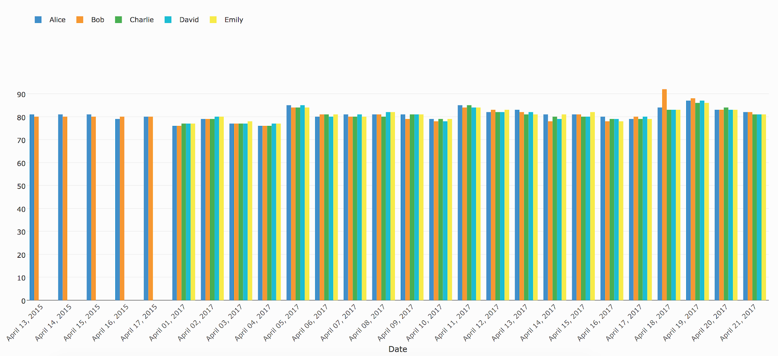
Grouped Bar Chart
Templates available for: One Operation (one comparison), Compare Variables, Multiple Axes (two comparisons), Universal Template
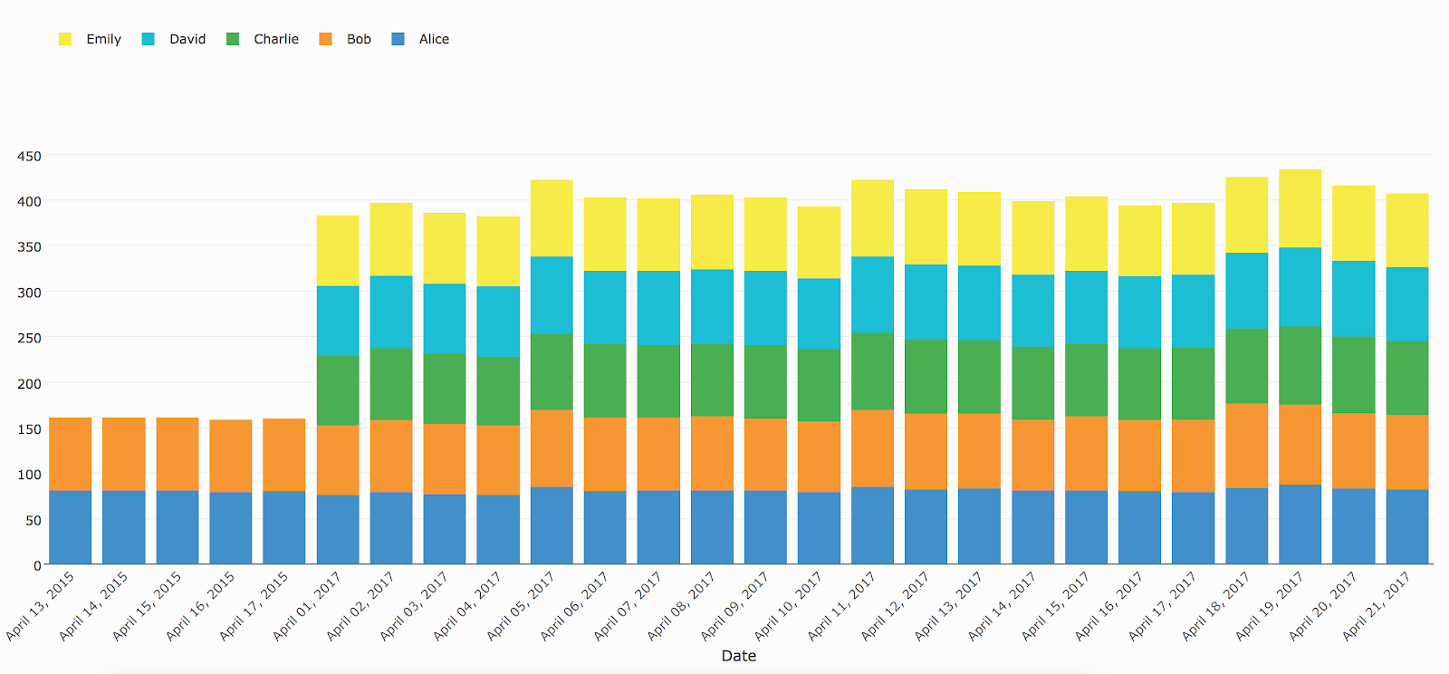
Stacked Bar Chart
Templates available for: One Operation (one comparison), Compare Variables, Multiple Axes (two comparisons), Universal Template
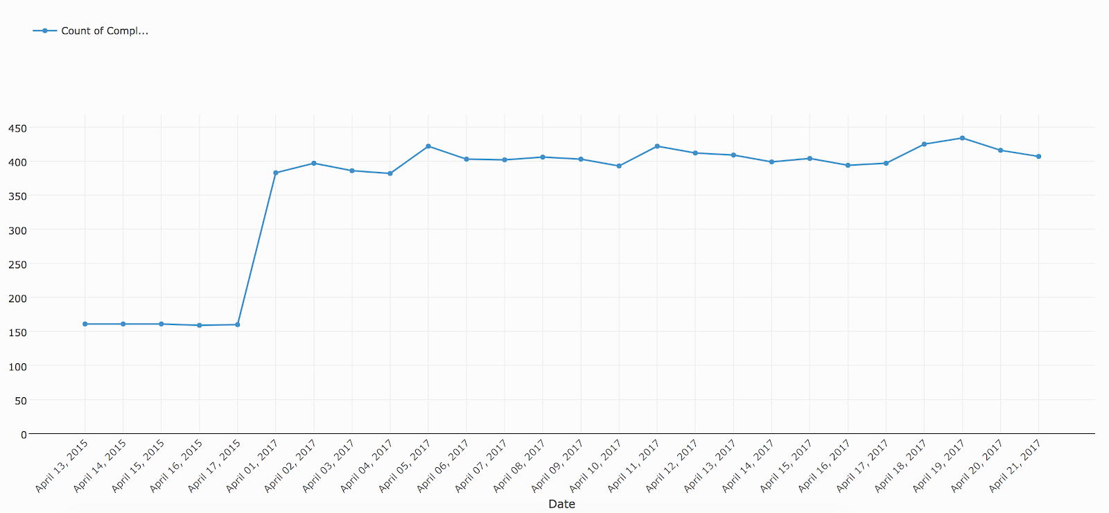
Line Chart
Templates available for: One Operation (no comparison), Multiple Axes (one comparison), Universal Template
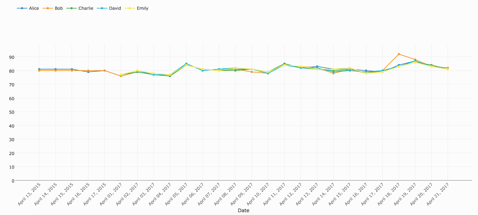
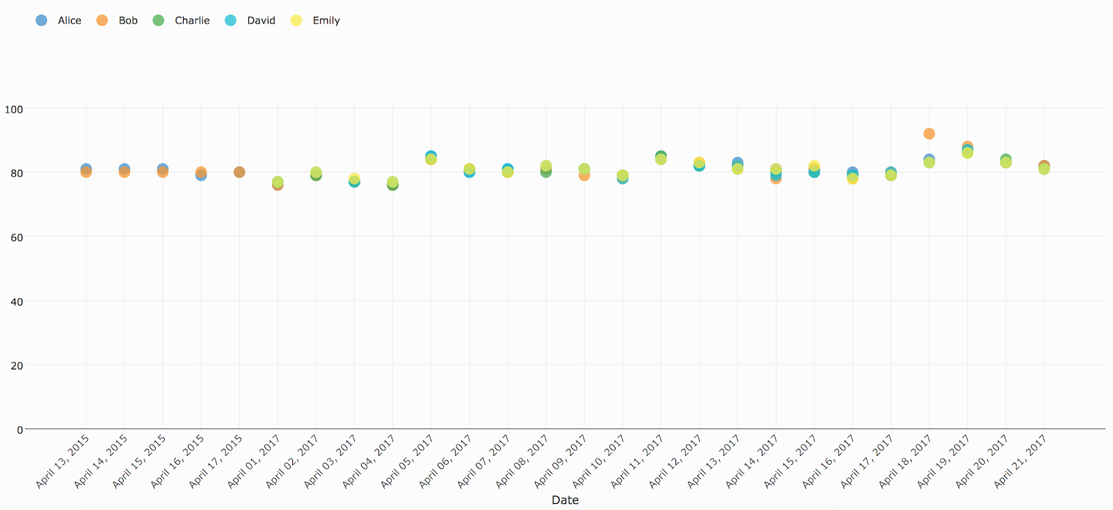
Multiseries Line Chart
Templates available for: One Operation (one comparison), Compare Variables, Multiple Axes (two comparisons), Universal Template
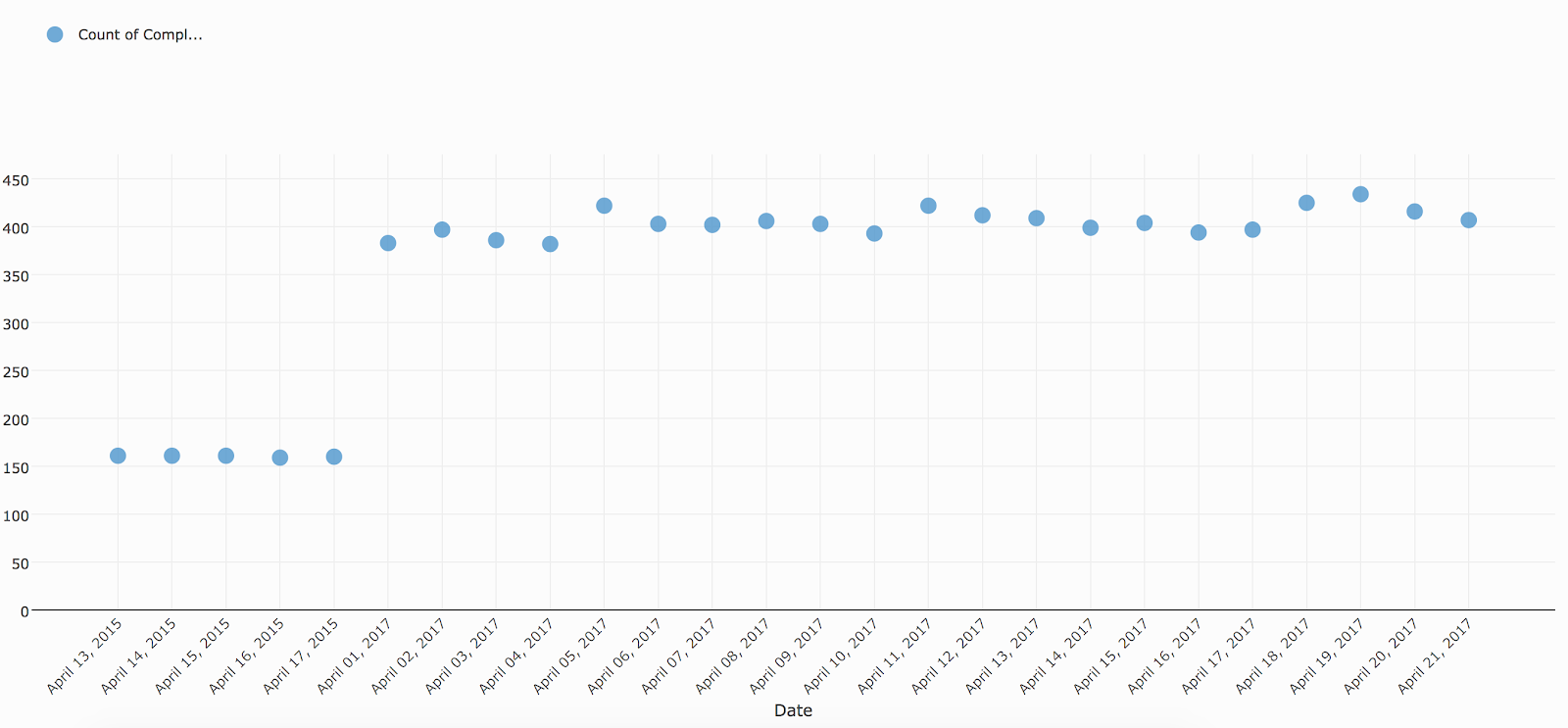
Dot Plot
Templates available for: One Operation (no comparison), Multiple Axes (one comparison), Universal Template
Grouped Dot Plot
Templates available for: One Operation (one comparison), Compare Variables, Multiple Axes (two comparisons), Universal Template
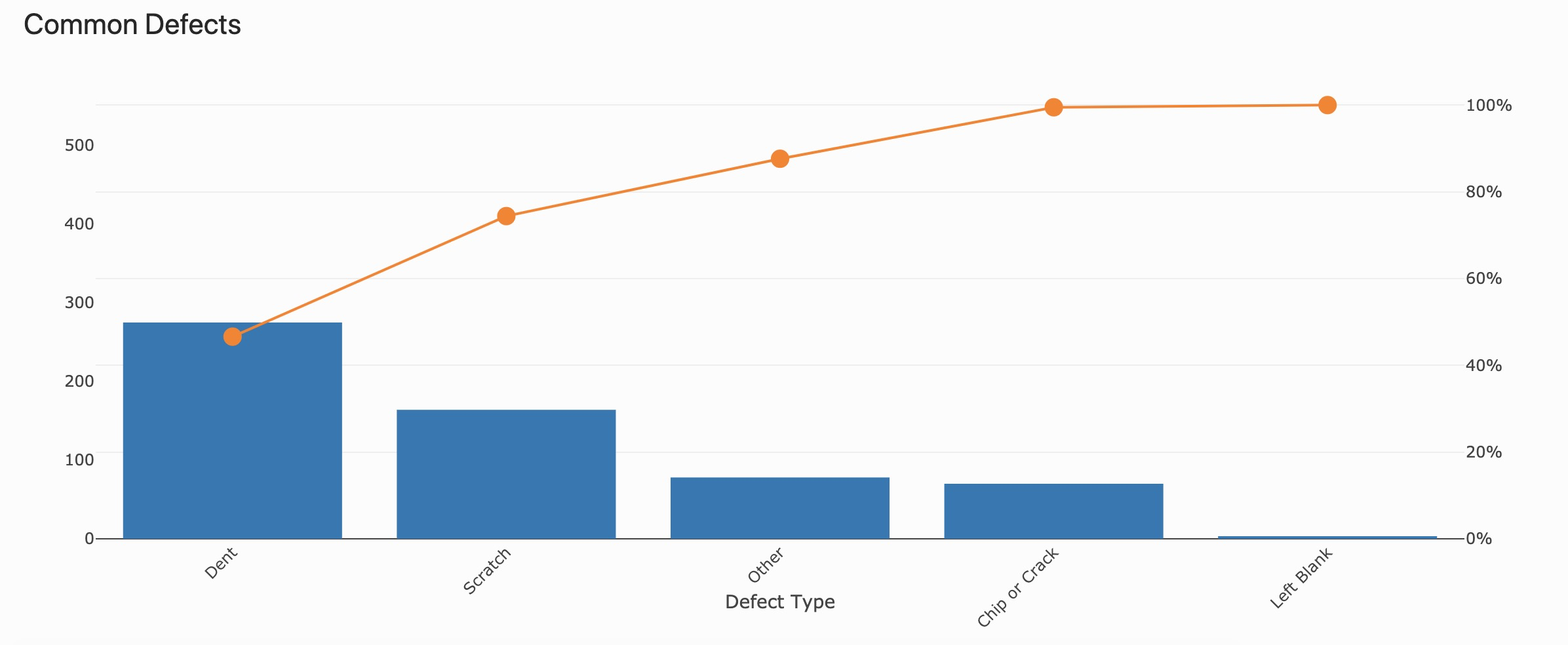
Pareto Chart
Templates available for: One Operation (no comparison), Multiple Axes (one comparison), Universal Template
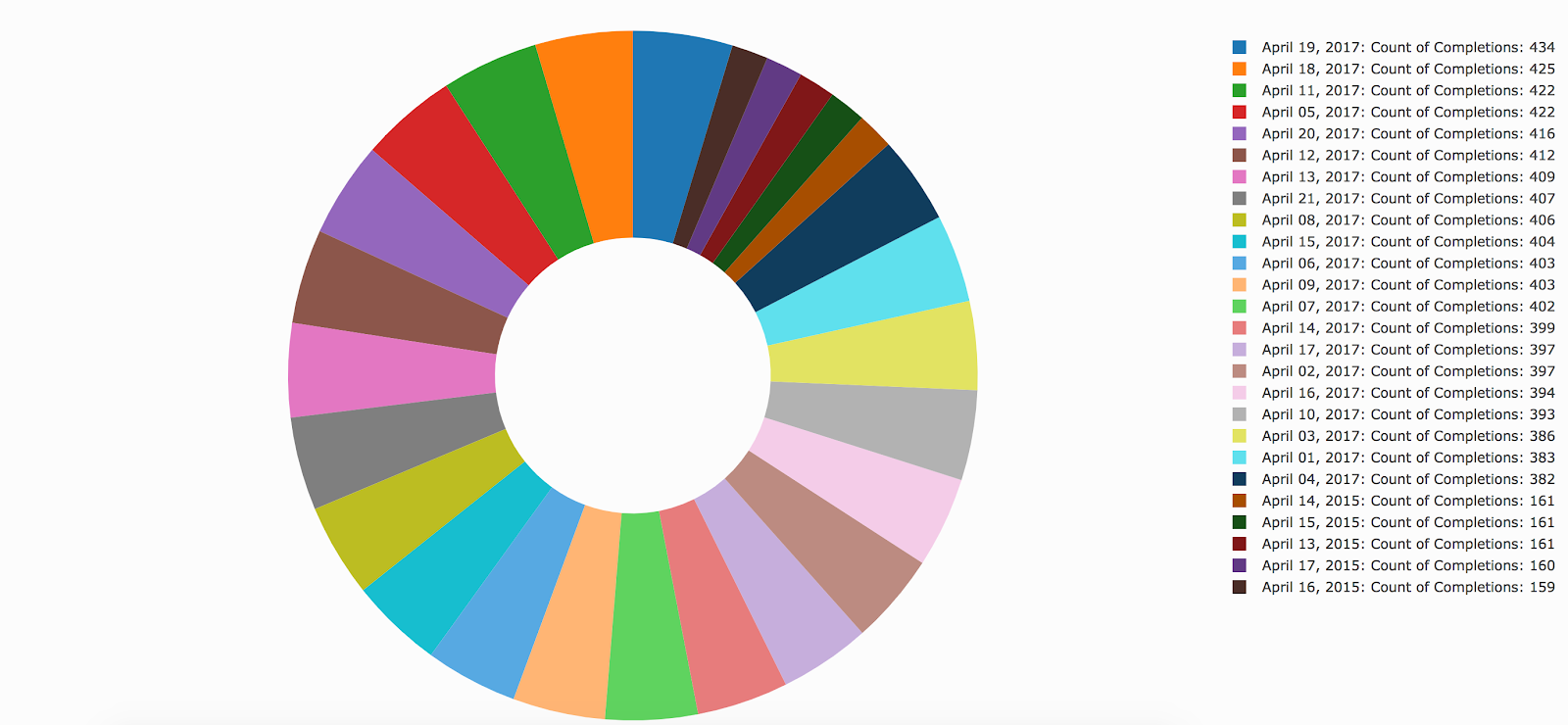
Donut Chart
Templates available for: One Operation (no comparison), Multiple Axes (one comparison), Universal Template
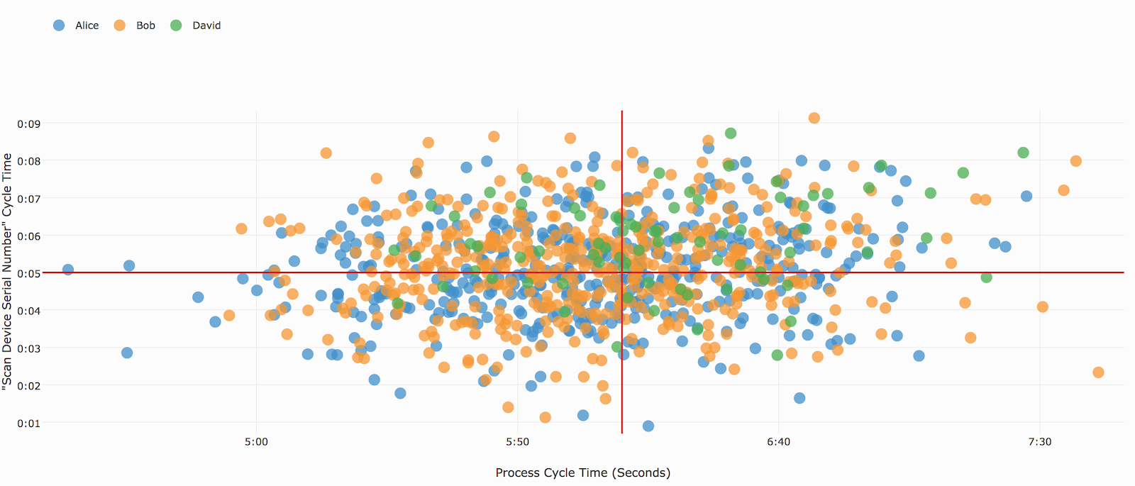
Scatter Plot
Templates available for: Universal Template
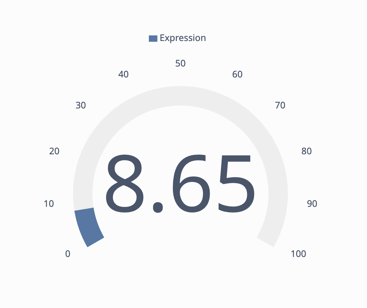
Gauge Chart
Templates available for: Universal Template
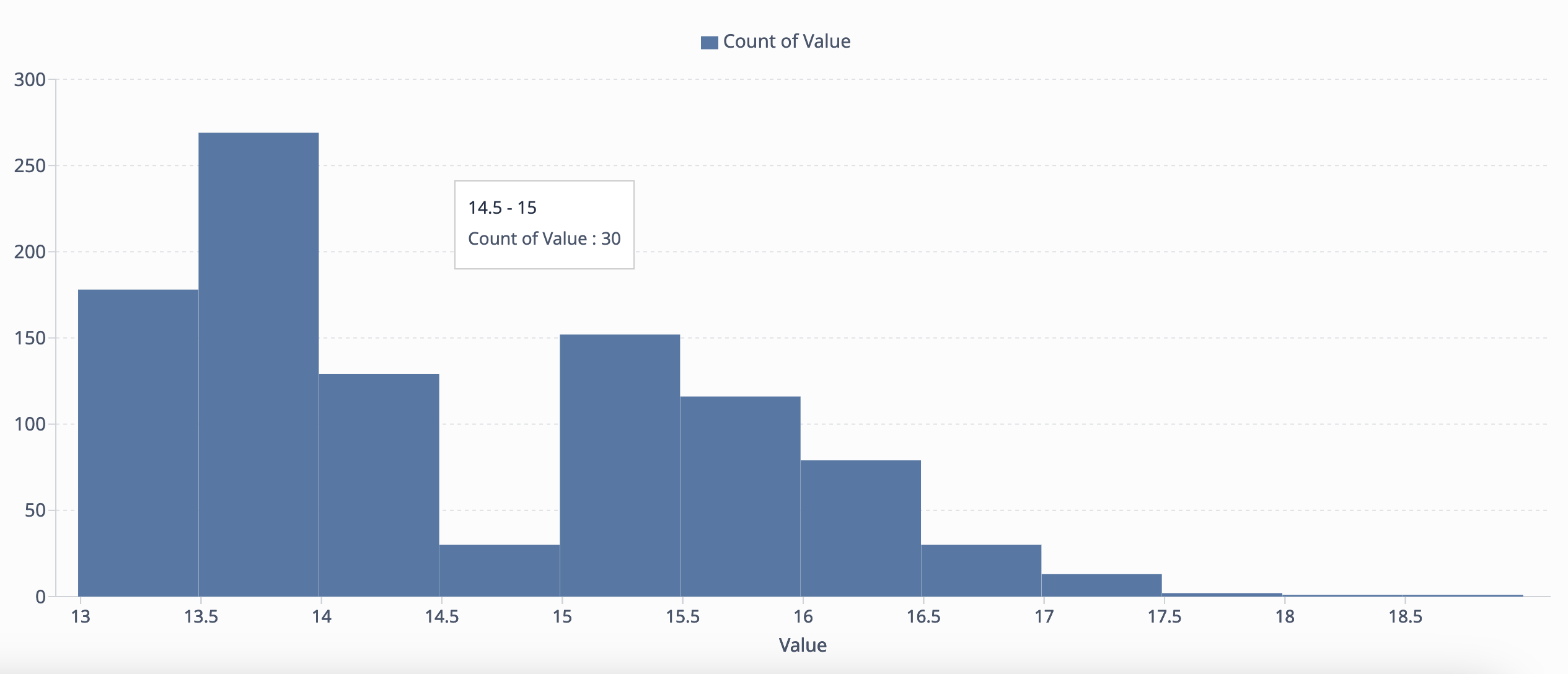
Histogram Chart
Templates available for: One operation, Universal Template
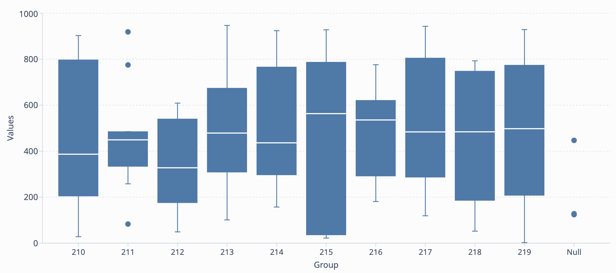
Box Plot
Template available for: Universal Template
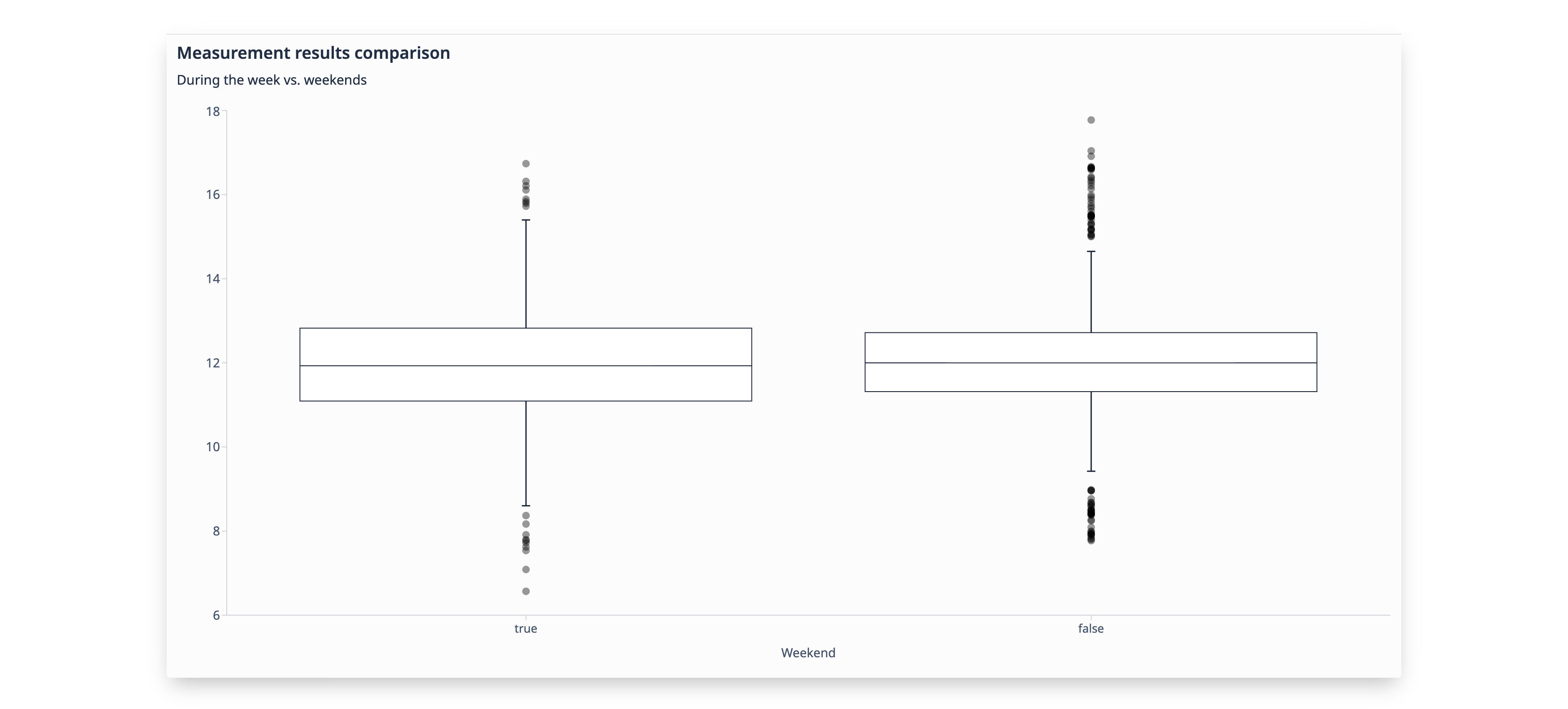
Multiseries Box Plot
Template available for: Universal Template
Formatting Charts
There are several options for formatting your charts. You can access these options by clicking the paint roller icon in the top right corner of the dashboard editing screen.
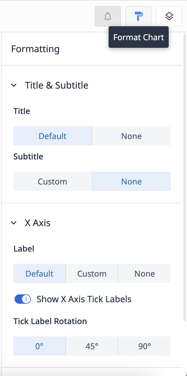
Title and Subtitle
Toggle the title of an analysis. Click on the analysis title at the top of the screen to change it.
You can also toggle a custom subtitle to add more context for other users.
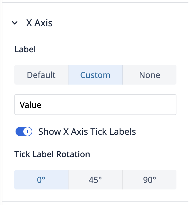
X Axis
Toggle the default X axis name, or create a custom name. You can also toggle the X axis tick labels and choose their orientation.
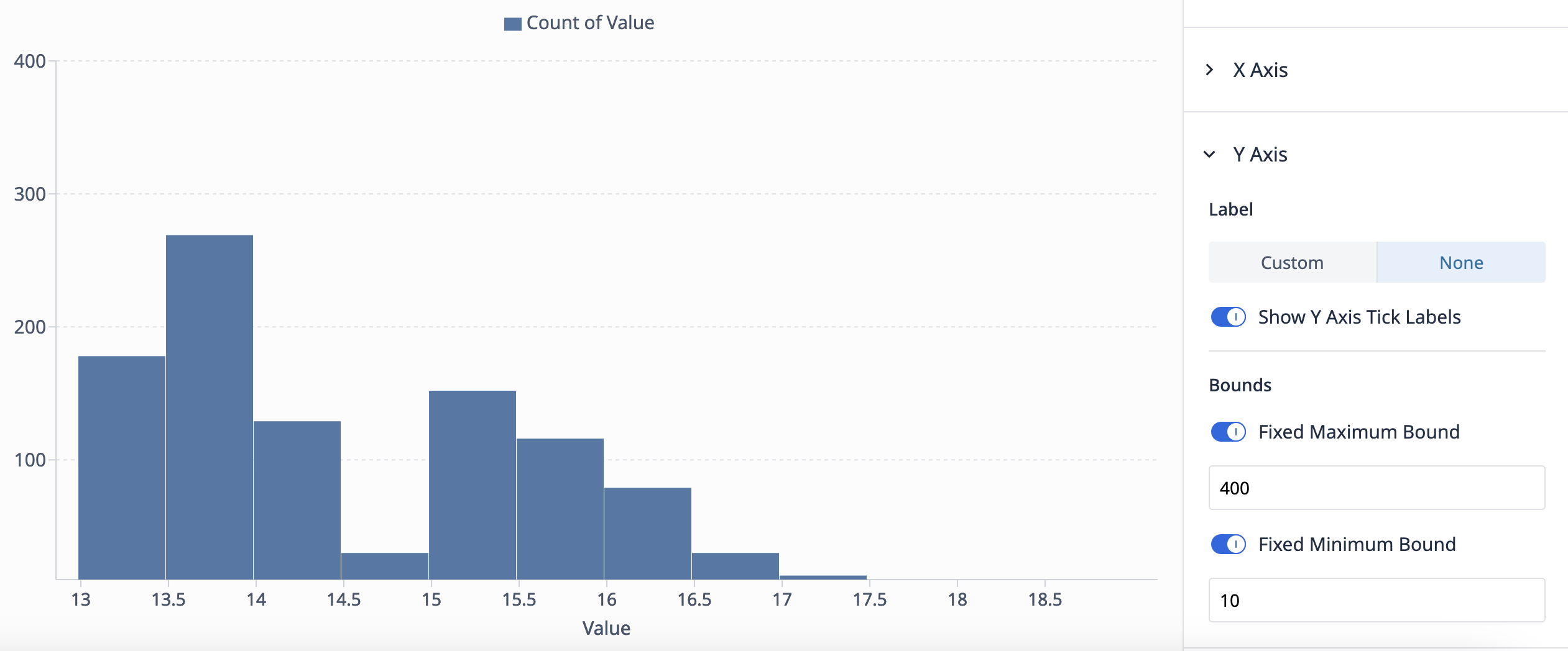
Y-Axis
Toggle the Y axis label and whether or not you want tick labels on the side of your analysis.
You can also set minimum and maximum bounds, the thresholds for data to appear on your analysis.
Series & Legends
Show legend
Toggle to view or hide the legend of the analysis.
Customize series
Set your own colors for each series in the chart.
Stacking
No stacking presents each series individually (ex. one bar represents each series)
Stacking presents a series as a contribution to a whole (ex. one bar combines mutliple series, each designated with different colors)
Data Labels
Toggle to view or hide data labels, which are numerical values of each series.
Did you find what you were looking for?
You can also head to community.tulip.co to post your question or see if others have faced a similar question!