What is a Widget?
- 30 Sep 2022
- 2 Minutes to read
- Contributors


- Print
What is a Widget?
- Updated on 30 Sep 2022
- 2 Minutes to read
- Contributors
- Print
Article summary
Did you find this summary helpful?
Thank you for your feedback
What is a Widget?
Enrich your applications with content for your users
NOTE
Not all widgets are available on all instances and subscription plans. Reach out to support@tulip.co to enquire about enabling additional widgets.
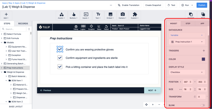
Widgets are the building blocks of apps. Widgets are used to display information for users, collect data from users, and execute trigger logic.
Dozens of widgets can be combined within an app to configure app steps to build an app interface that streamlines your process.
Types of Widgets
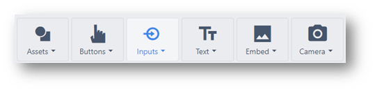
Button Widgets
A button that displays text and can trigger an action. The button widget is a blank widget that is completely user configurable. The Next/Previous/Menu/Complete widgets include default triggers to streamline app building.
Button - A completely configurable button that can trigger any logic
Previous - Go to the last step users were on.
Menu - Open the menu where users can change apps, change the app language, and log out
Next - Advance to the next app step.
Complete - Execute an app completion storing the value of app variables and go back to the app splash screen.
Read more about button widgets here.
Input Widgets
Collect data from your users with input widgets. Each input widget supports different types of variables.
Read more about input widgets here.
Text Widgets
Display static or dynamic text including the values of Variables, plain static text, and entire Record Placeholder.
Embedded Widgets
Embed video, CAD, Documents, and much much more into your application with embedded widgets.
Read more about embedded widgets here.
Camera Widgets
Display your Tulip Vision camera feed or scan barcodes with the device camera with camera widgets. More information on Tulip Vision can be found here.
Custom Widgets
When the default widgets don't perfectly fit your needs, custom widgets can be built to fill just about any use case. Combine HMTL, JavaScript, and CSS to extend the platform extensively.
Read more about custom widgets here.
Asset Widgets
Drag, drop, and resize vector images within your application to align your Tulip app with your brand.
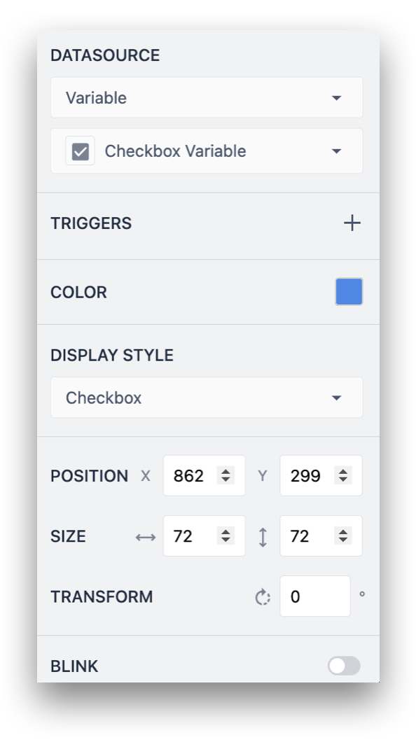
Configuring Widgets
Different widgets offer a plethora of configuration options. Selecting a widget will open its Side Pane. From this pane, both the form and function of the widget can be adjusted. Check out this document about configuring widgets.
Was this article helpful?