

How To Create Your First Shop Floor Dashboard
Learn how to build an interactive dashboard within Tulip’s App Editor
Tulip allows you to build two types of dashboards to visualize your progress towards hitting production goals:
- A desktop Dashboard, which is meant to be shared among Tulip administrators and executives via email or a live-streaming link
- A shop floor dashboard, which is meant to be accessible on TVs and touch screens on the production floor
A shop floor dashboard is popular for replacing paper charts and whiteboards on the floor. It allows any team member to visualize their work for the day.
It looks something like this:
But, before you can create one, you first need to plan out a group of manufacturing apps that will collect all the data. This can be a mentally exhausting exercise, because you need to think about apps for multiple roles on the production floor at once.
So, here’s an example of how one company created multiple types of apps that could collectively measure their shop floor KPIs using Tulip.
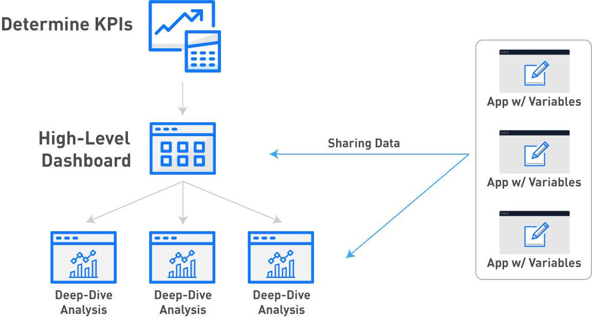
Here’s a quick summary of the process:
- Determine the KPIs that you would like to improve.
- Create one dashboard that covers all the high level metrics that will determine success
- Create an app for each station on your shop floor where work is being done that relates to one of the KPIs
- In those apps, create Variables that will track individual data points that will need to be aggregated
- Create individual Analyses that give a deeper look at each KPI with those variables from the app
- Include those analyses in the same app as the high-level dashboard in steps that give a deep-dive on each KPI
Here’s a quick diagram of the process:
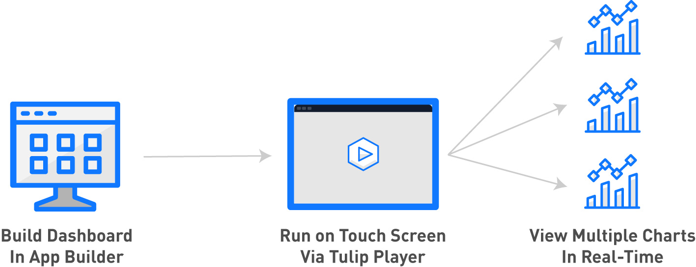
In Tulip, you can build shop floor dashboards in the App Editor to take advantage of all the interactive features of apps. Then, you can run the Tulip Player on a touch screen on the floor to allow any team member to dig into the metrics.
Here's a diagram of the process:
Note: In order to use this tutorial, you must understand the basics of Tulip’s App Editor and Analytics Builder.
Choosing Your KPIs
Before you get into building dashboards and manufacturing apps, choose the pain points that you need to address.
In this guide, we will use the example of a bicycle factory that has the following pain points:
- High defect rate: The first pass yield is too low, and the company is not sure of the root cause.
- No production visibility: Production data is not easily accessible because it is logged in paper sheets or never recorded, so cycle times for individual processes are unclear
- Machine uptime/downtime: Percentage of uptime is not recorded anywhere, so the team cannot set any benchmarks or goals
In order to address these pains, the bicycle factory has chosen to focus on:
- Rework/scrap rate: Learn which products and stations lead to rework or scrap
- Cycle time by product: Learn how long each SKU or work order spends at each station
- Percentage uptime by machine/station: Learn which machines/stations are causing a bottleneck or are being underutilized
Here’s the challenge: these KPIs are affected by multiple stations on the floor. So, process engineers must combine data from multiple apps to determine a root cause from several data sources (operator stations or machines on the floor).
Building a High-Level Dashboard
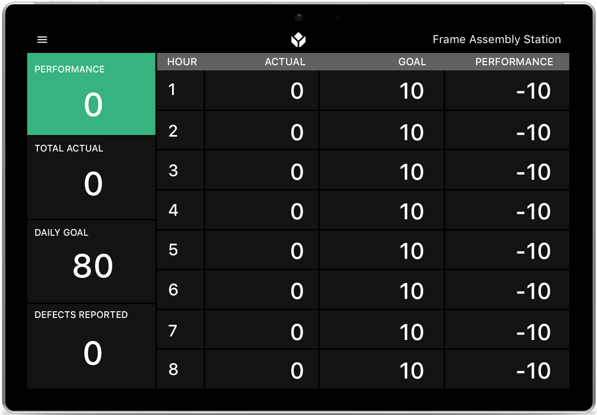
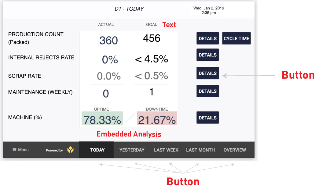
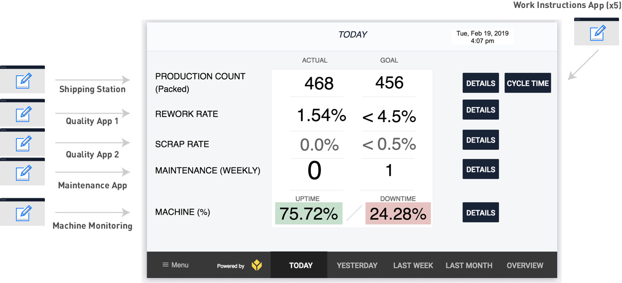
This is an example of a dashboard that would be presented on a touch screen on the shop floor to track the KPIs mentioned:
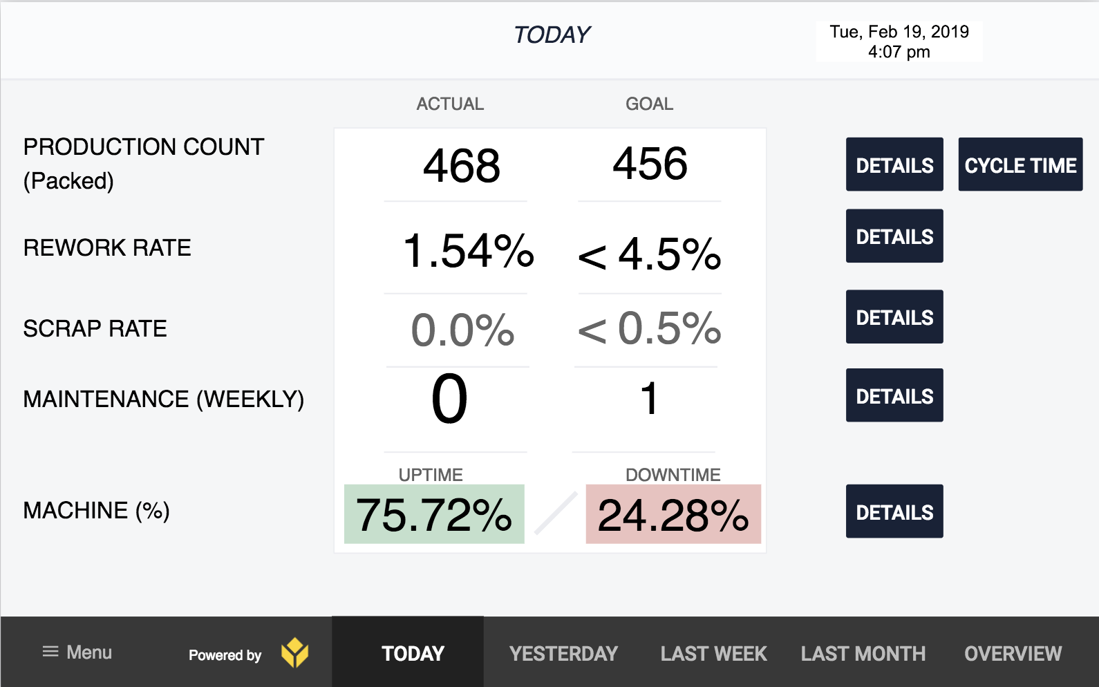
It covers each KPI that the bicycle factory needs to improve:
- “Production count” tracks the number of bicycles manufactured over the course of the day.
- “Rework Rate” tracks parts that need rework
- “Scrap rate” tracks the percentage of parts that must be thrown out
- “Maintenance (weekly)” tracks issues discovered during maintenance inspections
- “Machine %” tracks uptime and downtime for the most important machine on the floor
This shop floor dashboard allows operators and process engineers to do the following:
- See metrics across multiple date ranges: Today/Yesterday/Last Week etc.
- Compare real-time production data to goals
- Dig deeper into individual KPIs and see more granular metrics via the “Details” button
- See bottlenecks on the floor using the “Cycle Time” button
In this case, there are 5 separate stations on the bike-building manufacturing line, so “Cycle Time” will show a comparison of the cycle time for each of the 5 stations.
Here’s where this gets challenging: this dashboard is actually pulling data from 10 separate manufacturing apps.

We are going to go through each individual app and show how it collects data for this dashboard. Here are the different types of apps:
- The Work Instructions apps give a series of work instructions for the operator to complete their task. They track takt time each time the operator completes their work and hits the “Complete” button. These takt times are split up by individual SKUs, which the operator includes by scanning a barcode on each product. That SKU data is saved with each app completion via a variable.
- The packing station uses a headless app. This means that the app tracks data when an operator hits a button on the production line that is hooked up to a Tulip Edge Device. The operators do not interact with the app itself.
- Each quality app runs continuously on a tablet that is carried around by a quality specialist. Every time they inspect a part, they log their work on the tablet.
- The maintenance app runs on a tablet that is carried around by a maintenance technician. When the maintenance tech does their weekly rounds, they log any issues via the app. The issues are logged in form fields. This app just shows whether the rounds have been completed or not. When clicking on details, you can see what part of the weekly round was completed or not completed
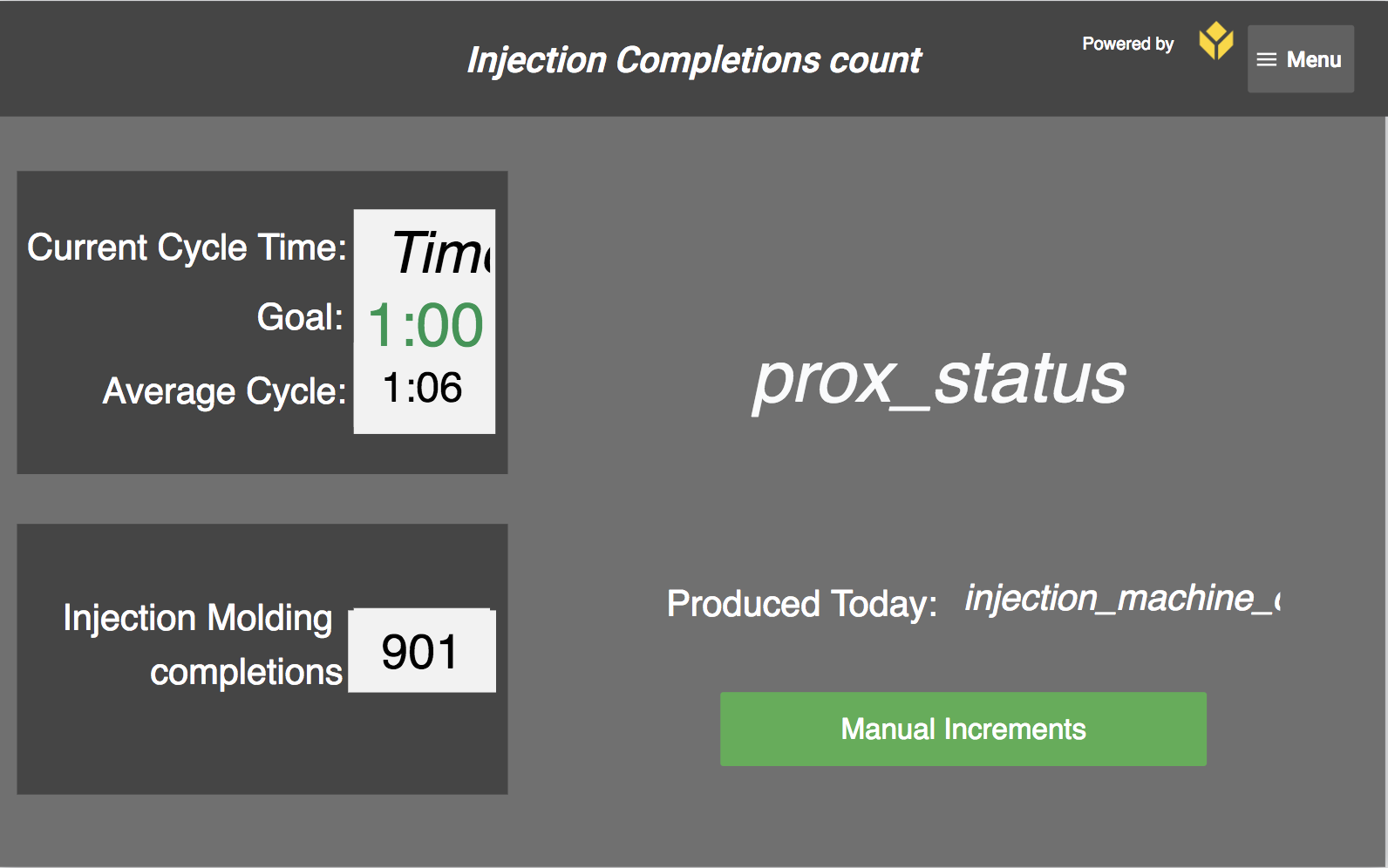
- The machine monitoring app is also a headless app. It is connected to a machine that has a pre-set cycle time of 30 seconds, at most. If it does not run during a 30-second timeframe during the workday, the app logs downtime. If it does, the app logs uptime. There is no interface for the operator. The machine is connected to Tulip via an OPC UA Connector.
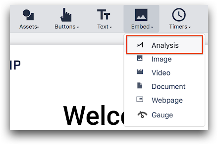
Here are the different features in Tulip that are needed to build this shop floor dashboard:
Each number in the “Goals” column is static text.
Each number in the “Actual” column is an embedded Analysis that uses the “Single Number” template. So, these Analyses were created in the Analytics Builder, and then added to the dashboard.
The buttons along the bottom of the dashboard send operators to a different step in the app. In order to create Analyses that are relevant for each date range, you must copy the Analysis, and use the Date Range field to change the time frame.
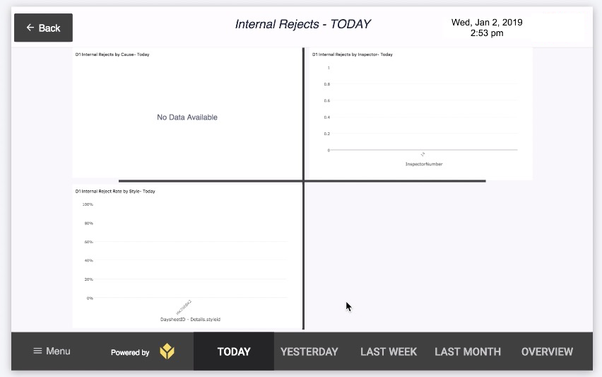
The buttons along the right side of the app direct operators to other steps within the app with more detailed analytics on each KPI. This example has 4 Analyses dedicated to investigating the rework rate:
Work Instructions App
If you want to know the cycle time for each bicycle, you need to start by adding up the takt times for each of the 4 assembly stations and the packaging station on the floor (in this example).
Your factory is building multiple types of bicycles, so you will also need to segment the data by SKU. This means you will need to have a variable in the app to track the SKU alongside the takt time for later analysis.
Your work instructions app might look something like this:
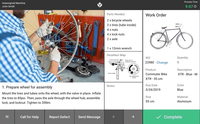
This app has a series of work instructions steps with a consistent design and relevant data about the SKU on each step. The operator can “complete” the app at any time, or press the “next” and “back” arrows to advance the instructions.
If each station uses a variation of this app, then it will be easy to combine the data together to see the cycle time via app completion data.
At the beginning of the app, you can require the operator to scan a barcode before they advance using a barcode scanner connected to the station tablet:
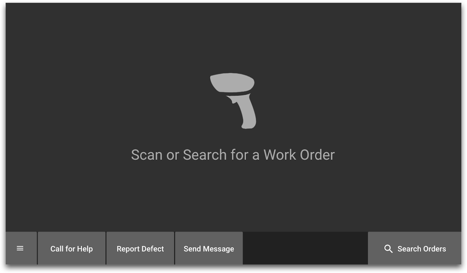
There are two ways that you can use this barcode data:
- If you just need the barcode number, you can save it in a variable.
- You can use a Connector function to bring in more data about the SKU from a SQL database or using an API to your MES or data record system. Then, you can save that data in variables
Here is an example of how you might use the Trigger Editor to call a connector function after a barcode scan:
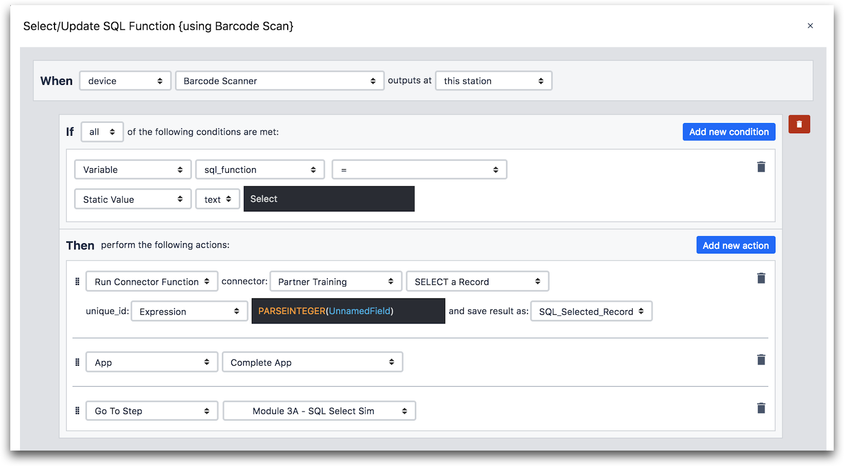
Here is more detail on the “Then” statement:
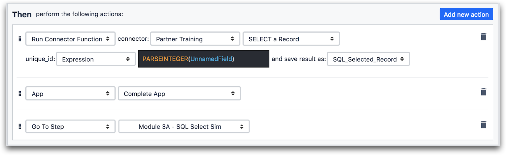
So here is the sequence of events in the work instructions apps:
- App begins
- Operator scans a barcode
- Upon barcode scan, a Connector function runs and retrieves data relevant to the SKU
- Operator completes app, barcode data is tied to that app completion
Here’s a diagram of all the apps working together.
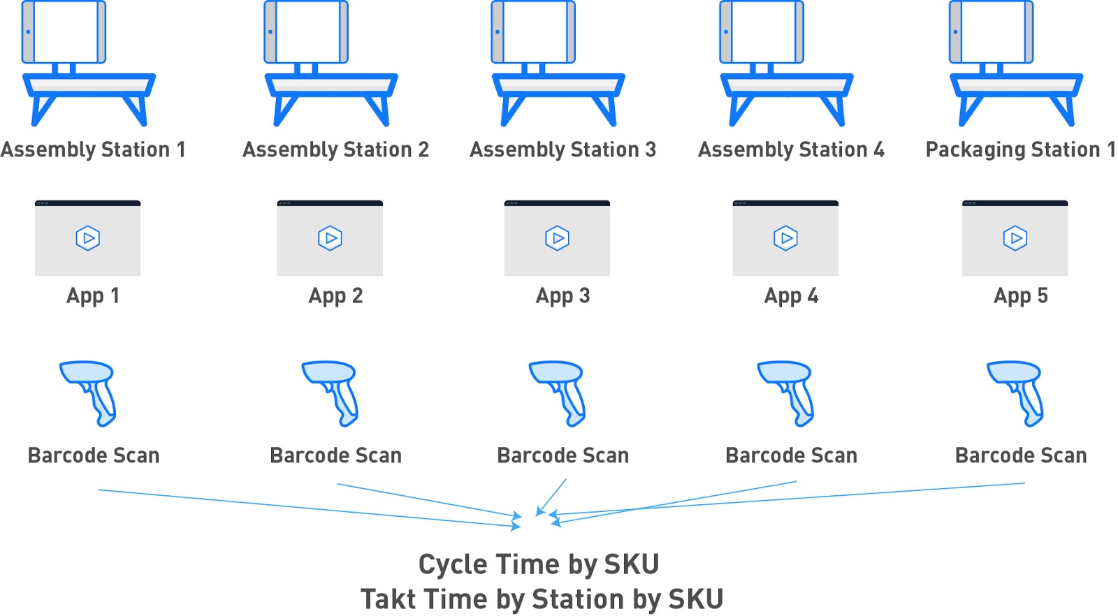
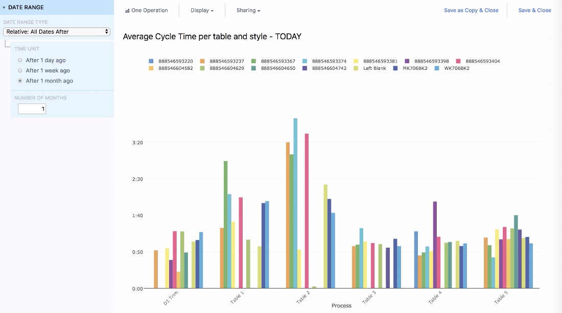
Then, you can add all 5 stations into the same Analysis, and split up the results from each station by SKU to see which stations are slowing down the line. This is a “deep dive analysis”, so it would appear on a dashboard that would be shown to the operator when they press the “Cycle Time” button.
Further Reading
Shipping Station App
In your bicycle factory, you ship containers with 6 bicycles apiece. You have one station dedicated to packing boxes.
In this case, operators do not need any instructions to do their jobs. But, you still want to track when each case leaves the factory.
So, you need to create a “headless app”. That means that there is no human interface. Instead, the app is hooked up to a button that the operator presses when the case has been packed. This button is connected to a Tulip Edge Device, which communicates every button press to Tulip.
Every time the button is pressed, you can increment your production count by 6.
Here’s an example of this one-step app that would run on a display at the shipping station:
Okay, the operator can TECHNICALLY use the app via the “Manual Increments” button. But, they would only need to do that if the physical button was broken for some reason.
Here’s how the data flows into the app.

You can connect this data to an MES or ERP upon app completion.
Analytics
There are no variables in this app, so the two data points you will collect upon app completion are:
- An updated production count
- Takt time for the station
This is pretty straightforward, so let’s look at ways to use this data across multiple date ranges.
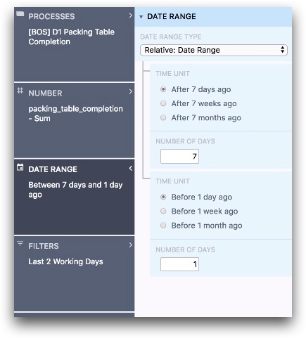
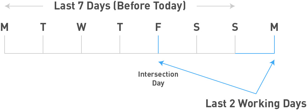
Let’s imagine that your bicycle factory only runs on weekdays. And, when you come into work on Monday morning, you don’t want to see a blank dashboard for data besides “today”. Instead, if you wanted to see data from “yesterday”, you would really want to see data from Friday.
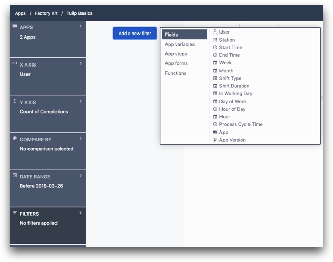
Here’s how to accomplish that in the Analytics Builder. First, set the date range from “After 7 days ago” to “Before 1 day ago”. That will give you the last 6 days leading up to today.
Then, use the Filters field to select the “Last 2 Working Days”. That cover today as well as the last working day before today.
The intersection of these two fields will give you “Yesterday”.
Here’s what it looks like in the Analytics Builder:
And here is a timeline view.
Further Reading
Quality App
In this factory, there are quality stations at the end of two production lines that inspect final products before they are ready to be packaged. They use the same app that runs on a tablet.
Although this happens after the 4 assembly stations, the app completion time is not included in the total cycle time for the product. That is why they were not mentioned in the “Work Instructions” section.
Also, since operators build multiple products with the same SKU in a row before moving on to another SKU, the app assumes by default that the SKU of the product is the same as the previous product.
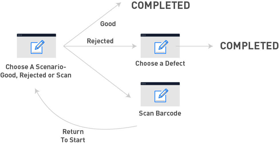
Here’s the first step in the app:
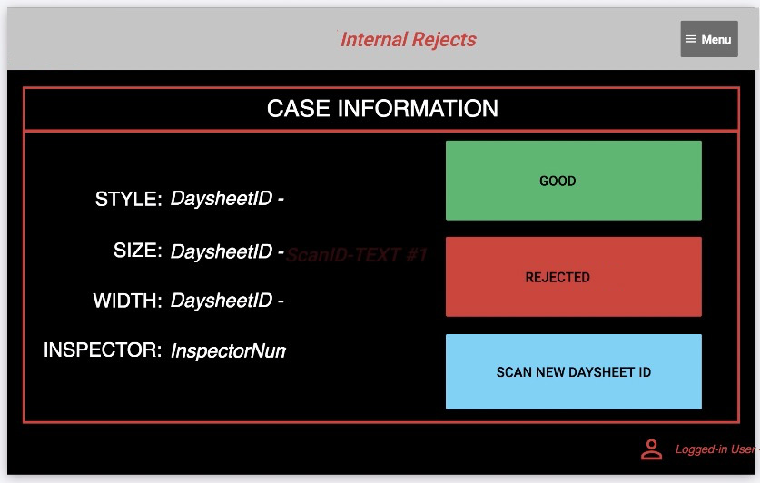
If the SKU is different than the previous product, an operator will press the “Scan New Daysheet ID”. This brings them to a screen where they are prompted to scan the product with a barcode scanner. When they scan, the app uses a Connector function to connect to the MES system and pull in relevant data. Then, the operator can indicate whether it is “good” or “rejected”
If the operator chooses “Good”, the app is completed and the values of the variables on the left side of the step are stored alongside the completion. This will allow for later analysis by SKU.
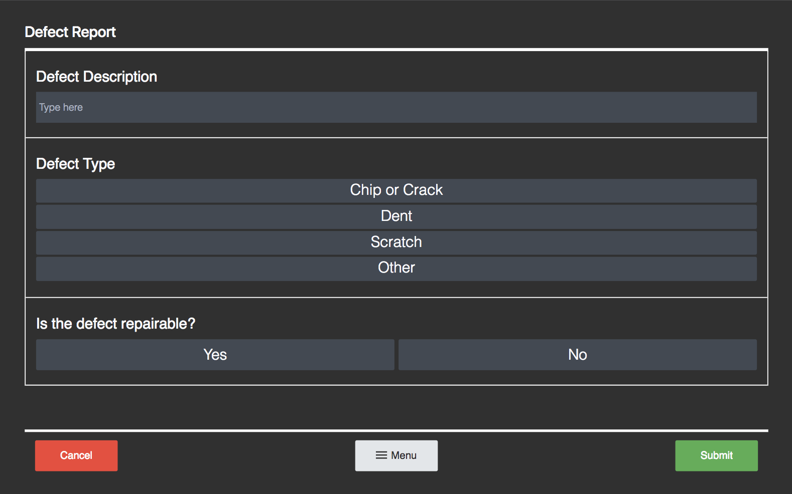
If the operator chooses “Rejected”, they are sent to a Form Step where they can select a defect. After they choose a defect, they can complete the app.
Here’s a diagram of the app logic:
Connectors
In this scenario, the barcode scan needs to return specific information about the SKU so that the quality specialist can validate that they are inspecting a specific product.
In order to accomplish this, you must call a connector function upon barcode scan, similar to the “Work Instructions” case above.
Analytics
This app will give you a rework rate- the percentage of products that are not allowed to be shipped due to a defect. It can calculate this simply:
- Log the total number of app completions where “Good” was pressed
- Log the total number of app completions where “Reject” was pressed
Then, with data from this app, you can investigate which SKUs are most commonly rejected, and common types of defects.
You can use the “Filters” field to look at specific products, and the Number field to create the ratio of good/rejects in the Single Number template.
Further Reading
Maintenance App
In your factory, you have separate types of maintenance inspections every week, month, quarter and 6 months. Maintenance techs need to carry around a tablet with an app, and note any issues they find while they do their rounds.
You can create one app with a separate set of steps for each type of inspection. The first step in the app will allow technicians to choose the type of inspection.
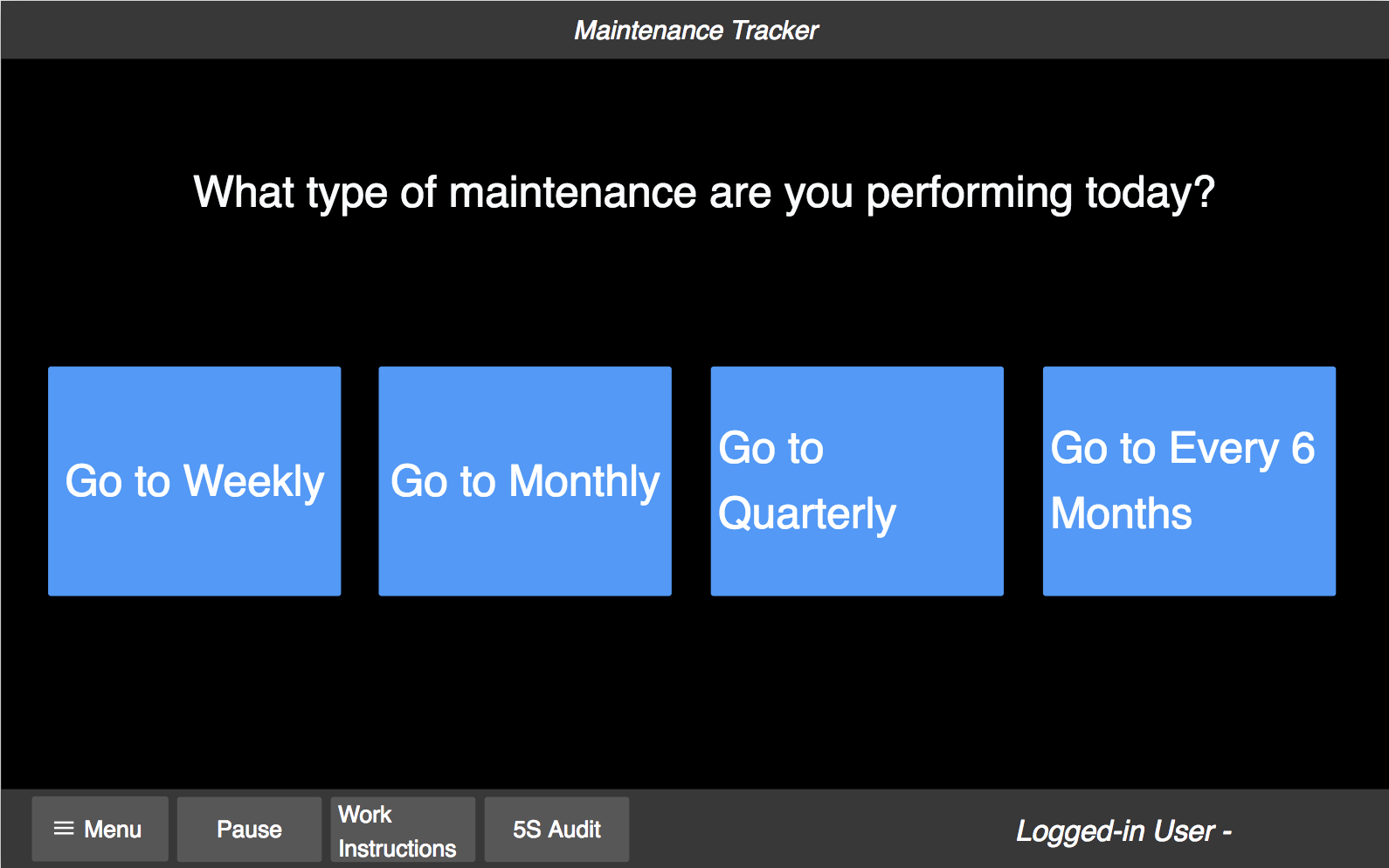
Then, create a series of Form Steps that correlate to individual machines that the tech must inspect.
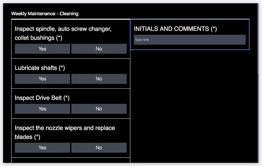
This app is very straightforward: one initial routing step, then a Form Step for each inspection.
Analytics
On the shop floor dashboard, the single number indicates whether the weekly inspection has been completed or not.
In a weekly inspection, most inspections should not lead to any further work. But, you will probably want to learn which tests failed so you can see trends over time.
You can use a Table template to create a table with just the comments field from each equipment inspection. That way, you can see which fixes were needed week by week.
Here’s an example of the comment fields from all equipment inspections. Use the Operations field to select the comments field from each Form Step of the app.

Further Reading
Adding Machine Monitoring Data to the Shop Floor Dashboard
You can use the Machine Attribute Widget to add a real-time feed of data from an individual machine to your shop floor dashboard.
Creating Your First Shop Floor Dashboard
Although you may start planning by imagining which metrics you would like to see on your shop floor dashboard, there are actually a series of assets you must create before building the shop floor dashboard. These can include:
- Apps for each station or role on the floor
- Variables in those apps to track important details
- Analyses that dig into each individual variable
- Copies of those analyses to fit multiple timeframes
- A series of dashboards within a single app
In order to launch a shop floor dashboard more quickly, you may just want to focus on app completion data and build the first, high-level dashboard. Then, after you have started to build some internal momentum, you can build out the deep-dive analytics and multiple date ranges.
Did you find what you were looking for?
You can also head to community.tulip.co to post your question or see if others have faced a similar question!