In this walkthrough, you will:
- Create a simple analysis from table data
- Target specific data by applying sorting and filters
An Analysis is a visualization of data stored in Tulip. Analyses automatically update to reflect recent data.
In this walkthrough, you’ll learn the basics of analyses by creating one in the Analytics Editor.
In order to follow this walkthrough, you must first complete the exercises in Build Your First Table.
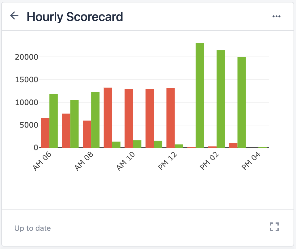
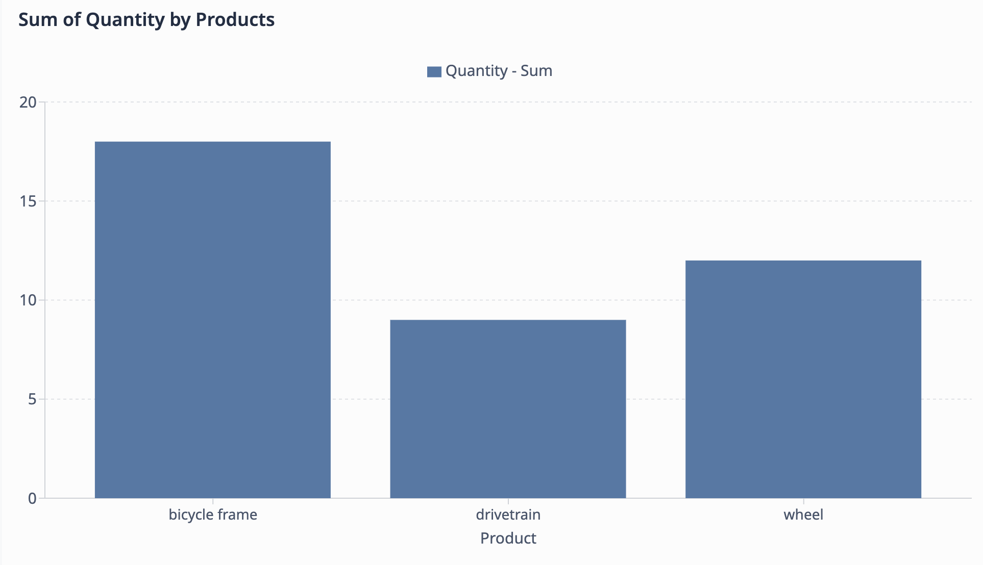
At the end of the exercise, you will have an analysis that looks like this:
Exercise: Chart quantities by product
In this exercise, we are going to create a bar chart analysis that shows the sum of quantity for each type of product. We want to see the disparity of units produced between each type of product (bicycle frame, drivetrain, wheel).
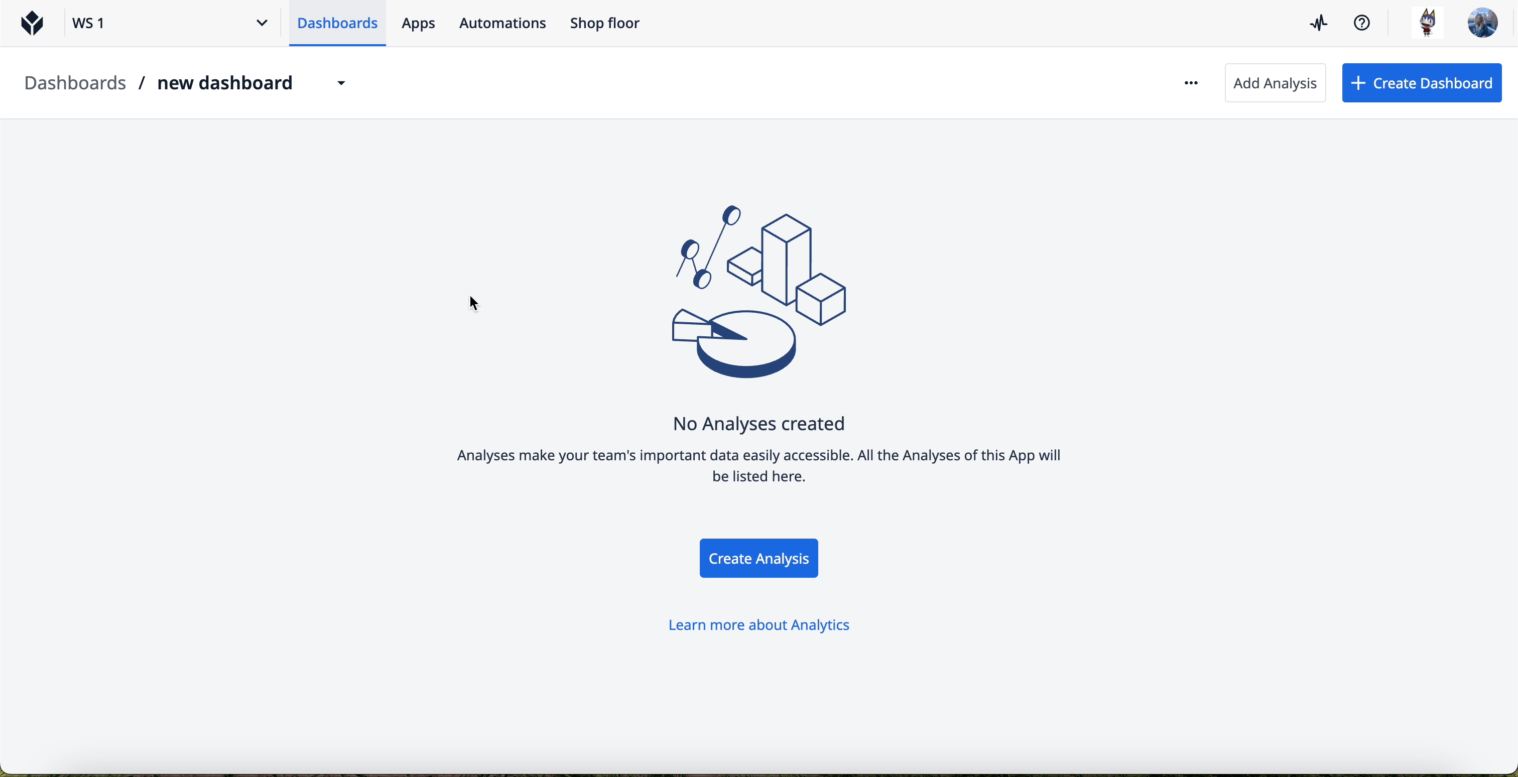
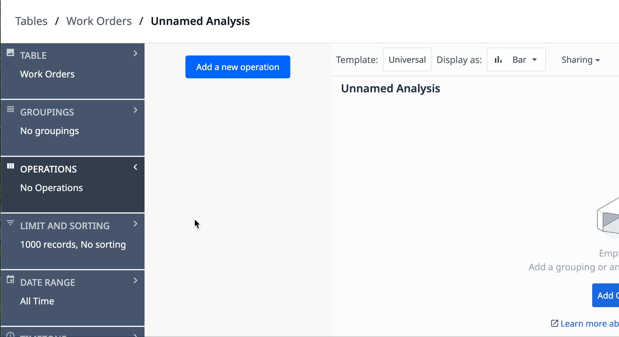
Select Work Orders table for new analysis
- Select the Dashboards tab in the top navigation bar. Click Create Analysis.
- Click the Table tab and select the Work Orders table.
Configure analysis data
-
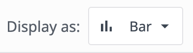
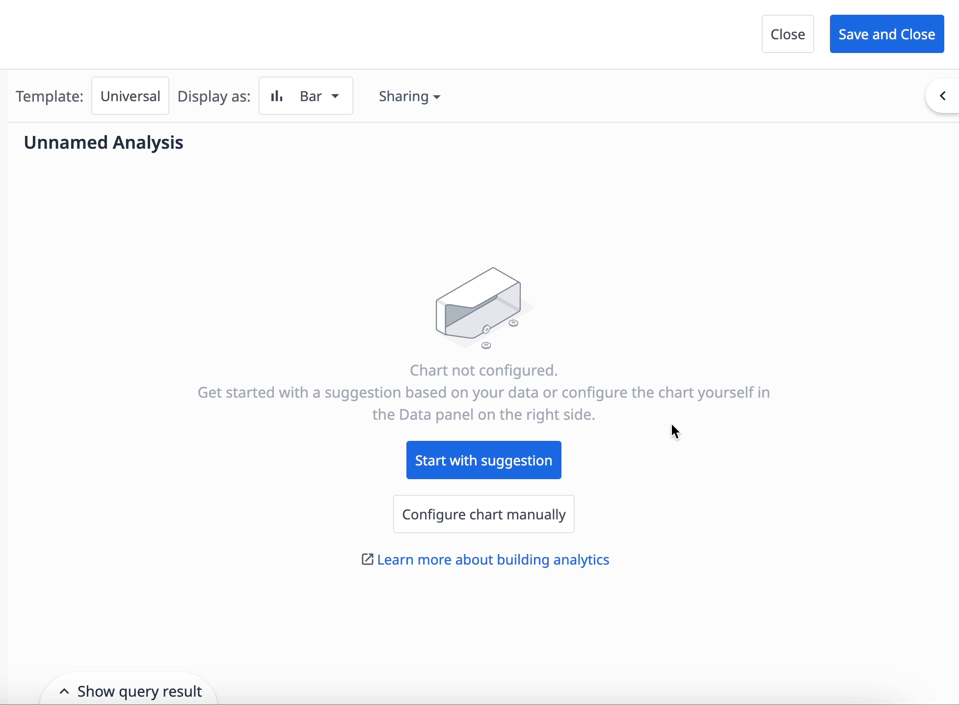
Click the Display dropdown and select Bar.
-
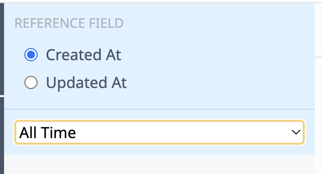
Click the Date Range tab. In the dropdown, select All time.
-
Click the Operations tab and then Add a new operation.
-
Select Aggregation functions → Sum.
-
Click <Select a variable or function>. Select Table Field → Work Orders Quantity.
The operation determines the data you want to see. In this case, we want to see the sum of product quantities.
- Click the Groupings tab and then Add a grouping.
- Select Table Fields → Work Orders Product.
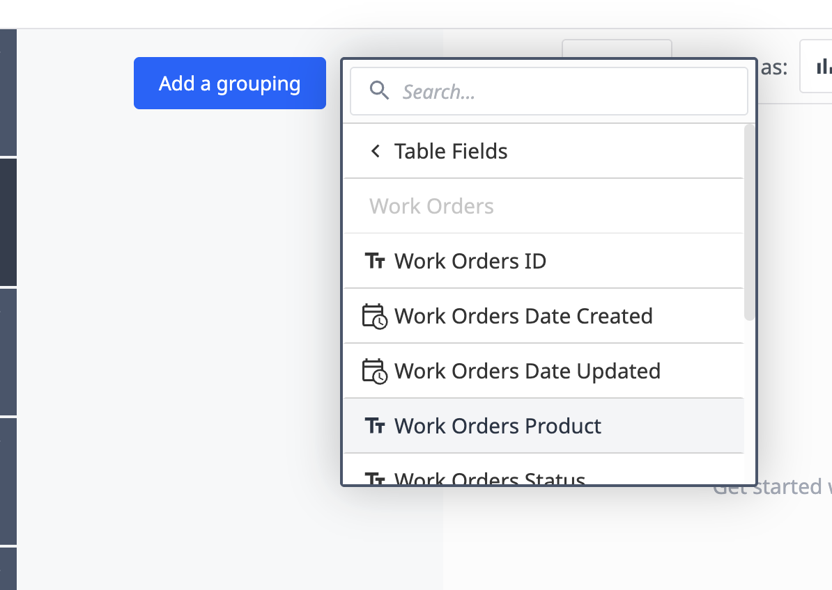
The grouping determines how you want to organize the data. In this case, we want to group the data by each product.
- In the Visualization panel, add the following fields for each axis:
- X Axis - Product
- Y Axis - Quantity
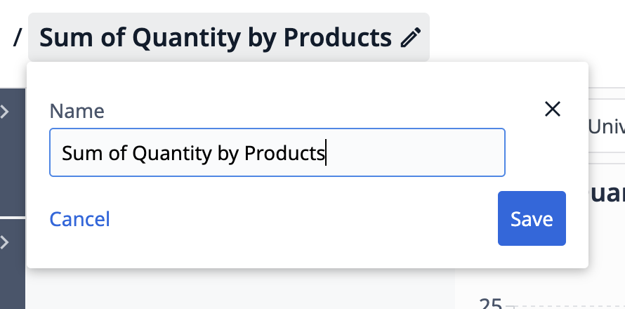
- Name your analysis so you can easily identify its purpose, such as “Sum of Quantity by Products”.
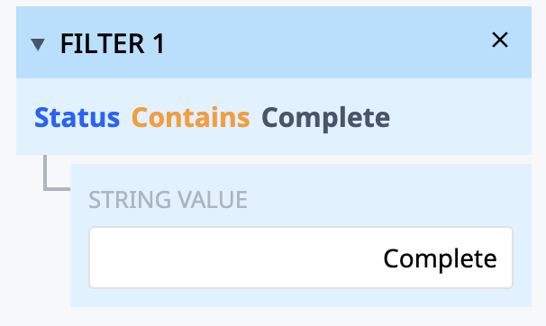
Filter data by status
To narrow down the data, let’s filter the data to only include completed work orders.
-
Click the Filters tab and then Add a new filter.
-
Select Function → Contains.
-
For the field, select Work Orders Status.
In the String Value box, type “Complete”.
Now you have a bar chart that shows the sum of units for all completed work orders per each product type.
Next Steps
Learn about what you can achieve with analyses:
- Intro: Data visualization with dashboards
- Drive continuous improvement with insights
- Dashboard development University course
Did you find what you were looking for?
You can head over to community.tulip.co to post your question or see if others have faced a similar question!