Learn how adding layers to charts can generate insights into your data
Layers can be added to certain chart types in Tulip to further increase the value of the analyses you are building. Layers are applied on top of a chart and use the data from it to generate insights. Insights are pieces of information that are extracted from or created using the data, e.g. outliers. You can use chart layers with tables, machines, and apps as data sources.
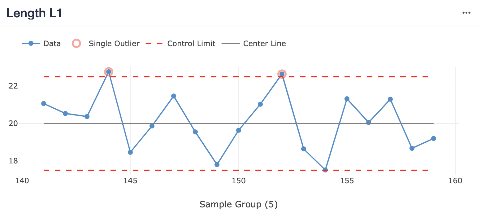
The image below shows an example of a line chart with the control chart layer enabled. There are outliers visualized.

Overview of Layers
The following shows a list of Layers in Tulip, the chart types and configuration they are available for, and the insights they generate. Click any layer name to learn more about that layer and how to configure it. As layers are used for comparison with the underlying data, precision for layers does not go beyond underlying data.
| Layer | Chart Types / Configuration | Insights |
|---|---|---|
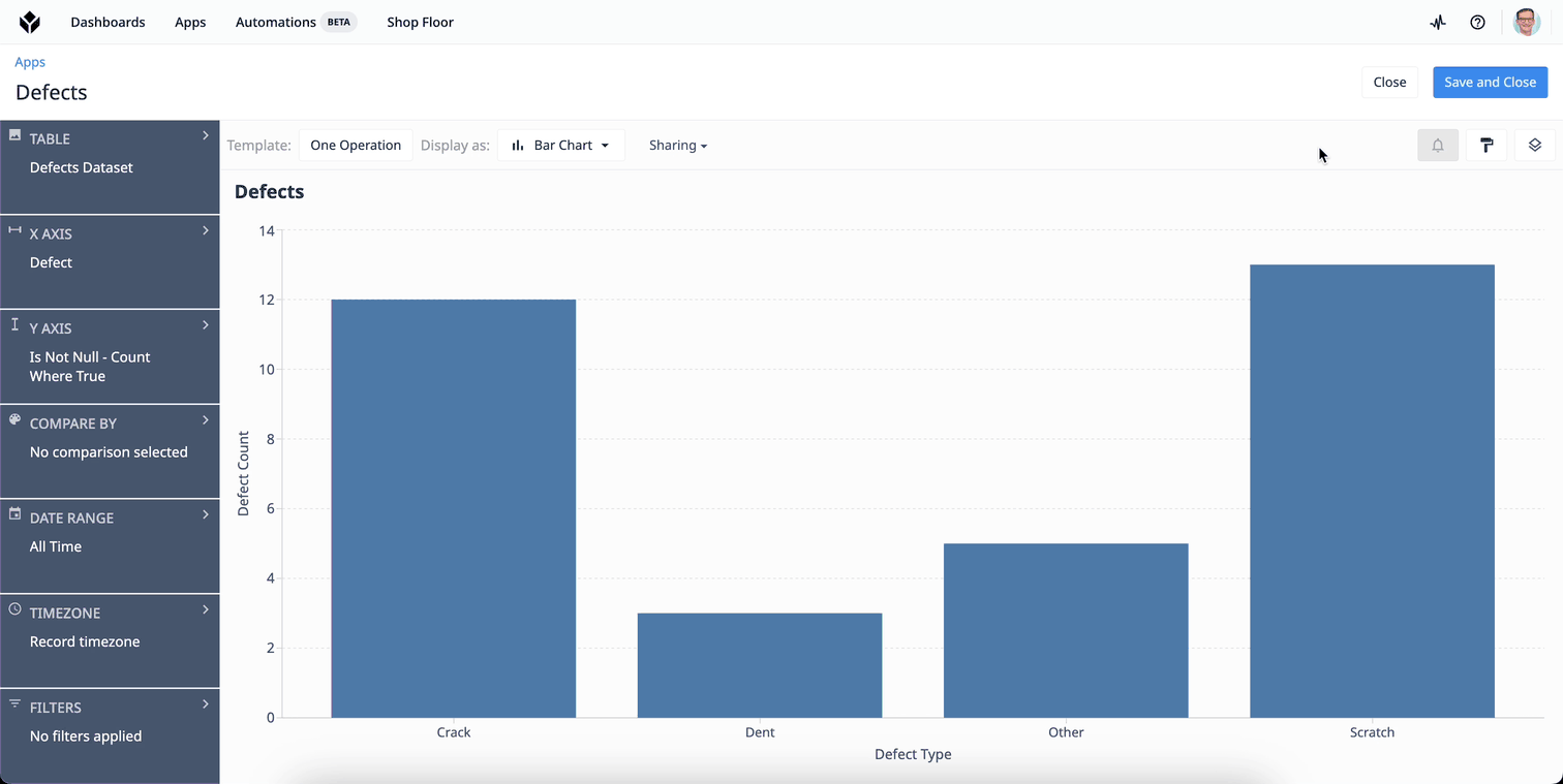
| Control chart | One Operation line chart with numeric data on the y-axis, Example: Length measurement for sample numbers | * Outliers, * Prominent Shifts |
| Forecast | One Operation line chart with numeric y-axis and timeseries on the x-axis Example: Defects per day. | * Forecast with confidence interval |
Configure a Layer
Each analysis can have one Chart Layer enabled.
Once you select a chart type that supports adding a layer, the "Chart Layers" icon on the top right of the Analytics Editor. This opens the "Chart Layers" menu in which will show all charts available for the current chart configuration.
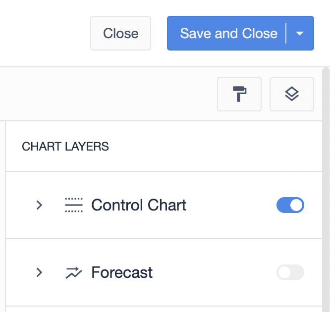
You can turn on a layer by clicking the respective toggle. The settings for it will automatically expand. You can also at any time collapse or expand the settings for a layer by clicking on the arrow left of its name.
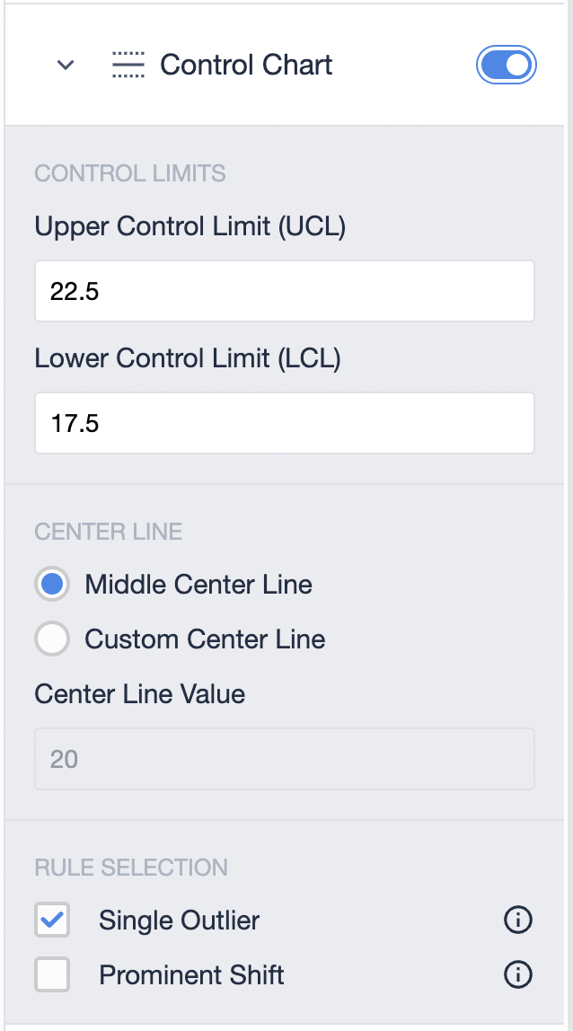
Should the toggle for a specific layer be greyed out, this can have one of two reasons:
- The chart configuration is not matching the conditions for the layer.
- You already have another layer enabled.
In both cases, the reason will be shown when you hover over the toggle for the layer.
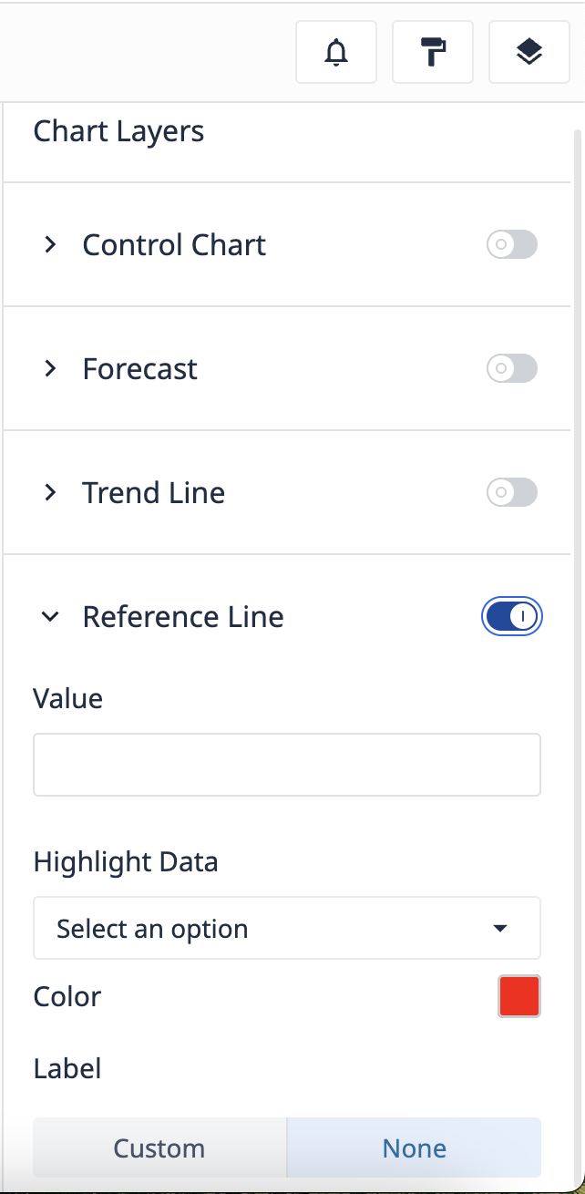
Reference line layers
A reference line layer allows shows a horizontal line on charts. Values that are above or below this line can be highlighted for immediate identification of out-of-reference data. Additionally, a label can be shown on the line to communicate what reference the line represents on the chart.
To add a reference line layer to your chart, click the Chart Layers icon in the Analytics Editor. Toggle the reference line and enter the value you want to set the line at.
Limits
| Item | Limit |
|---|---|
| Chart layers per analysis | 1 |
Alerting
You can also set up alerts for control charts. With alerts set up, Tulip checks for new Insights according to the check interval value, independent of the analysis being shown in an App or on a dashboard. If new Insights are found, an email will be sent out to the Tulip users specified in the recipient list.
Further reading
Did you find what you were looking for?
You can also head to community.tulip.co to post your question or see if others have solved a similar topic!