Let's say that you want a widget to appear on every step except for one. You need to remove the widget from the one step so you don't need to copy and paste it into each one.
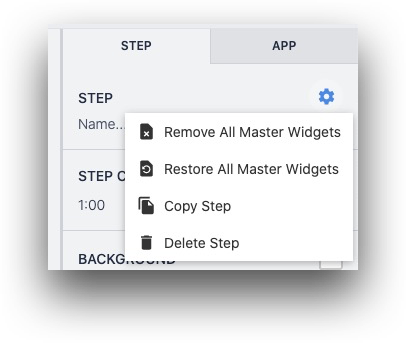
Additionally, you may want to remove all widgets from the Base Layout at once, rather than selecting them one by one. You can do this with the "Gear" icon at the top of the in the Side Pane.
You can also restore all Base Layout widgets after you have removed some of them.
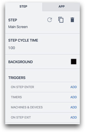
However, once you select a different step, the triggers will not appear in the side pane, even though they are present. This means that you cannot remove these step triggers from individual steps.
Base Layout
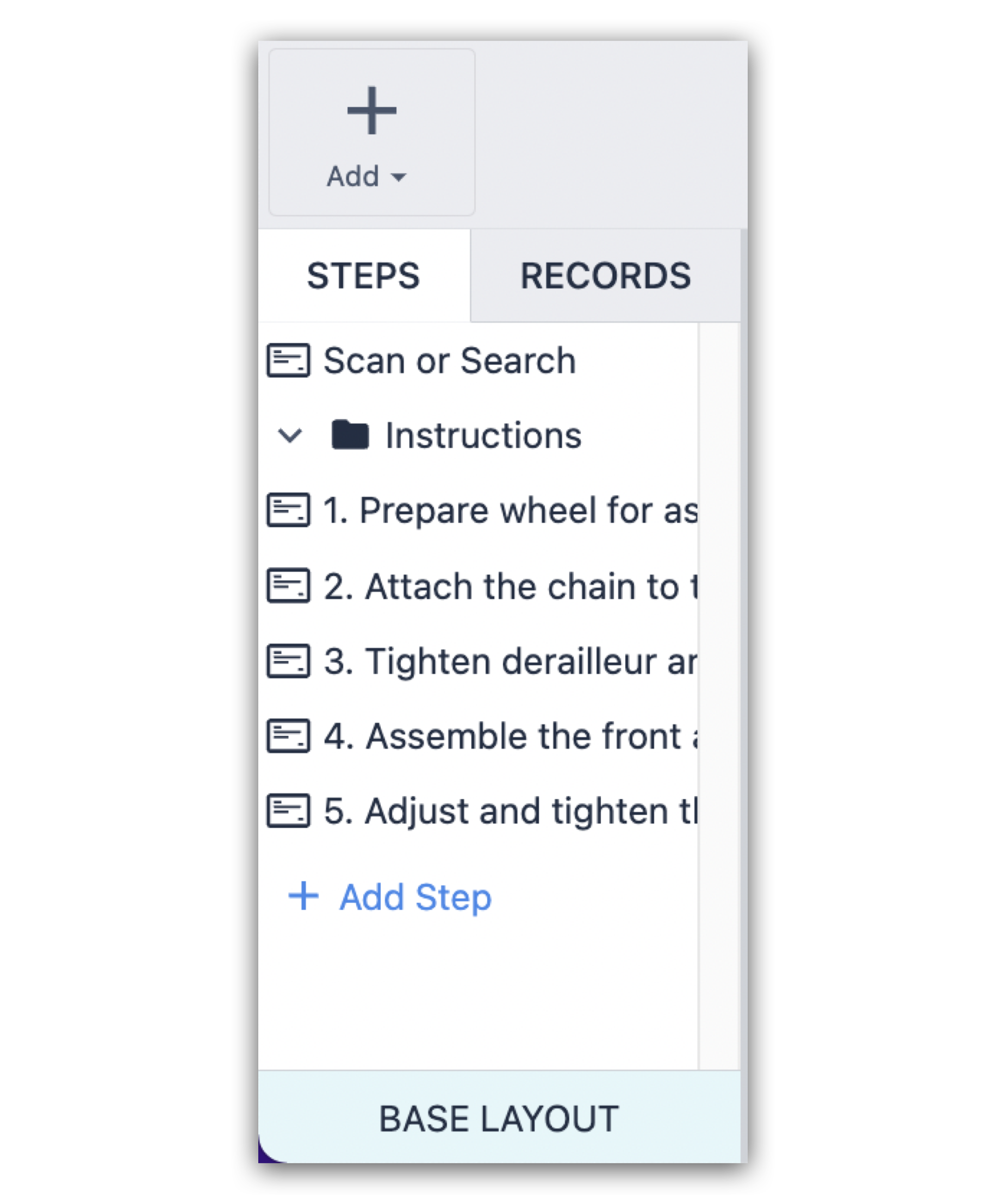
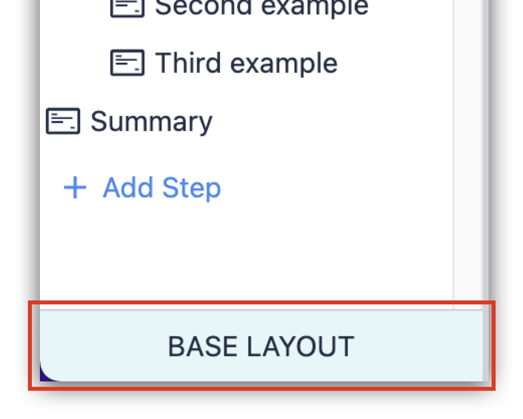
The Base Layout is the base template that all other Steps will be built on top of. Establishing common navigation buttons, and a consistent app background and style across all of your app steps can expedite the training and app-building processes. 
Base Layout
The Base Layout is the base template that all other Steps will be built on top of. Establishing common navigation buttons, and a consistent app background and style across all of your app steps can expedite the training and app-building processes. 
Trigger
Triggers are the mechanism to do things in Tulip Apps. Store data, move users between Steps, Interface with hardware, Etc.
Triggers can be added to widgets, machines, devices, apps, and steps.
Base Layout
The Base Layout is the base template that all other Steps will be built on top of. Establishing common navigation buttons, and a consistent app background and style across all of your app steps can expedite the training and app-building processes. 
Tulip University
Tulip University is a free resource to guide Tulip users through learning the Tulip. 30+ courses cover everything from the basics to Connector Functions and Edge Devices.
Enroll in your first course at university.tulip.co.
Base Layout
The Base Layout is the base template that all other Steps will be built on top of. Establishing common navigation buttons, and a consistent app background and style across all of your app steps can expedite the training and app-building processes. 
Widgets
Widgets are the elements that make up a specific App Step. Widgets can display information to users, collect user input, or trigger app logic.
Common widgets include: Interactive Tables, Number inputs, Machine attribute widgets, and more.
Step
A view your users will see within an application. Steps can be viewed chronologically or in whatever order best fits your process.
Steps can be grouped into Step Groups to manage and organize your app Steps.
Step
A view your users will see within an application. Steps can be viewed chronologically or in whatever order best fits your process.
Steps can be grouped into Step Groups to manage and organize your app Steps.
Widget
Widgets are the elements that make up a specific App Step. Widgets can display information to users, collect user input, or trigger app logic.
Common widgets include: Interactive Tables, Number inputs, Machine attribute widgets, and more.
Base Layout
The Base Layout is the base template that all other Steps will be built on top of. Establishing common navigation buttons, and a consistent app background and style across all of your app steps can expedite the training and app-building processes. 
Widget
Widgets are the elements that make up a specific App Step. Widgets can display information to users, collect user input, or trigger app logic.
Common widgets include: Interactive Tables, Number inputs, Machine attribute widgets, and more.
Widget
Widgets are the elements that make up a specific App Step. Widgets can display information to users, collect user input, or trigger app logic.
Common widgets include: Interactive Tables, Number inputs, Machine attribute widgets, and more.
Base Layout
The Base Layout is the base template that all other Steps will be built on top of. Establishing common navigation buttons, and a consistent app background and style across all of your app steps can expedite the training and app-building processes. 
Step
A view your users will see within an application. Steps can be viewed chronologically or in whatever order best fits your process.
Steps can be grouped into Step Groups to manage and organize your app Steps.
Side Pane (Context Pane)
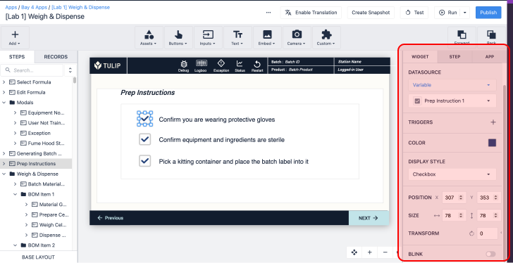
The Side Pane is the configuration pane on the right side of the App Editor where steps, apps, and widgets can be configured. Triggers can be added to adjust widget behavior.
Trigger
Triggers are the mechanism to do things in Tulip Apps. Store data, move users between Steps, Interface with hardware, Etc.
Triggers can be added to widgets, machines, devices, apps, and steps.
Side Pane (Context Pane)
The Side Pane is the configuration pane on the right side of the App Editor where steps, apps, and widgets can be configured. Triggers can be added to adjust widget behavior.
Trigger
Triggers are the mechanism to do things in Tulip Apps. Store data, move users between Steps, Interface with hardware, Etc.
Triggers can be added to widgets, machines, devices, apps, and steps.
Trigger
Triggers are the mechanism to do things in Tulip Apps. Store data, move users between Steps, Interface with hardware, Etc.
Triggers can be added to widgets, machines, devices, apps, and steps.
Steps
A view your users will see within an application. Steps can be viewed chronologically or in whatever order best fits your process.
Steps can be grouped into Step Groups to manage and organize your app Steps.
Side Pane (Context Pane)
The Side Pane is the configuration pane on the right side of the App Editor where steps, apps, and widgets can be configured. Triggers can be added to adjust widget behavior.