Add and modify an Interactive Table widget
In this article, you will learn...
- What is an Interactive Table widget?
- How to use Interactive Table widgets
Complete this tutorial if you have not yet created a table.
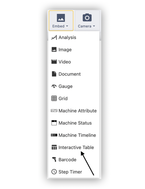
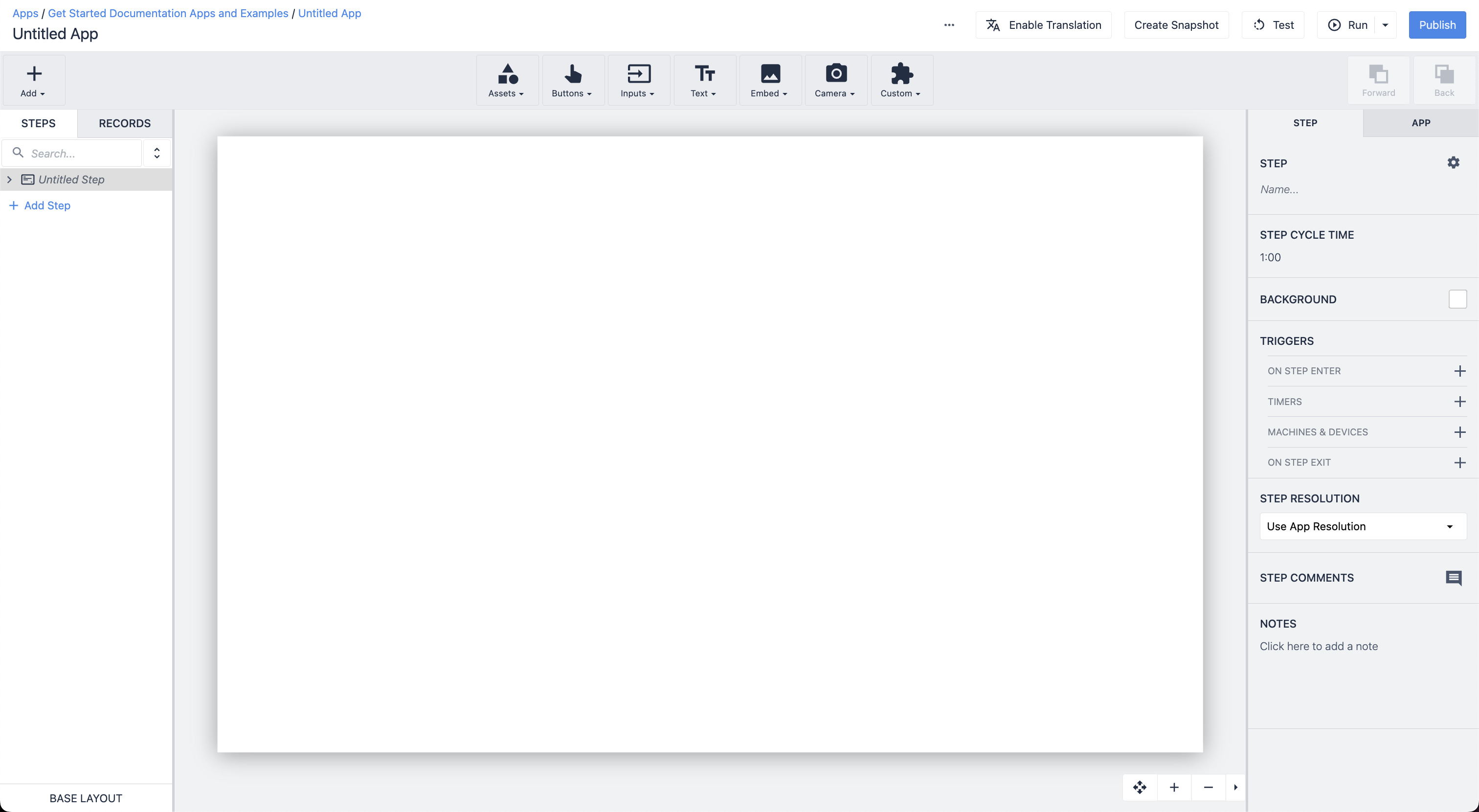
Add the Interactive Table Widget
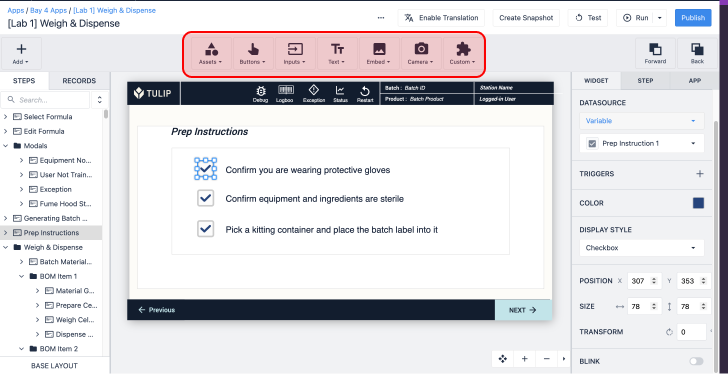
The Interactive Table widget is found under the Embed dropdown in the App Editor Toolbar.
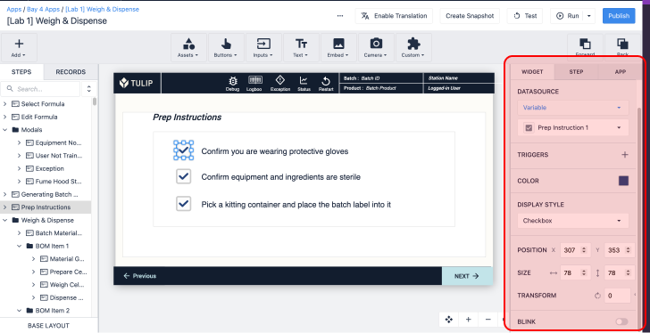
Datasource
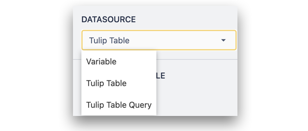
The Interactive Table widget can be used to visualize data from the following sources:
- Variable: Any variable within the App (the variable must be an array of objects).
- Table: An existing Tulip Table.
- Table Query: A query within a Tulip Table to return filtered records.
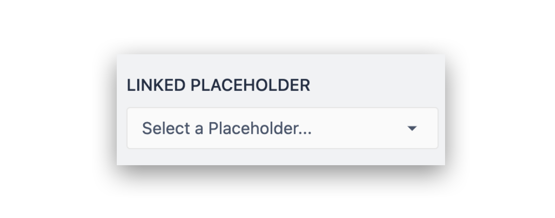
Linked Record Placeholder / Variable
An Interactive Table Widget can also include a Linked Placeholder or variable, depending on datasource. This represents a container for a single object, with an Interactive Table representing a list of Objects. If a linked placeholder or variable is set, selecting a row within the table will load that row of data into the container.
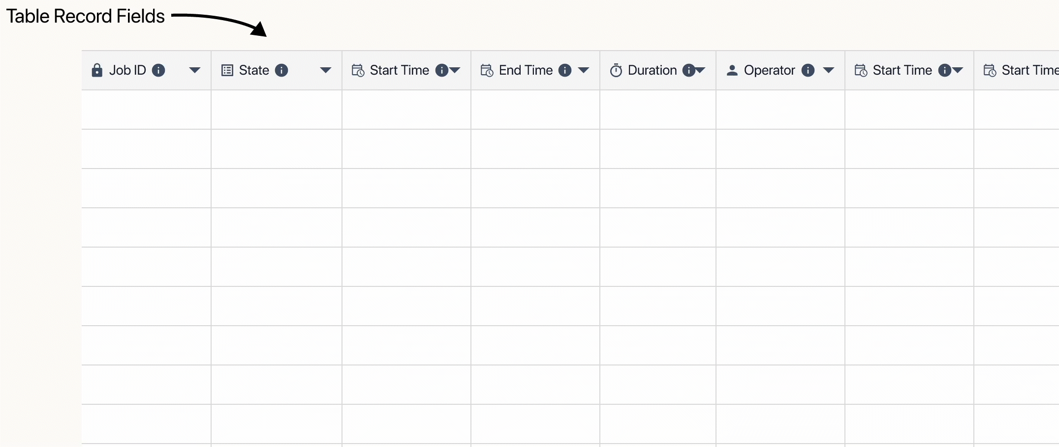
Columns
To add columns, select them from the dropdown list to add them one at a time. Columns are represented by columns in the selected Tulip Table, Table Query, or by object keys in the selected variable.
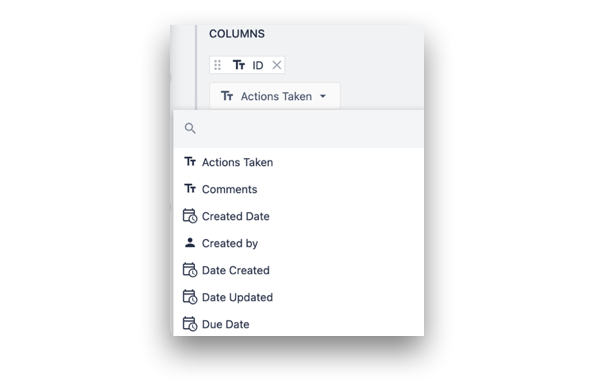
We recommend you display no more than 20 columns per step for optimal user experience and app performance.
To reorder columns, click and drag the labels in the widget properties. To change the width of the columns, drag the lines of each column in the App Editor or Player.
Text wrap
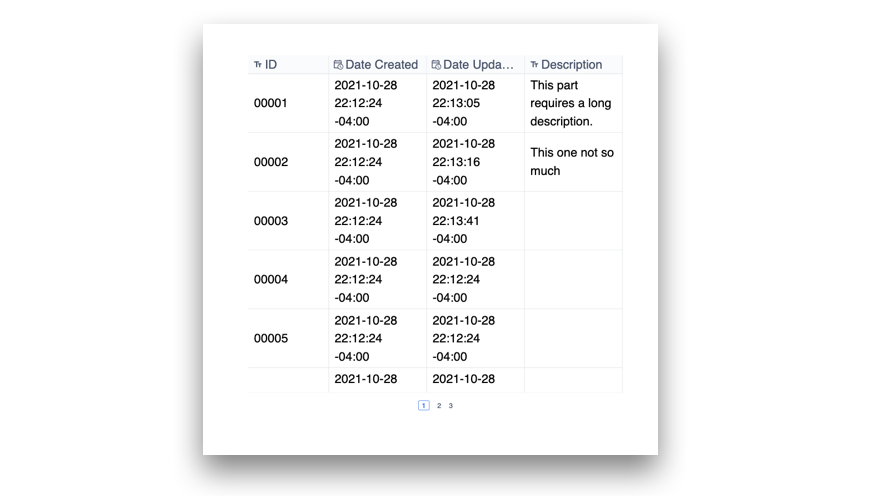
Text within an Interactive Table cell can be set to wrap. With wrapping enabled, longer-form text will create additional vertical space. With wrapping disabled, text will be shortened with an ellipsis when approaching the column edge.
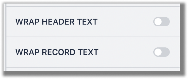
To toggle text wrapping in the header and record text, toggle the switches in the Side Pane.
Select button
A select button can be added to the Interactive Table widget to provide additional clarity to which row is selected if a Linked Placeholder/Variable has been added.
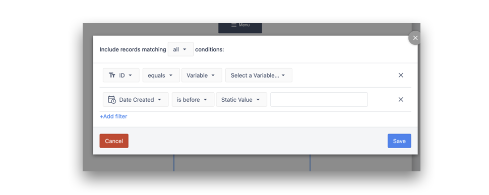
Filters
Static or dynamic filters can be added to the Interactive Table widget to filter out data in the interactive table widget. Filters can be set to match all or any condition and can be compared to Static Value, Variables, application information, and Table Record Field.
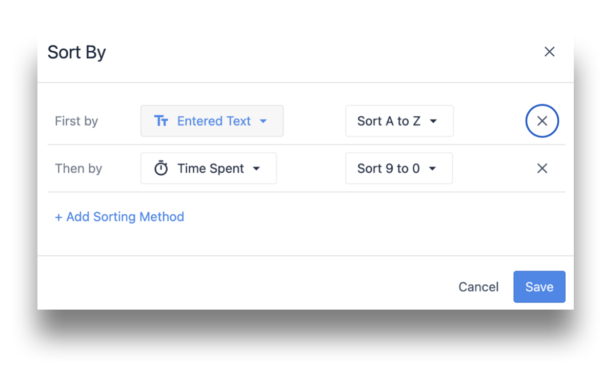
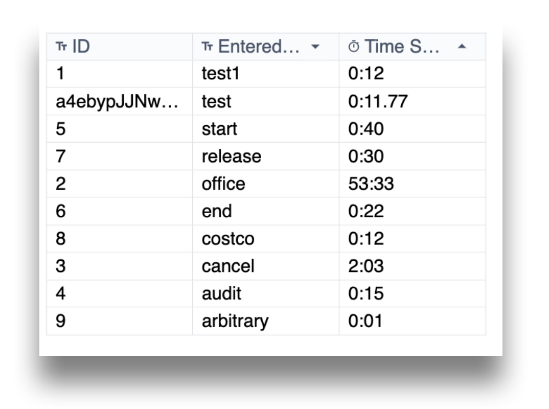
Sorting
Sorting the Interactive Table based on a specific column can be set up with the "Sort By" option in ascending or descending order (based on data type). You can also add multiple sorting methods per the columns in the table widget.
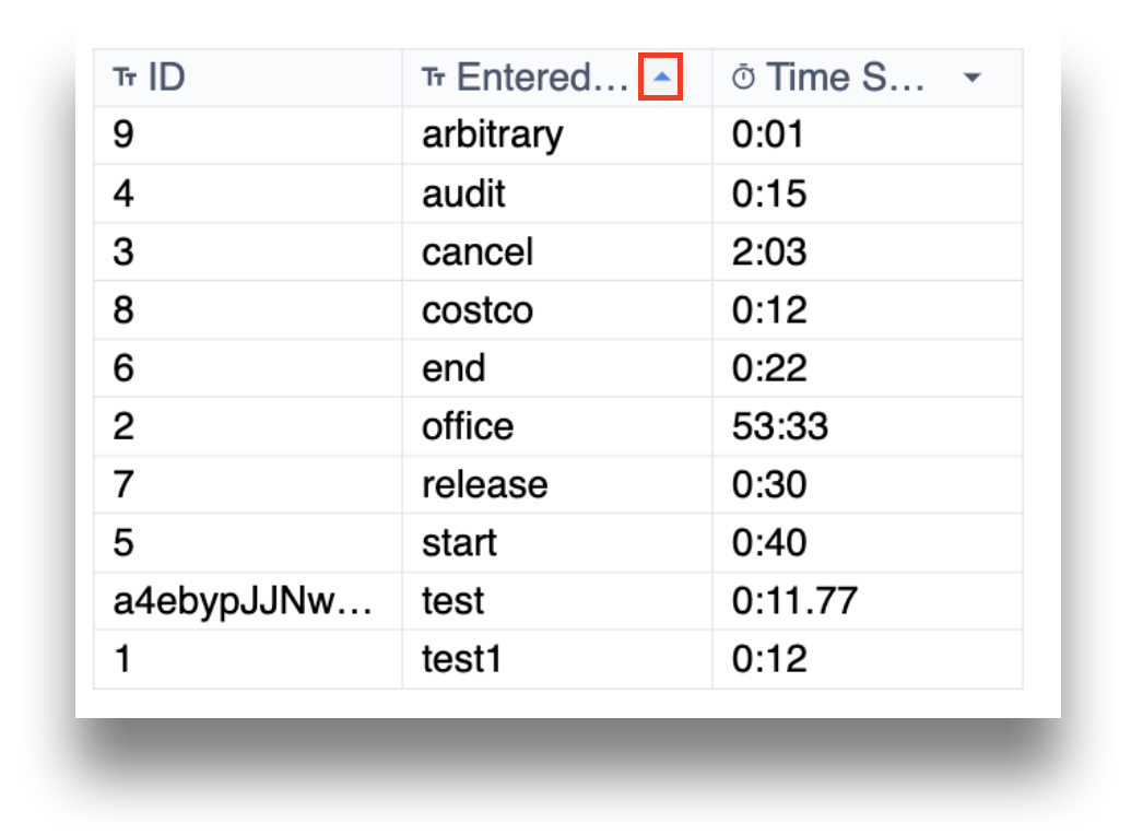
Columns already added in the Sort By option can also be sorted in the player. Click the ^ icon symbol to reverse the sort.
In order to ensure a performant app and user experience, we recommend NOT sorting the embedded table by any columns on which the embedded interactive table is filtered by.
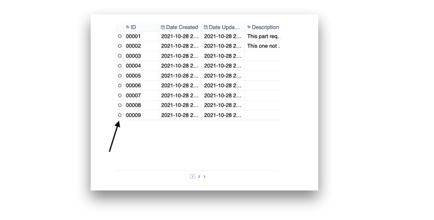
Row index
A row index can be added to the Interactive Table widget to indicate the row count on the left side. The row count is specific to the content actively being displayed or rendered by the widget.
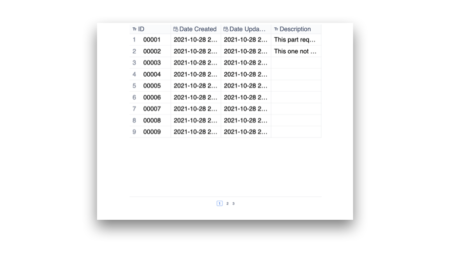
Rows per page
The number of rows per page on the Interactive Table widget can be can be adjusted here. Increasing the number of rows beyond a certain number will add vertical scrolling functionality to the widget.
Triggers
Triggers can be configured to run when a row is selected within the Interactive Table widget. To add a trigger, click the + button next to the Trigger label in the widget properties menu.
Triggers can leverage information from the selected row by setting a Linked Record/Variable and using this within the body of the trigger.
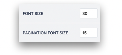
Font size and pagination font size
The font size of the data displayed in the table and the size of the page number labels can be adjusted within the widget properties menu.
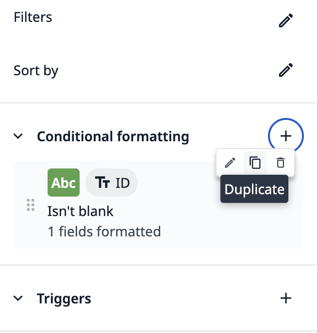
Conditional Formatting
In the app editor, Conditional formatting enables users to pick table fields as arguments for formatting rules in the interactive table widget
Conditional formatting rules shows a Duplicate option when there are fewer than 20 rules in the list.
Learn more about conditional formatting here.
Further reading
- How To Use Table Records in the App Editor
- Displaying Interactive Lists of Table Records Or Connector Output in Apps
Did you find what you were looking for?
You can also head to community.tulip.co to post your question or see if others have solved a similar topic!
.gif)