- Print
As of r234, Form steps have been disabled for all new Tulip Instances.
The guide to Form Steps gives a full overview of the various ways that you can customize a form in Tulip.
This article will list out all the different ways that you can customize each of the 6 form widgets.
If you would like to know how to customize Triggers in Form Steps, please review this resource
Boolean Widget

Default Value: Choose whether the value should be default "Yes" or "No"
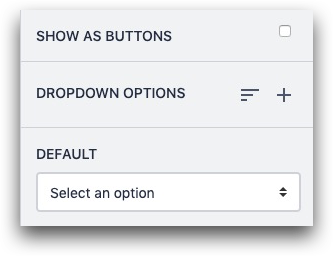
Dropdown Widget

Default: Choose an option that should be selected by default.
Show As Buttons: List options on the screen rather than forcing the operator to open the dropdown
Dropdown Options: Add a new option to the dropdown list, or add a group within the list.
You can add a new option via the "Enter" key. You can also paste a list of options, as long as they are separated into individual lines in a text editor (ie Word or a notes app).
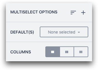
Multiselect Widget

Multiselect Options: Add a new option to the list, or add a group within the list.
Default(s): Choose an option that should be selected by default
Columns: If the list of options is long, allow it to be broken into multiple columns
The Multiselect Form Widget stores all choices as text values in a variable.
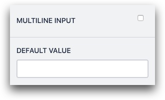
Text Widget

Multiline Input: Turn a single line into a multiline input to encourage longer responses
Default Value: Add a default value for the widget
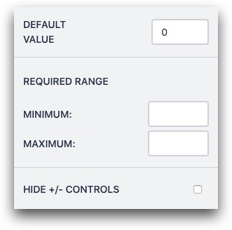
Number Widget

Default Value: Add a default number for the widget
Required Range: Do not allow the form to be submitted unless it falls within a certain range
Hide +/- Controls: Hide the + and - buttons from the widget
Photo Widget

Photo Input Options: Choose whether operators can add a photo via camera, Image upload from the local computer, or both.
Did you find what you were looking for?
You can also head to community.tulip.co to post your question or see if others have faced a similar question!


